MW
Please barewith me on this, I know there's loads of BBC News Mocks (of which I've probably created a fair few...)
So 2 weeks ago, with the impending launch of Reith across BBC News output I wanted to think of ways to improve on or change the current BBC E/R News look whilst tying into the master brand. I came up with a basic premise for an endboard quite quickly. Using only AfterEffects I came up with these.
This is the sketch btw, I am no artist so I apologise! It was a simple map it out before constructing the template in AfterEffects:
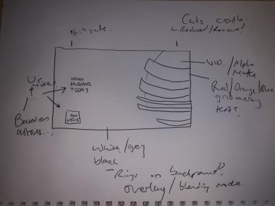
For the benefit of newer mockers, give this a go first - I tend to find it helps me get my barings with the software and where I'm going.
The first image, based on a sketch and drawing inspiration from the North West Tonight titles and the original Lambie-Nairn 2008 look was this:
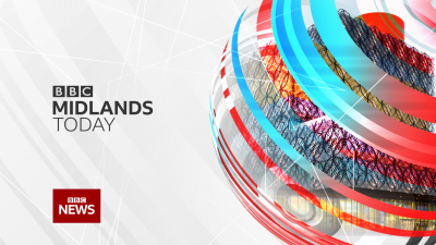
I felt that leaving the white behind was probably another step to take (interestingly, and inspired by Nottingham's 'East Midlands Tonight' I went with darkening the colour scheme)
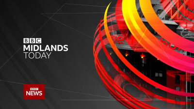
However felt that this was too dark, and with the orange and red quite jarring (the orange and red was seen by me as a 'Breakfast look' - despite the fact titles haven't been used on the breakfast output for a while).
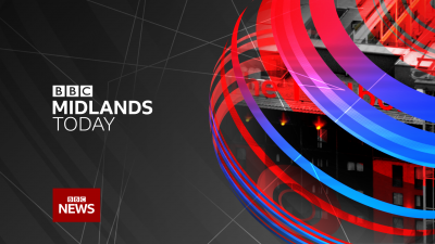
Changing the colours I did like the darker scheme but it felt stuck in 2003 and the clamshell,look, and didn't suit the magazine nature of the English Regions output
So I settled on this
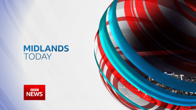
A blue tint to the backdrop and a slight gradient to the text and BBC News 'lozenge'.
Taking this idea into animation I came up with this short endboard (full titles are in AE but struggling to render due to me using an old laptop at the moment).
Few things I would change such as the endboard video shot for one, not happy with it, and the rings that animate the logo onscreen don't look as good now it's rendered out.
So 2 weeks ago, with the impending launch of Reith across BBC News output I wanted to think of ways to improve on or change the current BBC E/R News look whilst tying into the master brand. I came up with a basic premise for an endboard quite quickly. Using only AfterEffects I came up with these.
This is the sketch btw, I am no artist so I apologise! It was a simple map it out before constructing the template in AfterEffects:

For the benefit of newer mockers, give this a go first - I tend to find it helps me get my barings with the software and where I'm going.
The first image, based on a sketch and drawing inspiration from the North West Tonight titles and the original Lambie-Nairn 2008 look was this:

I felt that leaving the white behind was probably another step to take (interestingly, and inspired by Nottingham's 'East Midlands Tonight' I went with darkening the colour scheme)

However felt that this was too dark, and with the orange and red quite jarring (the orange and red was seen by me as a 'Breakfast look' - despite the fact titles haven't been used on the breakfast output for a while).

Changing the colours I did like the darker scheme but it felt stuck in 2003 and the clamshell,look, and didn't suit the magazine nature of the English Regions output
So I settled on this

A blue tint to the backdrop and a slight gradient to the text and BBC News 'lozenge'.
Taking this idea into animation I came up with this short endboard (full titles are in AE but struggling to render due to me using an old laptop at the moment).
Few things I would change such as the endboard video shot for one, not happy with it, and the rings that animate the logo onscreen don't look as good now it's rendered out.
Last edited by Mike W on 30 June 2019 10:33pm - 4 times in total