I uploaded this to Twitter and Facebook a couple of weeks ago, and I was pleased with the response I received, so I thought I'd share it with TV Forum.
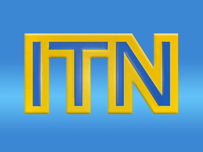
It's a recreation of the 1987 ITN logo. Here's the sample I worked from:
If you want it to look as close to the sample as you can get, three things perhaps. First would be the drop shadow behind the letters.
Then the lighting along the bevel, which has its own falloff - I think the best point as an example, is the bevel at the top-left corner, the top edge of the 'I', which is more highlighted. And more subtly, the bottom right corner of the 'T'. Might actually want to try tweaking the bevel along with it to give it a harder edge, if that's possible.
Lastly, the background gradient - to my eyes, looks as if the light blue that is roughly in the centre should be smoother - more spread out - and in the vertical dead-centre. At the moment, the lightest area appears to be below centre?
One further option that I'll admit I'm not exactly sure about, is to give the whole ITN lettering front face a slight shine. Either quite a focused light source (if you can render one) or otherwise possibly a white radial gradient, with the centre of the light lined-up roughly somewhere between the top of the T and the N - at least, slightly right of centre and up a smidge, I think!
I hope this makes sense... IMO you've def got the basics down, it's just adding or tweaking lighting & shadows.
It is a near faithful recreation of the logo, but as this is a simple logo i cant really give it anything more than 3/5* - Respectable.
I'm the same, sorry Rob - I think the first 3 come for execution and the last 2 get awarded on design merit! (God I sound like Tumble, deconstructing my vote!)
Another rare example of a brilliant and at least different mock on The Gallery. Only improvement I can think of is to adjust the bevel on the logo to match the real version, for some reason the edges look a little too sharp.
I preferred your first version, to be honest. A little bit too much yellow in the second one. I really wish ITN would bring back that logo. As evidenced in your mocks, it's timeless. A bit like the Iberia Airline logo for those in the know: thirty years running, and it still looks bang up to date today.
I would also like to see that logo against a dark (River Thames News at Ten) sky backdrop.