AJ
Hello,
Now, I know there's a godawful amount of Good Morning Britain mocks on here, but I wanted to revisit my old mock from last July, where I attempted to "tidy up" the graphics. In hindsight, it was a terrible mock, and didn't really change much or improve what is on TV.
So, I've had another look. The aim: to really tidy up the graphics this time, and make them clearer and easier to read. So, here goes.
TOTH
The opening, titles and music will all remain the same under this "new look." I'm going for evolution, rather than revolution.


(Well, you can't have a GMB revamp without a 1D exclusive, can you?! )
)
Programme Graphics
Here's the ticker, clock and logo. I've put the website address in the dead space next to the clock. During certain features, this will fade out and a hashtag will fade in.
Just in case they ever decide to bring back the weather graphic.

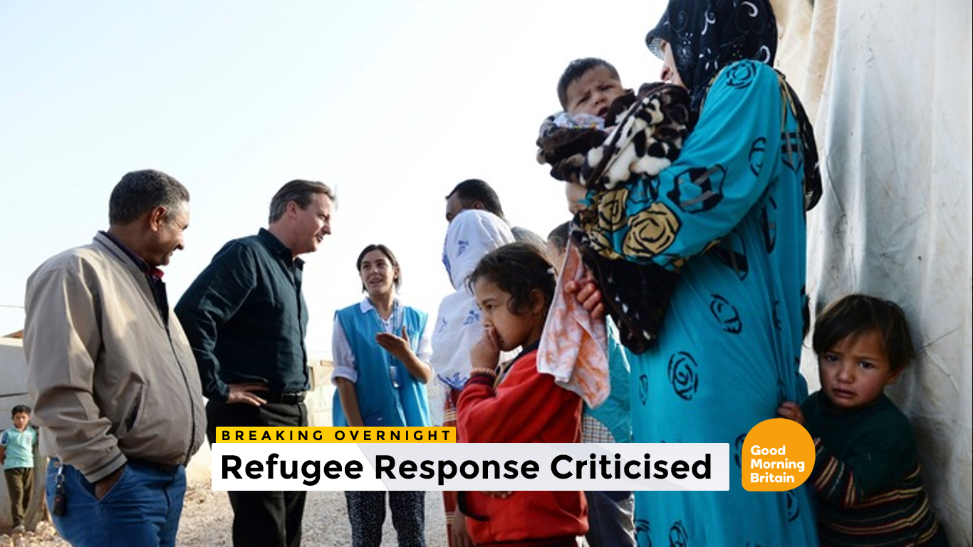
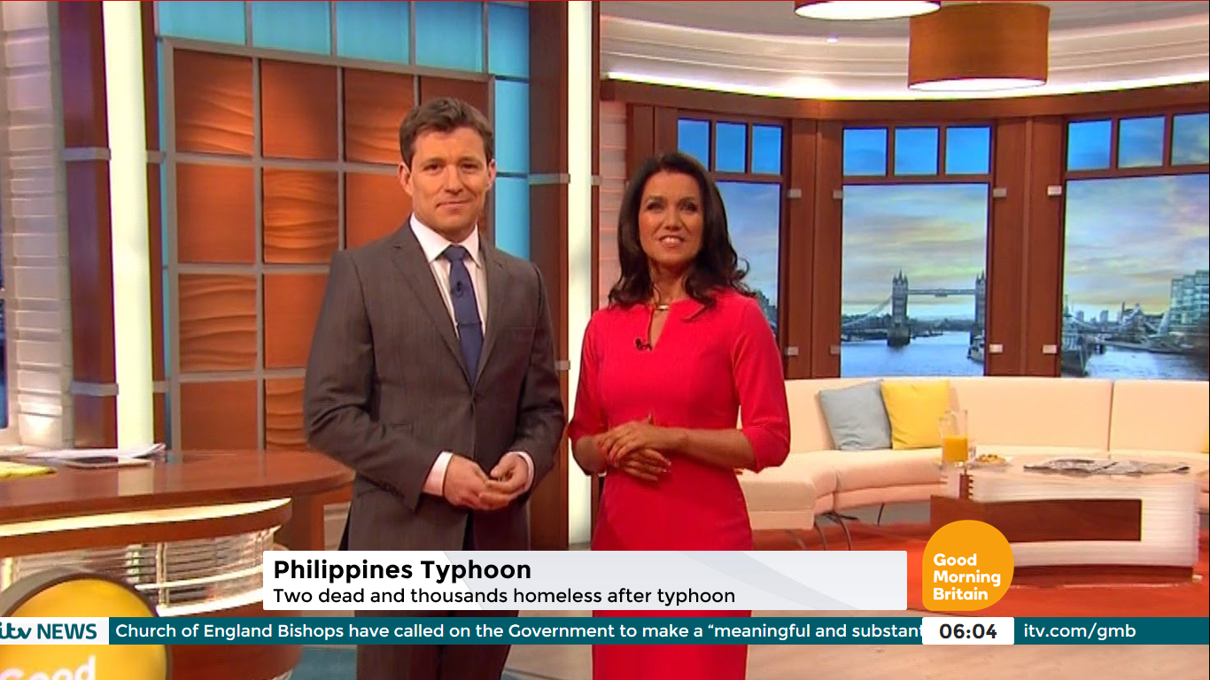
A breaking news / top story strap.

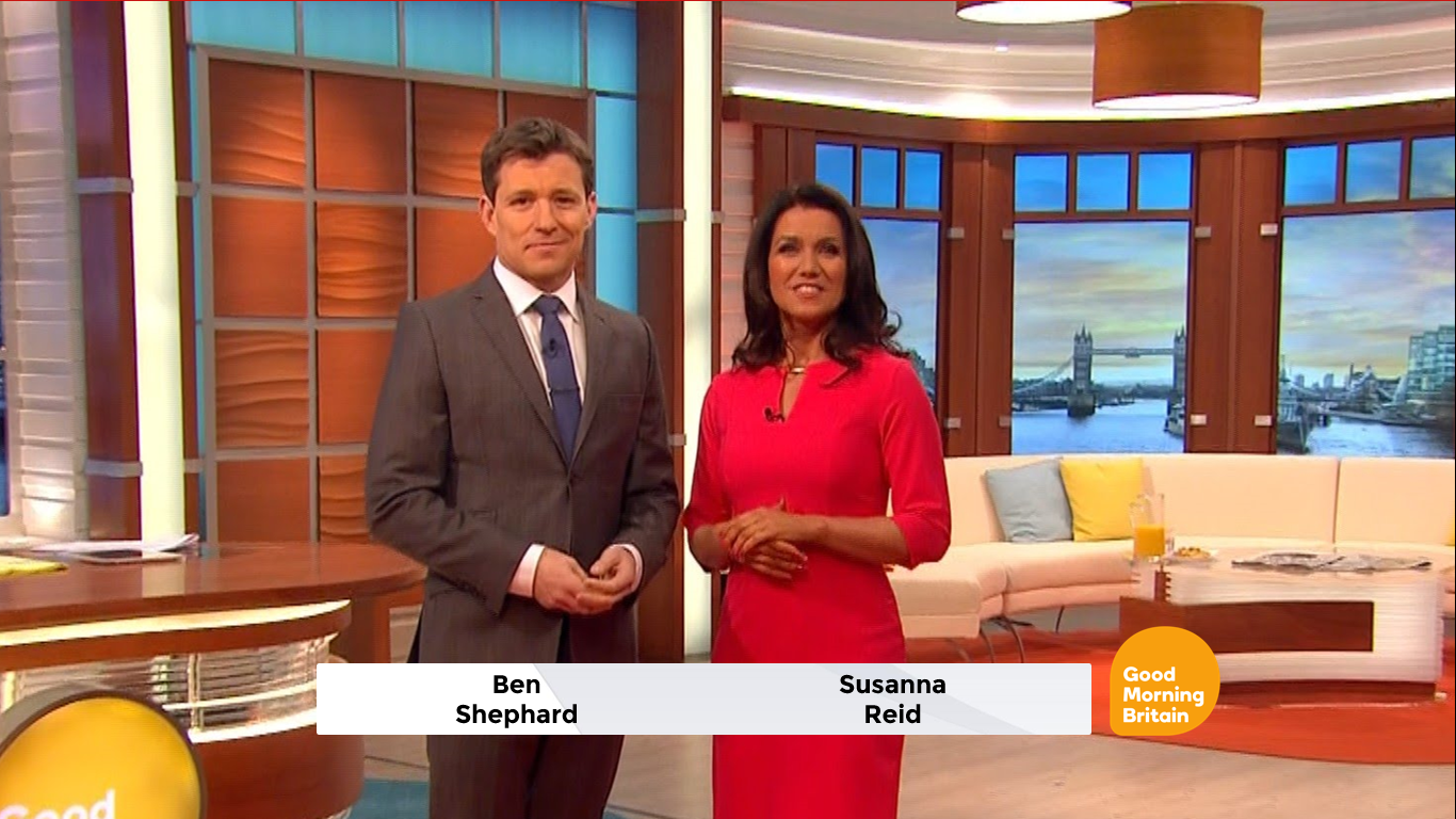
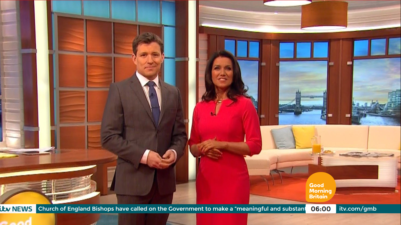
The usual day to day strap. Again, much the same as today, but a little cleaner.
Showbiz Sharp branding. The ticker remains on screen, but turns pink (as now). The weather bug - which we know they won't bring back - is covered over by a segment icon. Also an example of the hashtag instead of the website address.

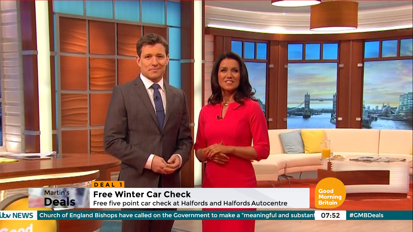
Here's what Martin's Deals graphics would look like.
The split screen.

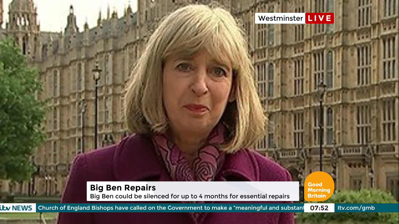
And finally the Live location bug.
I think it's a massive improvement over my last attempt - but then again, that isn't hard!
Hello,
Now, I know there's a godawful amount of Good Morning Britain mocks on here, but I wanted to revisit my old mock from last July, where I attempted to "tidy up" the graphics. In hindsight, it was a terrible mock, and didn't really change much or improve what is on TV.
So, I've had another look. The aim: to really tidy up the graphics this time, and make them clearer and easier to read. So, here goes.
TOTH
The opening, titles and music will all remain the same under this "new look." I'm going for evolution, rather than revolution.
(Well, you can't have a GMB revamp without a 1D exclusive, can you?!
)
Programme Graphics
Here's the ticker, clock and logo. I've put the website address in the dead space next to the clock. During certain features, this will fade out and a hashtag will fade in.
Just in case they ever decide to bring back the weather graphic.
A breaking news / top story strap.
The usual day to day strap. Again, much the same as today, but a little cleaner.
Showbiz Sharp branding. The ticker remains on screen, but turns pink (as now). The weather bug - which we know they won't bring back - is covered over by a segment icon. Also an example of the hashtag instead of the website address.
Here's what Martin's Deals graphics would look like.
The split screen.
And finally the Live location bug.
I think it's a massive improvement over my last attempt - but then again, that isn't hard!