AJ
Hi everyone,
Like most on here, I think that the current GMB graphics do the job, but I think that the white box in the middle of the lower third is just a little bit lazy.
Here's how I think it could be done a little better:
The main change to the lower thirds is the weather bug - I've moved this down to the ticker so that the space it previously used can be used for calls to action and further information.
Despite the complaints that caused ITV to move the clock in to the 4:3 safe area, I've moved everything back - there's no need for 4:3 safe, it just needs a little education for those who haven't got their TVs set up correctly. (But that's an argument for another thread!)
Anyway... here's the name strap for the start of the hour.
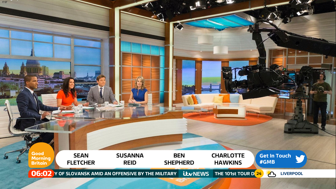
Much the same as before, but the area in the lower right is used for contact info etc - this wouldn't be there all the time by the way!

The coming up strap. Again, nothing massively different - just tweaked and tidied up a little. The call to action area has dynamic hashtags in much the same way as This Morning does.

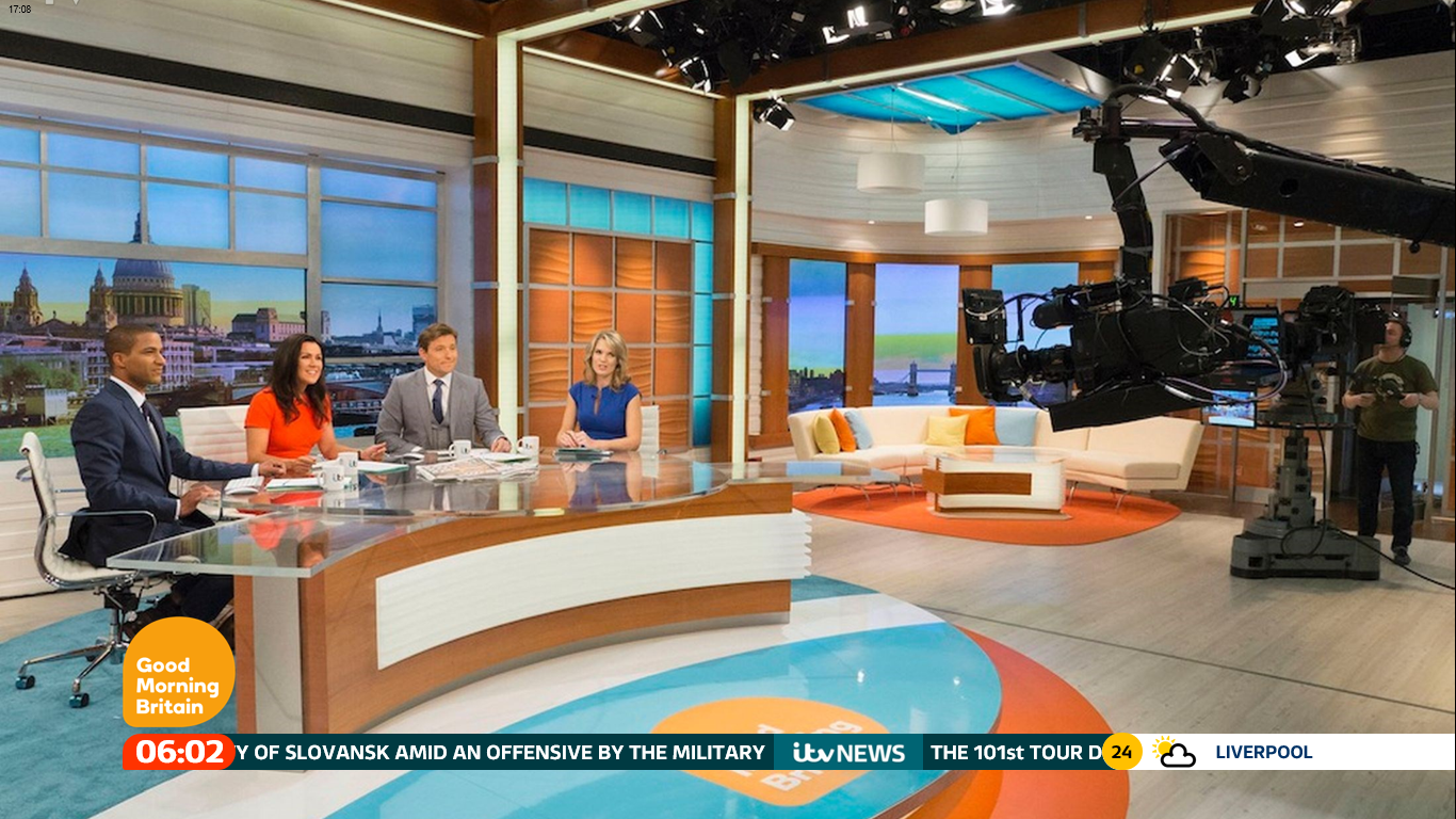
And here's the info straps. Again, just neatened up a little.
So yeah, that's how I think that GMB could redesign the lower thirds to make them look a little slicker. You'll probably disagree but as always, constructive criticisms welcome
EDIT: The GMB studio image is from TVLive.
Like most on here, I think that the current GMB graphics do the job, but I think that the white box in the middle of the lower third is just a little bit lazy.
Here's how I think it could be done a little better:
The main change to the lower thirds is the weather bug - I've moved this down to the ticker so that the space it previously used can be used for calls to action and further information.
Despite the complaints that caused ITV to move the clock in to the 4:3 safe area, I've moved everything back - there's no need for 4:3 safe, it just needs a little education for those who haven't got their TVs set up correctly. (But that's an argument for another thread!)
Anyway... here's the name strap for the start of the hour.
Much the same as before, but the area in the lower right is used for contact info etc - this wouldn't be there all the time by the way!
The coming up strap. Again, nothing massively different - just tweaked and tidied up a little. The call to action area has dynamic hashtags in much the same way as This Morning does.
And here's the info straps. Again, just neatened up a little.
So yeah, that's how I think that GMB could redesign the lower thirds to make them look a little slicker. You'll probably disagree
but as always, constructive criticisms welcome
EDIT: The GMB studio image is from TVLive.
