The Gallery

Developing BBC News (UPDATED)

New concept, graphics and colour scheme (August 2015)

This site closed in March 2021 and is now a read-only archive
JU
Justin
The colour is fine. Stop complaining about the colour... walls can be painted, sets can be redecorated, light bulbs can be changed. If Aaron does not want his mock to be red... i fail to see the problem.

BAM...
*


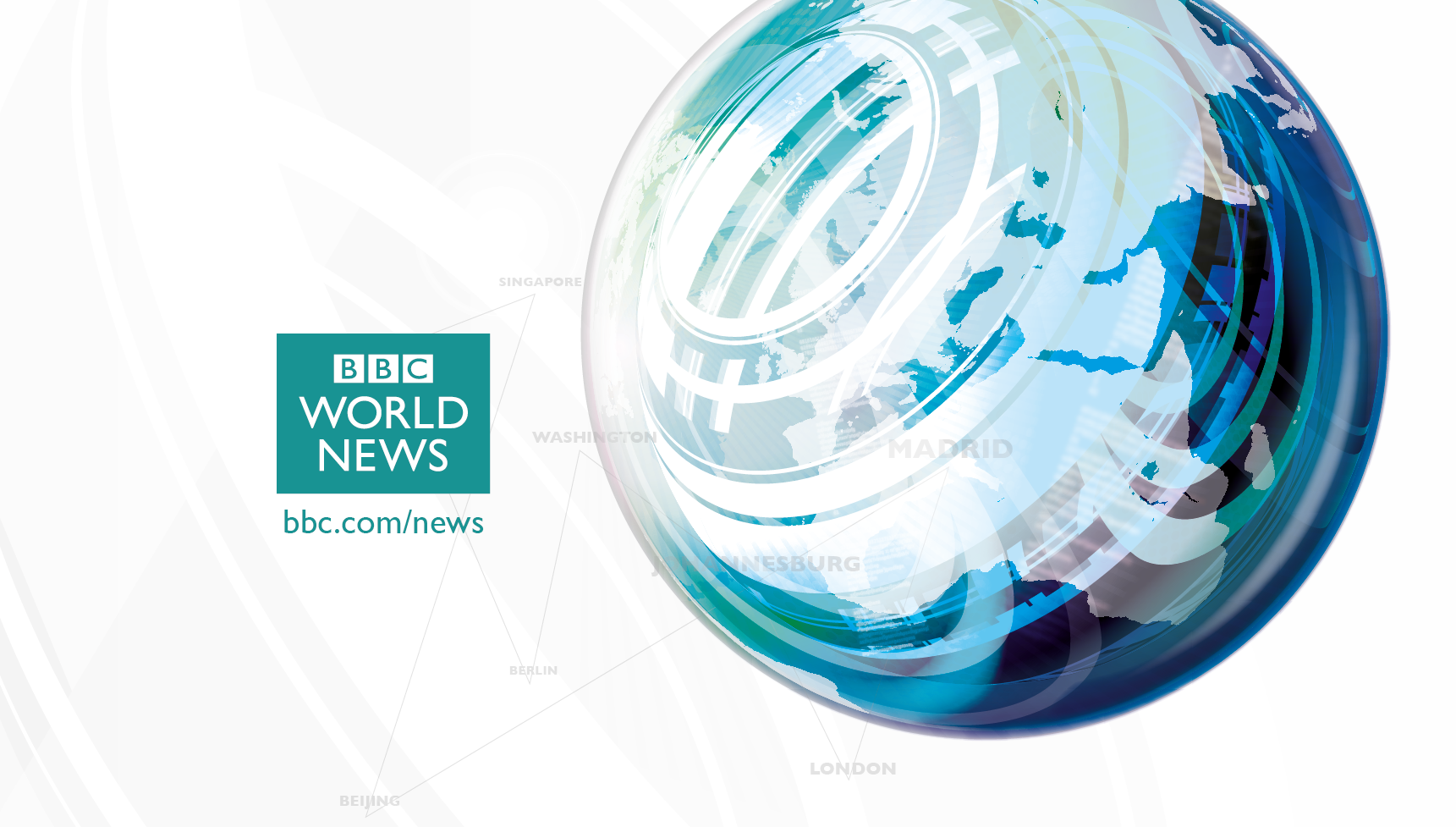
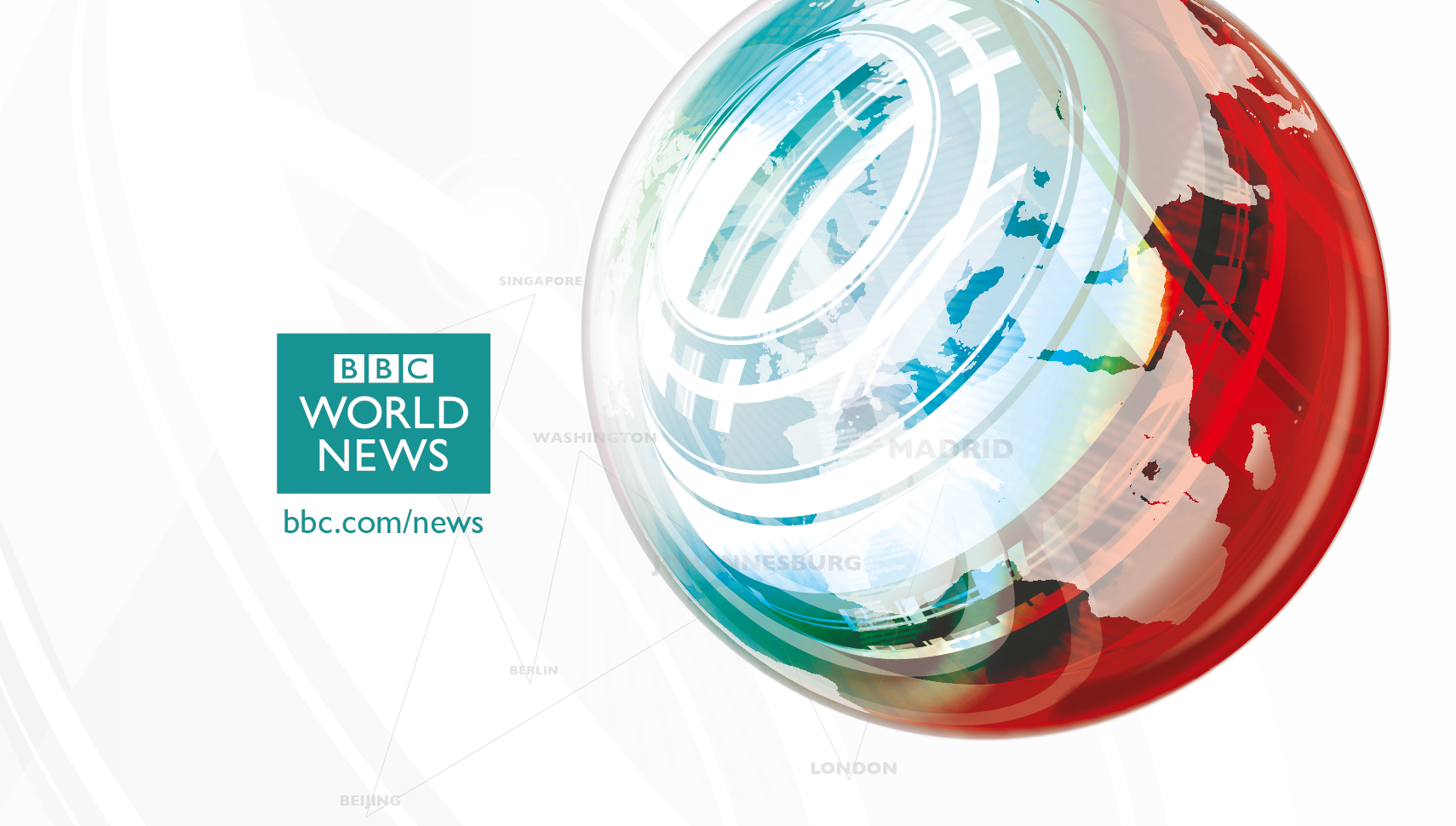
For those who have a predilection for China Red... there is absolutely no reason whatsoever why you could not have both... you'd only need minor changes to sets & lighting and you can even leave the newsroom walls painted red.
*
10 minutes work changing colours in an old mock. Laughing

It's the practicality of changing the colours which is why we're complaining. Ditching a well known authoritarian brand identity for something different during these budget cuts is just not feasible and that Aaron doesn't take it into account when making this mock.
SR
SomeRandomStuff
It's the practicality of changing the colours which is why we're complaining. Ditching a well known authoritarian brand identity for something different during these budget cuts is just not feasible and that Aaron doesn't take it into account when making this mock.

Okay lets see then... Can the colours be changed? YES ...seems practical to me.


The whole point of mocking is to change the existing brand. Whether the existing brand is strong or not. Whats the point otherwise... "oh no we've got to keep our branding the same forever" ...the gallery would be completely empty.

This is about what Aaron would do if he was given the job of replacing the BBC Graphics. Whether or not its financially feasable for the BBC to actually do it right at this moment is completely irrelevant.
BBCWalesToday, Jory and Aaron_2015 gave kudos
NI
Nicky
Why are people getting so hysterical? IT'S A MOCK. Judge how well or poorly it's designed, not go off on a tangent and tell him his mock is crap simply because you can't envisage BBC News without the red.

There's nothing wrong with changing the colours, but to reiterate what I said earlier, my personal view is that the shades Aaron has chosen don't evoke quite the right authority for BBC News. It all looks rather "BBC News Lite".

I also take issue with him saying he's willing to take on board feedback and criticism and then categorically stating he's not considering changing the colours, despite much of the feedback centring around this issue.
AA
Aaron_2015
I have taken on lots of feedback which I'll use to improve this project. However, I won't be changing the colour. Some people seem to have this concept that if they don't like it, it must be changed.

I do accept some people don't like it, but on this occasion, you'll just have to accept it. I feel that I may not have shown enough of my concept for people to begin to like the change. However, I'm working on titles at the moment that will feature the blue/silver and a few other things. If anybody has anything they'd like to see in the new colour scheme, let me know.

Maybe showing more things will change people's minds. Like I said, I've got things in the works.
BR
Brekkie
People seem to have forgotten the point of this forum. BBC News may be recognisably red but it is also tired too and a redesign should be about the future, not the past.

And back to what actually is - a mock. We've had dozens over the years which barely touch the current brand so please embrace the ones that don't.
NI
Nicky
I have taken on lots of feedback which I'll use to improve this project. However, I won't be changing the colour. Some people seem to have this concept that if they don't like it, it must be changed.

I do accept some people don't like it, but on this occasion, you'll just have to accept it. I feel that I may not have shown enough of my concept for people to begin to like the change. However, I'm working on titles at the moment that will feature the blue/silver and a few other things. If anybody has anything they'd like to see in the new colour scheme, let me know.

Maybe showing more things will change people's minds. Like I said, I've got things in the works.


Trying to give you feedback is like banging your head against a brick wall. I don't quite understand why it's so hard for you to handle constructive criticism, especially as you asked for it. Maybe it's an age thing.

Your graphics - while quite simplistic and certainly nothing we haven't seen before - are OK. They're fine. But the colour is off-putting. It's wishy-washy. It's neither striking nor authoritative. Remember you're designing your mocks for a globally-recognised news brand. Get rid of the status quo if you want (it's refreshing to see a BBC News mock without the blessed china red actually) but you should be prepared to choose an equally distinctive colour to replace it with.
AA
Aaron_2015
BBCNicky - do stop referring to my age, because we're going to have disagreements if you continue to do it.

You've also made your point countless times, it's getting boring. I want to develop this new idea (as I have already commented), not ditch it before the idea had chance to develop.

Aside from the colour (which I have thoroughly explained), I have never refused to change anything in my mocks. You seem to have this idea that I refuse to change anything which is quite simply wrong.
DO
dosxuk
Can we all just leave this until Aaron actually produces something?

(Which will hopefully be in months rather than days if he's actually going to rebrand the whole of BBC News)
AA
Aaron_2015
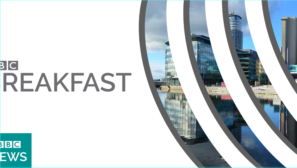
A small sneak peak at the new look BBC Breakfast:

*

*

More is yet to come, including Breakfast graphics and titles, plus BBC News titles and a title card. I'm also drawing up first plans for a new Breakfast studio, to show how the new colour scheme could be implemented into the current Breakfast studio.
MP
Michael Power
Good attempt, Aaron, but a few parts of your Breakfast title card are not 16:9 safe.
If Breakfast was aired with your graphics here's how it would look:
*
Just include everything in the safe areas and it may look better!
AA
Aaron_2015
Thanks for your feedback. On the template I use, the graphics are just past the 16:9 safe zone, so I'm not sure if I have miscalculated.
AA
Aaron_2015
A small sneak peak at the new look BBC Breakfast:

*

*

More is yet to come, including Breakfast graphics and titles, plus BBC News titles and a title card. I'm also drawing up first plans for a new Breakfast studio, to show how the new colour scheme could be implemented into the current Breakfast studio.


Any further feedback would be great.

Newer posts