AA
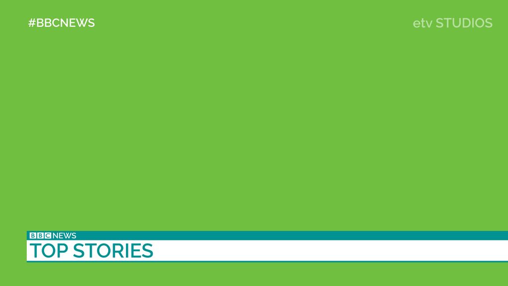
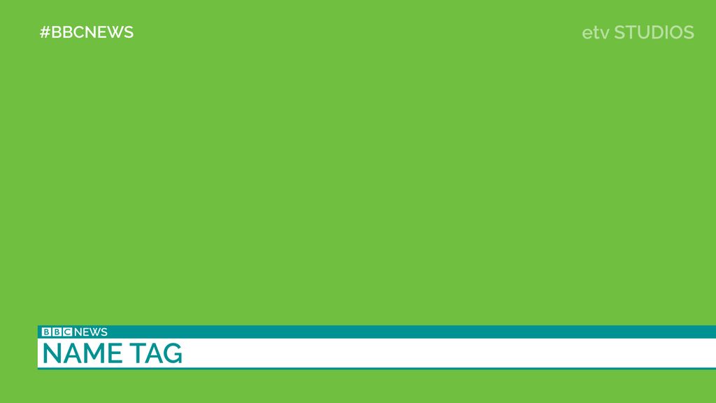
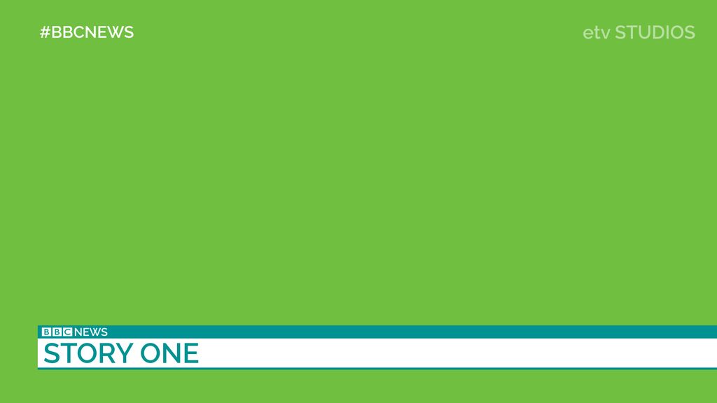
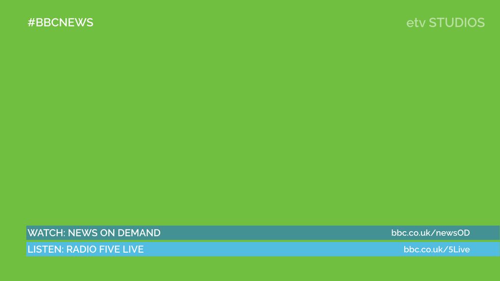
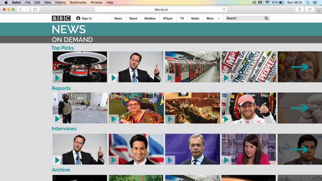
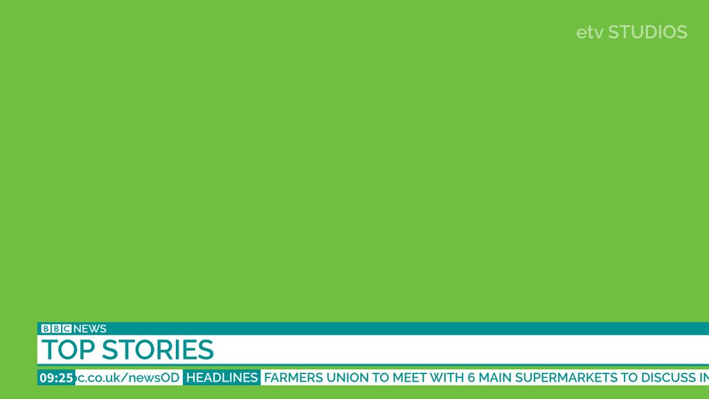
With BBC News in danger of being moved online, I've explored how this could be done. My response would be to create an 'On Demand' service. BBC News On Demand offers a huge selection of reports, interviews, analysis, clips from the archive, plus detailed headlines uploaded on the hour, every hour. BBC One national bulletins would still come from the newsroom, but using the updated graphics I have created. Shown in the images below is how the headlines uploaded to the web would look:
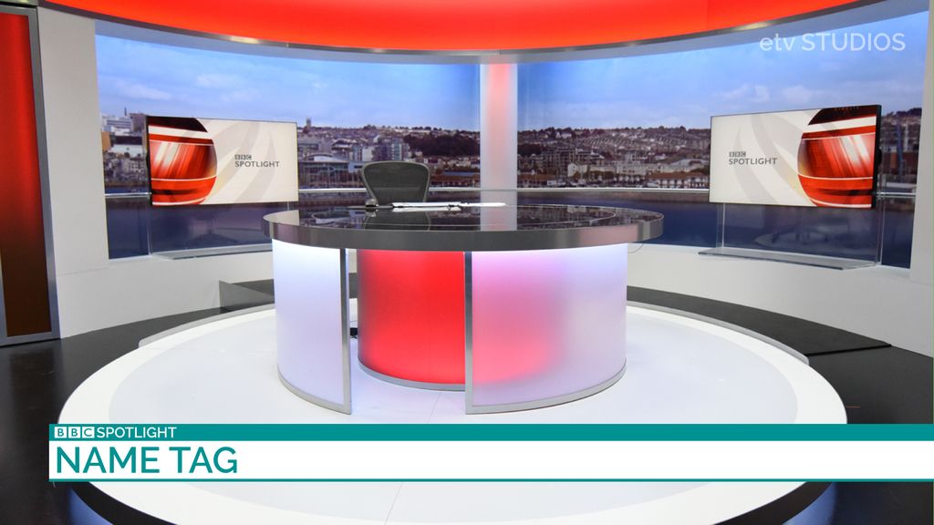
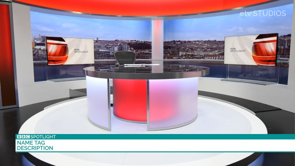
Updated regional graphics (Spotlight used in this example):
News On Demand webpage:
Plus a look at how this design could be implemented into the news channel in it's current format:
As always, constructive criticism is always appreciated. I decided to focus on getting the stills correct first, before starting work on a video. Thank you for the taking the time to look .
.


Updated regional graphics (Spotlight used in this example):


News On Demand webpage:

Plus a look at how this design could be implemented into the news channel in it's current format:

As always, constructive criticism is always appreciated. I decided to focus on getting the stills correct first, before starting work on a video. Thank you for the taking the time to look
.
Last edited by Aaron_2015 on 20 August 2015 2:50pm