WH
Whataday
Founding member
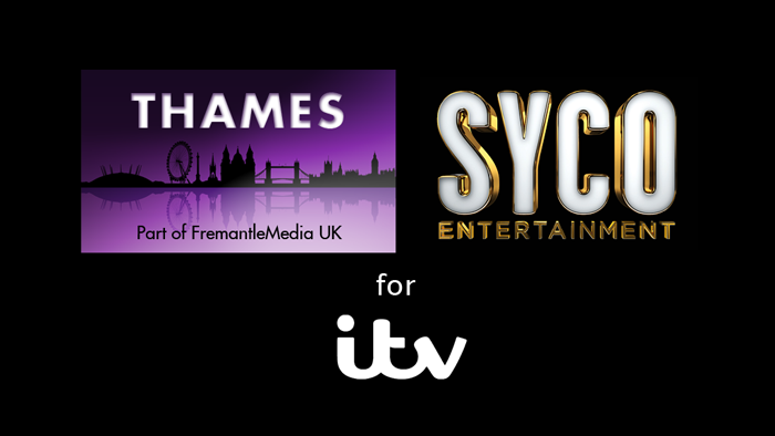
I've had a go at a replacement logo for Thames TV, as I'm sick of that horrible circle they've been using lately.
I've kept the same theme, and tried to make it fit in with FremantleMedia UK's other labels, so it's not dramatically different, but nothing could be worse than what they have now.

I've kept the same theme, and tried to make it fit in with FremantleMedia UK's other labels, so it's not dramatically different, but nothing could be worse than what they have now.
Last edited by Whataday on 2 January 2014 8:19pm