JK
I was thinking about how if the ITV News channel returned, how would it come across onscreen?
I thought I'd design something based on the news channel in 2012.


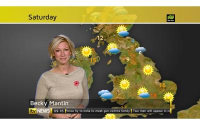
I've changed the weather to fit in with ITV News:
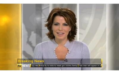
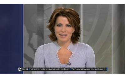
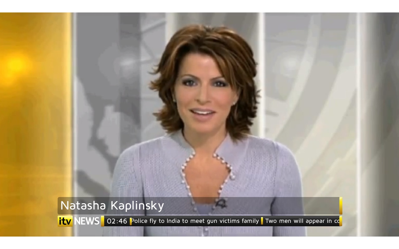
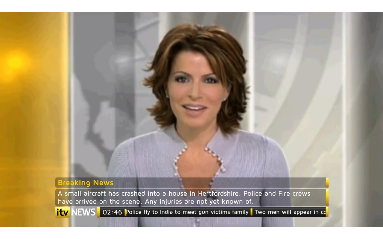
And with the question being asked in the ITV News thread, why the separate News at Ten identity was axed a few years ago, I wondered whether it would work in the current studio:
I hope you like it and as always, constructive critisism is welcome.
I thought I'd design something based on the news channel in 2012.


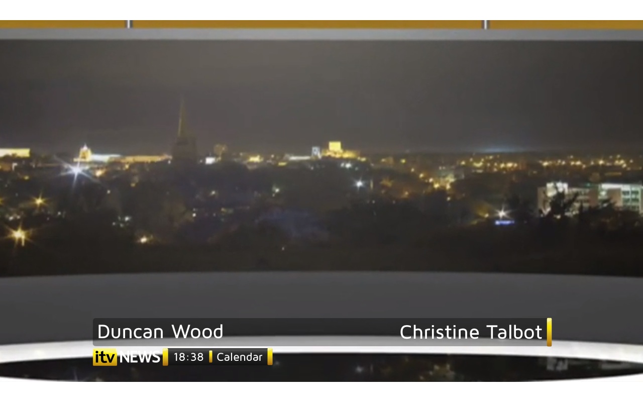
I've changed the weather to fit in with ITV News:

And with the question being asked in the ITV News thread, why the separate News at Ten identity was axed a few years ago, I wondered whether it would work in the current studio:

I hope you like it and as always, constructive critisism is welcome.
Last edited by JK08 on 14 January 2012 11:19pm - 2 times in total