GR
I know that the Gallery is full enough of Daybreak mocks, but they inspired me to try making another one. At the moment, I've done just astons and other graphics. Don't know if I'll animate them in a video or design new stings and/or studio (my designs, I think, can fit to the current presentation and studio).
Anyway...
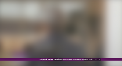
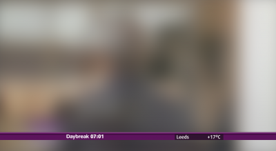
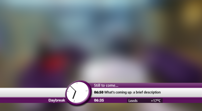
The basic configuration: DOG, clock, ticker and weather. Regarding the ticker: don't know if it's too bad with too little place for ticker - maybe the design would be better without it. Anyway, there are some pictures without a ticker, so you can decide.

From basic to way too much: the same configuration with the website promotion added.

Over the shoulder graphics. Technically, it should have been placed on a newsdesk photo, but... never mind.
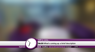
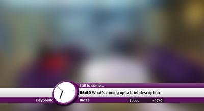
Not sure if any breakfast programme used this way of promoting later insets (with analogue and digital clock) before. Anyway, the whole mock was derived from this idea in the first place.
Another note: the Daybreak logo will slide to 'safe zone' and back every time when the 'clock' or other overlays are used. By the way...
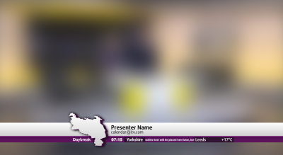
An attempt to implement these graphics into local news. Each region will use its own map (probably tilted like the clock above; the map here is intentionally not tilted or something like that).
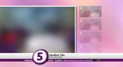
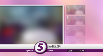
And '5-a-day'.
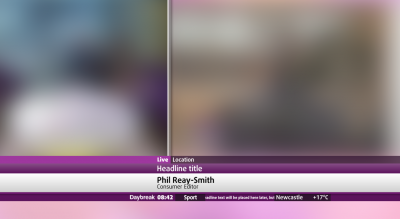
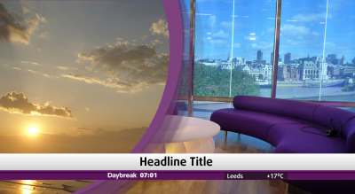
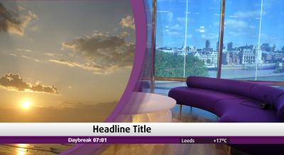
Rather rough attempt at the split screen. In case if it isn't clear enough, the left part is for studio, and the right part is for correspondent.
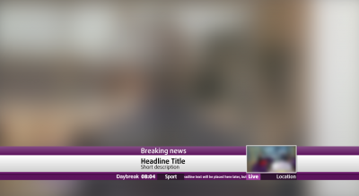
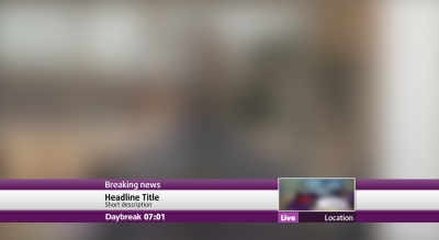
Instead of rather rough attempt on breaking news aston seen on air, here's my variation. The video on the right will be (probably) live feed from the place.
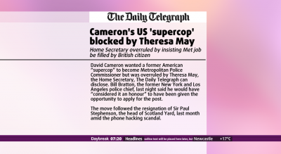
An example of a newspaper headline/quote.
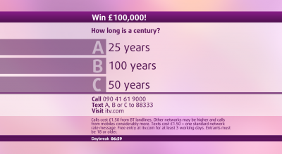
An example of competition screen.
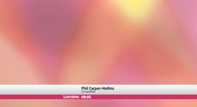
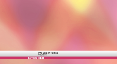
And something for Lorraine.
What do you think? (And yes, I've used the same font family as in 'Channel Six' Challenge entry - just because it looks good and can be a good replacement for Neo Sans).
Anyway...

The basic configuration: DOG, clock, ticker and weather. Regarding the ticker: don't know if it's too bad with too little place for ticker - maybe the design would be better without it. Anyway, there are some pictures without a ticker, so you can decide.

From basic to way too much: the same configuration with the website promotion added.

Over the shoulder graphics. Technically, it should have been placed on a newsdesk photo, but... never mind.

Not sure if any breakfast programme used this way of promoting later insets (with analogue and digital clock) before. Anyway, the whole mock was derived from this idea in the first place.
Another note: the Daybreak logo will slide to 'safe zone' and back every time when the 'clock' or other overlays are used. By the way...

An attempt to implement these graphics into local news. Each region will use its own map (probably tilted like the clock above; the map here is intentionally not tilted or something like that).

And '5-a-day'.

Rather rough attempt at the split screen. In case if it isn't clear enough, the left part is for studio, and the right part is for correspondent.

Instead of rather rough attempt on breaking news aston seen on air, here's my variation. The video on the right will be (probably) live feed from the place.

An example of a newspaper headline/quote.

An example of competition screen.

And something for Lorraine.
What do you think? (And yes, I've used the same font family as in 'Channel Six' Challenge entry - just because it looks good and can be a good replacement for Neo Sans).
Last edited by German Rudnev on 8 August 2011 4:16pm
