Okay, this is my second upload. I can see that most of you were not to keen of my ITV mock so ive given that a break for now. I started this one a while ago so I thought it needed to be uploaded to have some feedback on how to improve
UPDATED: All of the images below have updated
updates:
now are in safe areas
images resized
less harabara
logo resized
new image (guests)
Break Bumper:
Headlines:
On-screen graphics:
Coming up:
Weather sting:
Regional news:
Guests:
Last edited by Identity on 24 November 2011 7:43pm - 3 times in total
JA
james
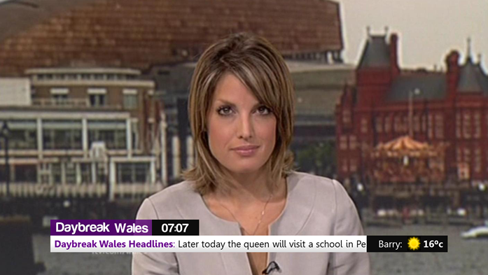
That has to be the WORST mock design for Daybreak I have ever seen.
1)You haven't even kept the correct image size for the logo and have skewed it out of shape.
2)You haven't bothered with safe areas
3)Some of the graphical elements don't size up for instance the logo and the clock aren't the same size
4)Too much use of 'Harabara' font. Try using another font
The only good idea is the weather on the ticker but even that is let down in its execution.
For a start, I suggest you use the thumbnails The Metro uploader generates a Thumbnail URL too, and by the size of your mock, it'd still make everything visible.
My first point is your version of the Daybreak logo - If you're keeping the same style of logo, and instead of producing a bad recreation, just use the actual logo.
Secondly, it just doesn't work very well, in my opinion. Gradients, badly aligned graphics, along with odd gaps between graphics, and a ticker which is partially taken up by, what I'll presume, is the ever present 'Wales Headlines' or 'Sports Headlines' - that would work better if it was separated, instead of 'in the ticker', as it were.
Finally, you say you did the mock a while ago and only uploaded it today, but these are being churned out so quickly, and without taking what was said about mocking in the other thread for your ITV graphics, I think you could be spending five minutes on them and then going 'that's broadcast quality, eh?'
That has to be the WORST mock design for Daybreak I have ever seen.
1)You haven't even kept the correct image size for the logo and have skewed it out of shape.
2)You haven't bothered with safe areas
3)Some of the graphical elements don't size up for instance the logo and the clock aren't the same size
4)Too much use of 'Harabara' font. Try using another font
The only good idea is the weather on the ticker but even that is let down in its execution.
Indeed, I'm with James on this!
And please, Harabara is just disgusting - use the actual Daybreak logo font please; Dalton Maag Co Headline Condensed (edited by Daybreak themselves)
Finally, you say you did the mock a while ago and only uploaded it today, but these are being churned out so quickly, and without taking what was said about mocking in the other thread for your ITV graphics, I think you could be spending five minutes on them and then going 'that's broadcast quality, eh?'
OP - please stop putting your mocks online as soon as you're "done". Move onto a different idea, or start the same idea over again taking it on a different track. Come back to the mock the next day, and see if there's any improvements you can make. If so, make them, then come back another day, and so on. Once you're happy you can't improve it, upload it then for public viewing.
It's far better to upload a handful of good ideas than loads of bad ideas with a sprinkling of good stuff. By uploading stuff you put time and effort into, you'll also find the comments become a lot more constructive.
That has to be the WORST mock design for Daybreak I have ever seen.
1)You haven't even kept the correct image size for the logo and have skewed it out of shape.
2)You haven't bothered with safe areas
3)Some of the graphical elements don't size up for instance the logo and the clock aren't the same size
4)Too much use of 'Harabara' font. Try using another font
The only good idea is the weather on the ticker but even that is let down in its execution.
Indeed, I'm with James on this!
And please, Harabara is just disgusting - use the actual Daybreak logo font please; Dalton Maag Co Headline Condensed (edited by Daybreak themselves)
Okay so if i sort out the safe areas out and then reduce the use of harabara then it will be alot better?
My first point is your version of the Daybreak logo - If you're keeping the same style of logo, and instead of producing a bad recreation, just use the actual logo.
Its not just a recreation of the old one, thetes a new colour,new size and drop shadow on text now
My first point is your version of the Daybreak logo - If you're keeping the same style of logo, and instead of producing a bad recreation, just use the actual logo.
Its not just a recreation of the old one, thetes a new colour,new size and drop shadow on text now
Has anyone else noticed that Daybreak has become the new News 24 of the Mock Designs forum?
Look, I've no right to tell people what they can and can't post but I really feel we've reached some kind of saturation point here.
I would suggest that unless you can invest the time and effort to create an entirely different solution and not simply a dodgy, half-arsed recreation of what's already on screen now, it's not worth posting.
That new font looks miles better but you have still ignored the safe areas. I am not that keen on the gap left when names appear between the strap and the ticker but on the whole your mock is starring to improve. I would like to say however that it is good you haven't just gave up from the comments and are taking them on-board.
I agree with what James' saying, also I think the weather bar could have been done better, IMO long names are going to get squished.
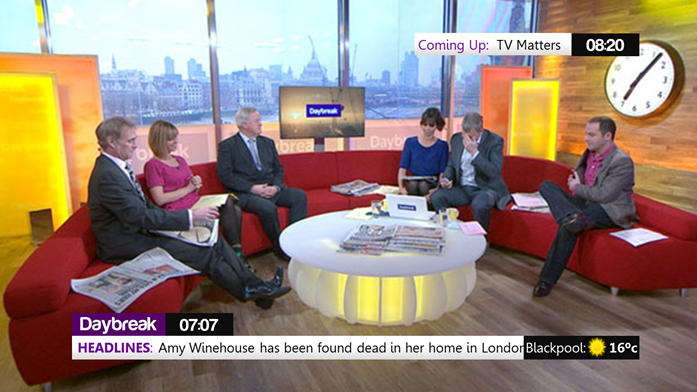
I think you should move the logo/clock and weather underneath the Headline ticker, with the aston above, thus removing the the blank bit after the logo/clock