AG
Quite frankly boring, plus a who load of other issues.
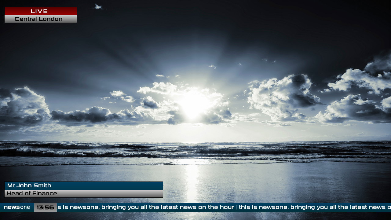
* You have ignored safe areas.
* What's with the outlines on some astons.
* Use a more readable and serious font (e.g. Helvetica, SwisBT or similar)
* The "|" on the ticker is unnoticeable, more spacing would work along with a "●"
* Get rid of "Mr".
* And "Head of Finance" for who?
* You have ignored safe areas.
* What's with the outlines on some astons.
* Use a more readable and serious font (e.g. Helvetica, SwisBT or similar)
* The "|" on the ticker is unnoticeable, more spacing would work along with a "●"
* Get rid of "Mr".
* And "Head of Finance" for who?
ST
From what I see it's just a generic brand. Kind of what ITV do on theirs for when they're programming them...
PERSON NAME
Description Here
The font is on, as long as it matches the 'news one ' branding you have on there.
Safe areas, IMO, don't really matter anymore - take it this is for a HD channel?
PERSON NAME
Description Here
The font is on, as long as it matches the 'news one ' branding you have on there.
Safe areas, IMO, don't really matter anymore - take it this is for a HD channel?
DF
Thanks for the comments - this is literally all fake, I made up all the names and titles so I wouldn't consider them an important part of the mock.
I agree, they are boring, but the idea behind them was to have something crisp and clear and readable on HD instead of something overblown, like some channels such as Fox News in America do, and Sky News used to do before HD. (Yes, it is supposed to be HD ) I'll expand on the suggestions given and make another mock of these soon, with more detail and styling, and with a different font, thanks for the comments
I agree, they are boring, but the idea behind them was to have something crisp and clear and readable on HD instead of something overblown, like some channels such as Fox News in America do, and Sky News used to do before HD. (Yes, it is supposed to be HD
) I'll expand on the suggestions given and make another mock of these soon, with more detail and styling, and with a different font, thanks for the comments
DO
Good job your opinion doesn't matter to the rest of us then, as safe areas do matter as much as ever. The only difference is with HD we go from 4:3 safe areas in a 16:9/14:9/4:3 frame to 16:9 safe areas in a 16:9 frame. You still can't have graphics all the way to the edges of the frame and expect everyone to see them. That and utilising safe areas in mocks makes your work seem much more professionally finished and attractive.
The font is what? Quite unreadable maybe, but "on"
To the OP - when creating mocks, put them fullscreen on your monitor, and move back a couple of metres - some fonts, like the one you're using become quite difficult to read, especially with their normal spacing.
Safe areas, IMO, don't really matter anymore - take it this is for a HD channel?
Good job your opinion doesn't matter to the rest of us then, as safe areas do matter as much as ever. The only difference is with HD we go from 4:3 safe areas in a 16:9/14:9/4:3 frame to 16:9 safe areas in a 16:9 frame. You still can't have graphics all the way to the edges of the frame and expect everyone to see them. That and utilising safe areas in mocks makes your work seem much more professionally finished and attractive.
The font is on
The font is what? Quite unreadable maybe, but "on"
To the OP - when creating mocks, put them fullscreen on your monitor, and move back a couple of metres - some fonts, like the one you're using become quite difficult to read, especially with their normal spacing.
SR
This is pretty bad. Aside from all the obvious flaws in the design, what is the point in Mocking a News channel that doesn't exist?
DO
What's the point in mocking an existing news channel, it's not like your ideas will ever be used, and in fact just prejurdises (sp?) people against your mock compared to what they already have (or the "OMFG!!1! ****AMAZING**** gRaPhIcS!!!!!111!!2" they used to have). The only additional difficulty you have is explaining what the graphics are for, and TBH, you should be doing that for all mocks, as it helps introduce your mock, frame your ideas and how those ideas turned into what you're presenting.
I'd far rather see 1000 mocks for non-existant programmes / channels done half decently than a single "I had 2 seconds to spare so I started up powerpoint and made a Daybreak mock, arn't I brilliant (no negative posts cos I know its rubbish but I'm only 14 and if you say nasty things that's bullying and I'll tell my mum and she thinks I'm very clever for making such brilliant stuff so nah)" stuff we keep getting over and over and over again.
what is the point in Mocking a News channel that doesn't exist?
What's the point in mocking an existing news channel, it's not like your ideas will ever be used, and in fact just prejurdises (sp?) people against your mock compared to what they already have (or the "OMFG!!1! ****AMAZING**** gRaPhIcS!!!!!111!!2" they used to have). The only additional difficulty you have is explaining what the graphics are for, and TBH, you should be doing that for all mocks, as it helps introduce your mock, frame your ideas and how those ideas turned into what you're presenting.
I'd far rather see 1000 mocks for non-existant programmes / channels done half decently than a single "I had 2 seconds to spare so I started up powerpoint and made a Daybreak mock, arn't I brilliant (no negative posts cos I know its rubbish but I'm only 14 and if you say nasty things that's bullying and I'll tell my mum and she thinks I'm very clever for making such brilliant stuff so nah)" stuff we keep getting over and over and over again.
DB
Safe areas, IMO, don't really matter anymore - take it this is for a HD channel?
They still matter, even European broadcasters that have ditched the 4:3 safe zone, has a 16:9 safe area.
Safe areas, IMO, don't really matter anymore - take it this is for a HD channel?
They still matter, even European broadcasters that have ditched the 4:3 safe zone, has a 16:9 safe area.
Last edited by dbl on 18 August 2010 8:10pm
NJ
Neil Jones
Founding member
My first reaction to this was "what the bloody hell?!".
Now, having had the opportunity to look at it again, I don't think I've seen such a depressing looking mock. Yes, the news can be depressing but wrap it in depressing d�cor and it is ripe for disaster.
Now, having had the opportunity to look at it again, I don't think I've seen such a depressing looking mock. Yes, the news can be depressing but wrap it in depressing d�cor and it is ripe for disaster.