RD
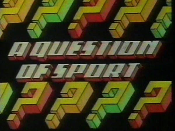
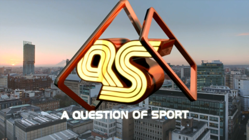
The 47th series of A Question of Sport started tonight with a new set, titles and a new version of the theme tune.
However the infamous 'QS' logo that's been in use for many years (possibly since the beginning?) has been dropped for a newer version.
From this:
To this:
It's vile. You can tell the old logo represents an athletics track. This logo doesn't represent anything. And it looks like it's in lower case which just makes it even uglier.
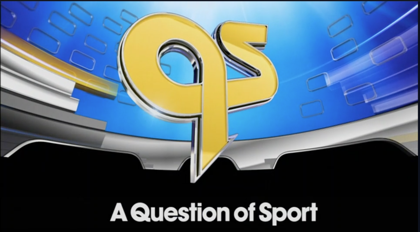
Last edited by RDJ on 17 August 2017 12:13am