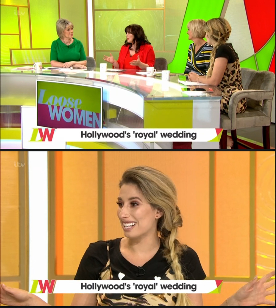
Of all of the studio moves, the old studio would have been one of the easiest to recreate at Television Centre. It's all a bit too green and red in my opinion and it's not really subtle enough unlike the white and wood of the old set.
Not really a fan to be honest, definitely a step backwards.
I'm not sure why they need to make the 'Up next' caption text so big that it needs to scroll - seems rather pointless!
Agree that it is a little garish - it's a shame they can't create a slow fade of different colours on the logo and the background to escape the clash of green and pink. Pretty impressive that they now have a tiered set up with the quick turn around from Lorraine though.
I do find it odd that Lorraine gets a big LED screen and LW now gets a tiny screen on the desk. As Colleen has already proven, it would've been good to keep a screen behind them. It would've also meant one less thing to move out between set changeover.
That's absolutely disgusting. Change for the sake of it here, they should have just brought over the set from TLS. Wouldn't be surprised if they make changes come the new season in September. Unfortunately that means 5 months of that for Loose Women viewers.
is it just me or is the sounds a bit odd today? I am listening on headphones so perhaps not
Also finding the camera a bit wobbly, the studio horrifically garish but really liking the graphics. I would just prefer the main writing in the lower thirds to be more grey than black, like the pervious package.