TV Home Forum

Which ITV company from 1955 to 2002, had the best logo?

(May 2016)

This site closed in March 2021 and is now a read-only archive
IS
Inspector Sands
CTV Facilities were the OB hire firm, not an early version of the cake

The OB hire firm CTV wasn't Central, it was Corinthian TV

Quote:

the cake was actually a multi-colour rainbow fade block printed!

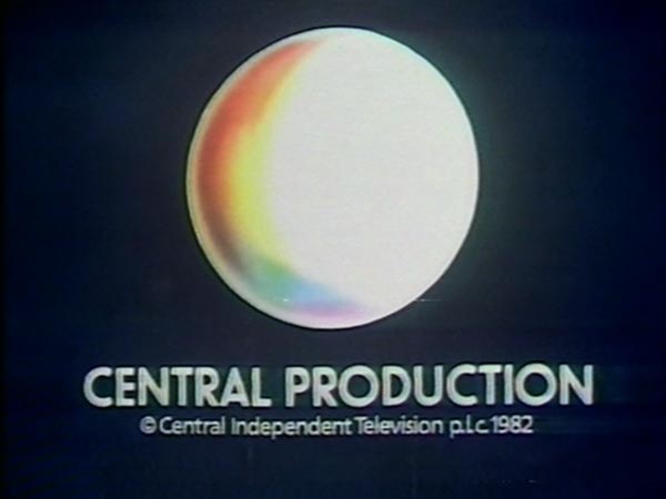
Surely that graphic proves that it wasn't a cake but a globe, even in it's later incarnation
WH
Whataday Founding member
Central Television Facilities was Central's version of The London Studios (ie the studios operation spun off in preparation for franchise renewal). That logo dates from the late 80s.
ST
Stuart
Central's Cake in my opinion, as it allowed a virtually unlimited combination of how it could animate and be formed onscreen.

BTW, here is an early trademark of it. Its a globe, with longitude and latitude lines coloured in.
http://i64.tinypic.com/2mgr3gz.jpg


I'm fairly certain that the trademark shown is a much later evolution of the 'cake' used for the spin-off company, as mentioned by others.

If you look at the original Central logo, it didn't even have a spectrum in 1982:

http://s19.postimg.cc/ib7ryb5wz/Central_1.jpg

They then changed it to a blurred spectrum on the left:

http://s19.postimg.cc/4wrj45d83/Central_2.jpg

. . . and then to the first version of what would become the 'cake' . . .

http://s19.postimg.cc/vewur0oqb/Central_3.jpg
BA
bilky asko
Central Television Facilities was Central's version of The London Studios (ie the studios operation spun off in preparation for franchise renewal). That logo dates from the late 80s.


Indeed - a search of the IPO's site shows that those logos were filed in June 1989

Other searching has revealed to me that Central owned the trademarks "Databurst" and "Data Burst".
:-(
A former member
original Central logo was actually this:

http://i0.wp.com/www.tv-live.org.uk/media/inthepast/central/firstcentrallogo981.jpg
HC
Hatton Cross
That is I think you'll find was the 'holding logo'.
That was used before the original globe logo came back from the design agency.
Last edited by Hatton Cross on 20 May 2016 8:39pm
WH
Whataday Founding member
Other searching has revealed to me that Central owned the trademarks "Databurst" and "Data Burst".


Databurst being the name Central coined for broadcasters flashing up a load of text pages in sequence very quickly, with the intention of anyone recording it being able to view each page using the pause option on their VCR.
SP
Steve in Pudsey
Which is probably why YTV called theirs a "Data Blast" on Bad Influence.

bilky asko and Lou Scannon gave kudos
SP
Spencer

I'm fairly certain that the trademark shown is a much later evolution of the 'cake' used for the spin-off company, as mentioned by others.

If you look at the original Central logo, it didn't even have a spectrum in 1982:

http://s19.postimg.cc/ib7ryb5wz/Central_1.jpg


True of the main ident, although it was there on the original endcaps...
*
:-(
A former member
And when you look at the original continuity slides, you could see the beginnings of the 'cake' as the logo showed the shaded part as 14 sections.

Here's an example, but from an evening menu trailer...

http://tig.gy/?m=CENTRAL-STRIPES-MENU-1.jpg

Transdiffusion show the original 'cake' style logo here - https://www.transdiffusion.org/2004/05/24/central-2
Last edited by A former member on 21 May 2016 10:27am - 2 times in total
BA
Bail Moderator
*
BBCME, Nathan and Lou Scannon gave kudos
ST
Stuart
I only moved here in time to see 'Westcountry' as the new C3 provder in the 1990s

Westcountry transmogrified into Carlton, with lovely new idents, but I found this little gem on YouTube about Carlton's image. . . Laughing

I'm sure most of it wasn't used, but it explains the later colour range.


I Love this . . .

Last edited by Stuart on 22 May 2016 12:28am

Newer posts