TV Home Forum

BBC Two rebrand development Update

(August 2013)

This site closed in March 2021 and is now a read-only archive
MD
mdtauk
The previous thread about this was archived here: http://www.tvforum.co.uk/tvhome/bbc-two-rebrand-development-announced-33263/

It seems that this rumoured BBC Two relaunch may not be dead. Following the one+one research project by Daniel Eatock, we have this little snippit posted this year.

http://www.eatock.com/2013/2/

Quote:
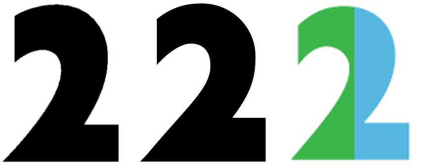
A logo proposal for the future rebranding of BBC2. A return to the iconic numerical ‘2’ designed by Lambie-Nairn. The two parts appear in different colour combinations on each application, referencing the diverse and unique programme juxtapositions that regularly appear on the BBC2 schedule.

http://www.eatock.com/files/bbc2.jpg

Quote:
The proposal was first presented in 2009 as part of a successful pitch working in collaboration with devilfish.

http://www.eatock.com/files/options2.jpg
LO
lobster
Its got potential. I wonder if echoes of this became the BBC4 idents with the split screen theme?

That's how I can see it being used.
DK
DanielK
So...this is basically ITV's idea applied to the '2' device and the colours don't change, yes?
CH
chris
So...this is basically ITV's idea applied to the '2' device and the colours don't change, yes?


Certainly sounds like it from looking at those images, but I think it could be used much more cleverly with a split screen idea like BBC Four (as mentioned).
BR
Brekkie
Considering it's four years old it's fair to say it's not going to end up on screen - he wouldn't be posting it if it was. Looks rather crap to be honest too.
AN
Ant
Quote:
The two parts appear in different colour combinations on each application, referencing the diverse and unique programme juxtapositions that regularly appear on the BBC2 schedule.

Urgh. Marketing talk.
:-(
A former member
Thinks of More4's flippers.
FL
flaziola
'Return of the iconic 2'
Has it ever left? Confused
WP
WillPS
Abbot Mead Vickers BVDO redrew it. It's a bit different (but you'd have to know that to notice).
CA
Cavan
Made a little comparison between all the 2s.
*
MD
mdtauk
Abbot Mead Vickers BVDO redrew it. It's a bit different (but you'd have to know that to notice).

The thicker and shorter re-draw of it, was obviously made so more of the "view" could be seen. Due to the practical nature of the original 2's means that there was always some variation from the pure graphic.
MK
Mr Kite
Yes, in the 1991-2001 set, they weren't all rigidly identical though some were optical illusions, such as the refraction in the water ident. Glass is another one people say is irregular but I don't think it's as irregular as it looks because the slope of the bevelled glass makes it appear thinner than it actually is.

What did confuse me a bit were the copper and paper 'cut out' idents. Yes, I can see that the two is slightly angled to reveal a bit of background but Paper Cut Out seems to have two colour tones on the two which I don't understand the significance of, whereas on Copper Cut Out, the tail doesn't seem to stick out and seems flush with the wall when it perhaps shouldn't be, if the two is supposed to be on an angle.

Yes, the current two was altered slightly to fit in with the 'windows' idents better.

I notice on that pitch, the two has a longer tail than the original 1991 version.
Last edited by Mr Kite on 27 August 2013 12:49am

Newer posts