GR
So, I decided to have a go on the company which lost even more than others in 2009 - Westcountry.
How will it return? (apologies for small size; originally images were 1024x576, but it looked so big, so I decided to change the size, but I can't restore it!)

That 'W' again! I decided that it will make more interest than generic or genericised style.
( Also, there's a Carlton-stylee star, which sighifies its former ownership.)
A promo to Westcountry Live, keeping the same style. The networked ones will have ITV1 logo, and 'itvlocal.com/westcountry' (can be unseen) will read 'itv.com/westcountry'.

Fast forward to 6 o'clock (based on 1999 style, before 'hi-tech' sequence).
7.30pm, and another cock-up with Corrie. While it's repairing, this comes (with some voice and music).
Also, this can come before the break.
So, what do you think (in constructive-criticising way)? (And, if you want, I can re-do this work again, in bigger size.)
German.
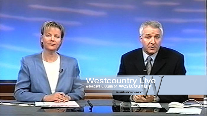
How will it return? (apologies for small size; originally images were 1024x576, but it looked so big, so I decided to change the size, but I can't restore it!)
That 'W' again! I decided that it will make more interest than generic or genericised style.
( Also, there's a Carlton-stylee star, which sighifies its former ownership.)
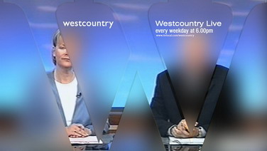
A promo to Westcountry Live, keeping the same style. The networked ones will have ITV1 logo, and 'itvlocal.com/westcountry' (can be unseen) will read 'itv.com/westcountry'.
Fast forward to 6 o'clock (based on 1999 style, before 'hi-tech' sequence).
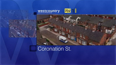
7.30pm, and another cock-up with Corrie. While it's repairing, this comes (with some voice and music).
Also, this can come before the break.
So, what do you think (in constructive-criticising way)? (And, if you want, I can re-do this work again, in bigger size.)
German.