Just feels like a cheaper version of the balloon idents, maybe even a parody or something you'd see on W1A but a little bit more dull. The logo would lack consistency with the rest of the BBC just like the current logo and nothing here solves the many problems in the current branding and idents other than just the fact it doesn't have an identifier.
Just feels like a cheaper version of the balloon idents, maybe even a parody or something you'd see on W1A but a little bit more dull. The logo would lack consistency with the rest of the BBC just like the current logo and nothing here solves the many problems in the current branding and idents other than just the fact it doesn't have an identifier.
Thank you to those who have given feedback. In response to the box being too small and cramped, I have redone the logo, used Reith, and have even made a BBC logo using Reith Serif and Reith Sans
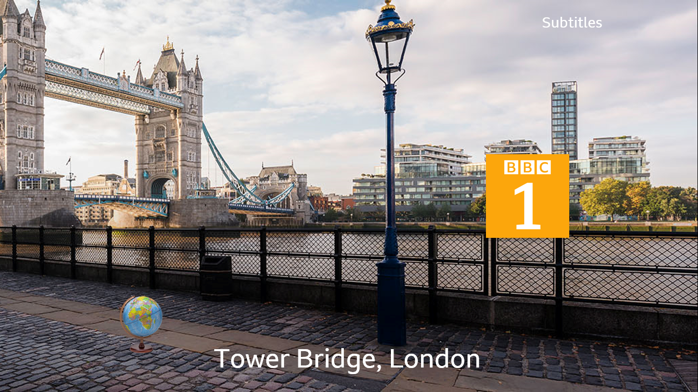
The globe on a wooden stand looks awful, please remove it for any future ident mocks, it really, REALLY doesn't need to be on screen at all.
Well, the point of the project is to add a central symbol to BBC One (BBC 1 in my mocks), and I believe that bringing back the globe is the best way to do it. If you don't like that particular globe, that's fair, but to remove it is to remove the point of the mock in the first place.
If you believe a TINY globe on a stand almost hidden on the ident itself is a good idea for a mock / logo for BBC ONE, you may as well stop now. It needs to be more prominent, and as it is it doesn't sit with what's on screen and would just look silly. I think you need to rethink the concept completely if the globe on a stand siting in the middle of a scene is the idea. It just won't work.