Been putting off wrapping presents, and I've had a go at tidying things up a bit.
It's deliberately not in the same style as you've gone for, but it's related. I've not spent very long on this, and it's mostly about lining things up, having the same spacing and sizes for everything, and reducing the size of the colour palette. Tried the split screen with a blue background and ended up doing a hue shift on it as the screen was just
too
blue.
Don't go this route - look at things I've done and ask yourself why, and whether you should incorporate things.
Thanks for the inspiration - I'll tone down the blue
RH
richard h
Its definitely improving Owen. I've been impressed that you have taken peoples constructive criticism and suggestions onboard and are making constant improvements instead of going off in a huff and deleting things like others have in the past
I like the new today's show menu. I still think the clock is hard to read with the colours you have chosen. maybe add a black outline to the clock numbers so it stands out from the background or make the background slightly darker
Are you able to find a similar font which has letters spaced out a bit more? certain things from a distance look like 2 words become one such as Roman Kemp on the today's menu
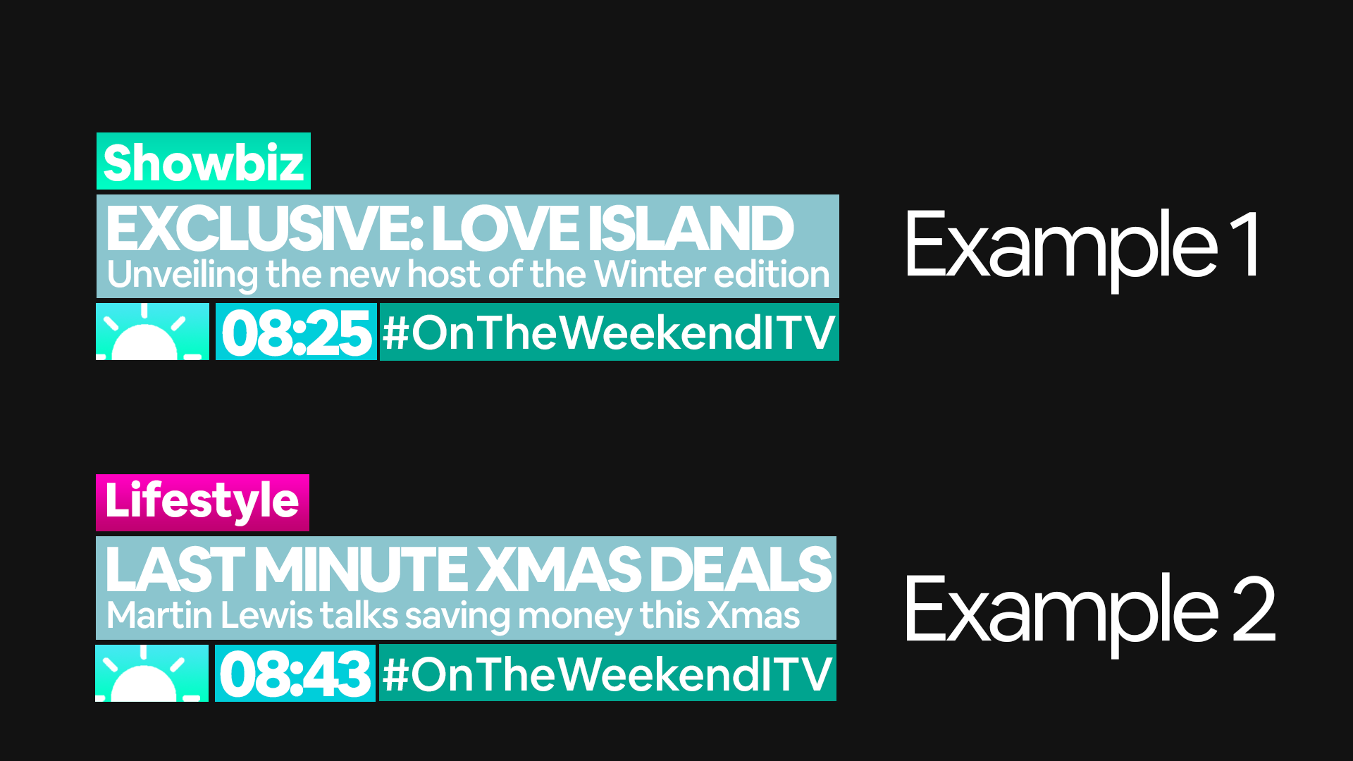
Following dosxuk's tidier version of the mock, I thought I'd refresh it again. For starters, I toned down the CAPITALS and also increased spacing between characters as Richard h suggested. The 'headline' section of the lower thirds is now front and centre, which I feel makes it clearer for the viewer. I chose a more grey blue to make sure the text was legible and moved down the logo and clock. The hashtag has returned as I feel it makes the programme feel more modern/fresh; however, this time there's no capitals. Above the 'headline' box is the 'topic' box. I created 2 examples to show how they vary from the colour scheme to make sure the whole thing isn't too blue.
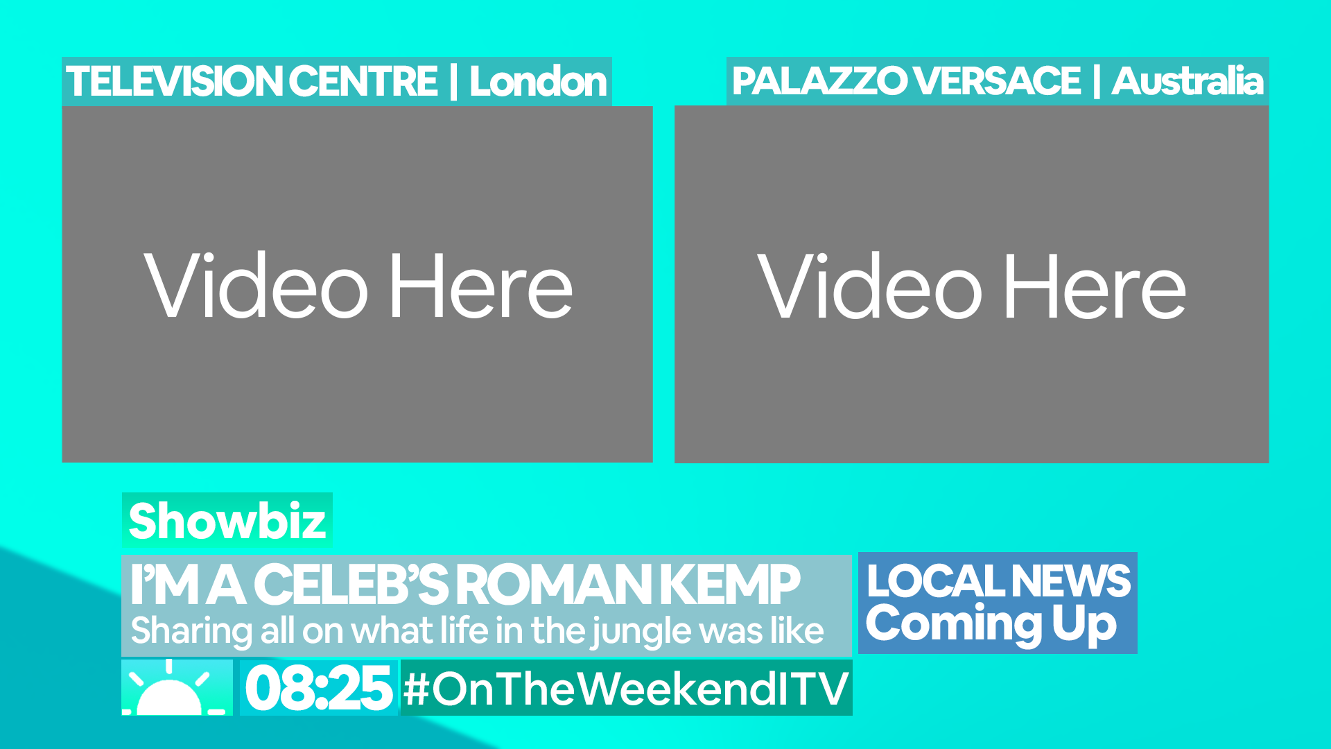
As for the interview split screen, I kept this pretty similar, only changing the video rectangles to actual rectangles as I think it looks a lot neater. It also has the new lower thirds, along with a 'LOCAL NEWS' coming up box I added on to demonstrate how the graphics can have extra things on the edge - this was not possible with my previous version of the mock.
As always I can't wait to hear feedback on this *hopefully* new and improved re-mock of this mock
I'd honestly say that dosxuk's version is something that would appear in TV, to me it's the nature of having space rather than text being too overly large and cramped.
I do think a recurring theme is it all being very oversized. On the last image you posted, the lower thirds almost extend to halfway up the screen, rather than... well... the lower third.
I do think you need to take in some consideration as to what will be on those lower thirds as well, on all your examples you've included a section for coming up, more so with the initial layouts its part of the overall design, so looks as though it would be a constant graphic, otherwise it would look odd when taken away.
With the latest layout, it's better in that it doesn't take up its own space, but if was to be taken off-screen then it leaves the rest falling rather short and not taking advantage of the full width, especially if the text would be squashed if it was any longer.
The scale just seems all wrong on the latest mock. Whilst doxsuk has just GMB'd your idea, the scale looks about right and everything seems to be positioned in the right place.
Also think about what information you need on screen - although of course on ITV Daytime especially there is a lot on screen which doesn't need to be, it's a lot more subtle than your effort - again largely down to scale.
I'd suggest firstly just scaling down your existing design to be more comparable in size to what doxsuk did above, and then as others have suggested work on that spacing between the lettering - it's crucial to it being legible on screen. I'd personally ditch the logo as part of the lower thirds too - it's just junk and doesn't serve any purpose.
Overall though you've managed to avoid going black and white, so it's not all bad.
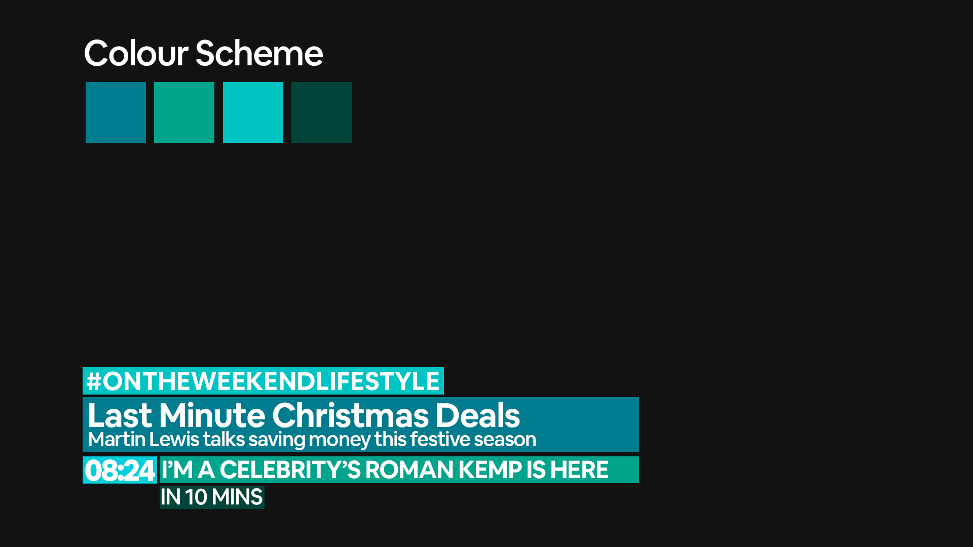
Obviously scaling has been a big issue with this mock. I have scaled down everything in the lower thirds and changed a few other aspects. The cramped text spacing is now fully gone, and I feel it does look a lot tidier. In addition, text no longer entirely fills each box, meaning there is definitely enough room for longer headlines. Furthermore, as Brekkie pointed out, at the moment, the logo is a little futile - it is now gone. However, I would like to redesign a logo including the title of the programme and include it in these lower thirds as I feel it is vital to a show's identity. Penultimately, I have made the colour scheme a little less vibrant but kept the blue style. Now the 'segment name' is included with the title of the show along with a hashtag, in the example attached, it is #ONTHEWEEKENDLIFESTYLE but it could also be #ONTHEWEEKENDSHOWBIZ. For main breaking news stories it would just be BREAKING NEWS though. As for the split screen, it would stay the same except incorporate the new lower thirds and adjust the location name boxes to use the slightly altered colour scheme.
This is getting a bit more similar to GMB, however I personally feel it still isn't the same, as it uses an entirely different font and also an entirely different colour scheme. Other little things aren't the same too. Hope you like
Just looks so much better - only issue now is the contrast of the text on the clock to the background.
However as great as it is you've taken on feedback it does show how design by committee doesn't exactly inspire originality. I think though now you've got the basics right you can start being a bit more creative.