HJ
I think this mock is really awkward, with the font not fitting the boxes well at all. I think that you need to re-think the presentation of these boxes, and the font/ colour inside them as its barely legible tbh. Also, wheres the originality. Its only 3 boxes, text and the current BBC One logo. Thers little point creating a mock for something without improving the current presentation.
EDIT: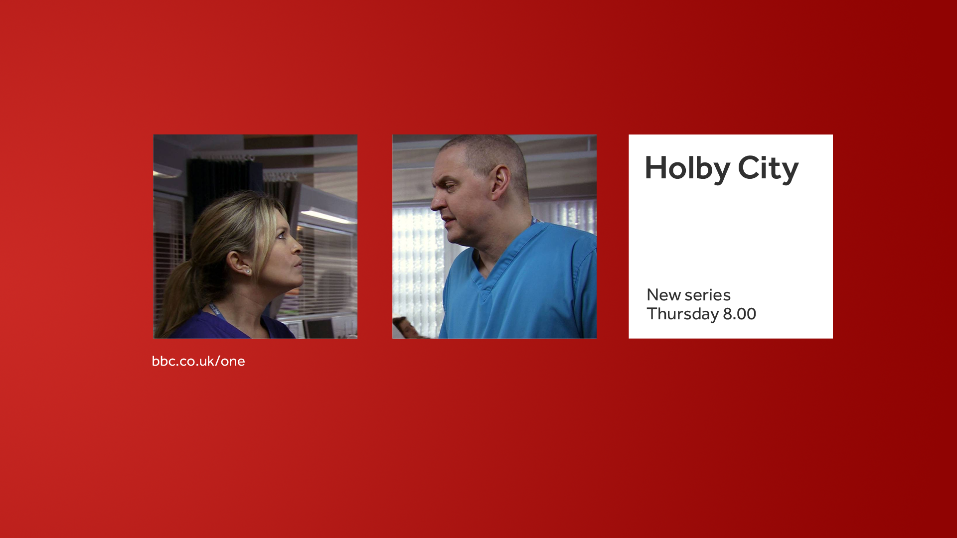
I personally feel like something like this would be more effective presentation if you can find a clever way to fit three equivalents into one preview.
EDIT:
I personally feel like something like this would be more effective presentation if you can find a clever way to fit three equivalents into one preview.
Last edited by HJL on 11 April 2014 4:32pm
AG
Hmm, not so sure on the red background, for some reason the shade does not work.
Edit: I will say that the font fits nicely inside them, although there could be a problem on longer names, and I can read it, and assume it will cycle through making the text darker for readability like many other channels already do.
GE
So, the consensus is that the red on the now/next/later slide isn't working. That'll change tomorrow when I can get back to my PC.
Also, I think a certain user has gotten a bit big for his boots, going against what everyone has said (no names though )
)
Also, I think a certain user has gotten a bit big for his boots, going against what everyone has said (no names though
)
GE
Update!

Another go at the now/next/later slides. The background is now a red (with a slight gradient), the 'tonight' text is at the top in the middle, and the BBC One logo is at the bottom.
Another go at the now/next/later slides. The background is now a red (with a slight gradient), the 'tonight' text is at the top in the middle, and the BBC One logo is at the bottom.
AS
I really like it but I think that it would look nicer if you aligned the tonight and the logo with the centre of the first block. It's just a suggestion. I think it has become ever so slightly dull but it's a great mock still, and at the mo it's 4/5 from me.
Last edited by ASO on 13 April 2014 2:30pm - 2 times in total