The Gallery

ITV News

Evening News and News at Ten (December 2015)

This site closed in March 2021 and is now a read-only archive
LE
Lee
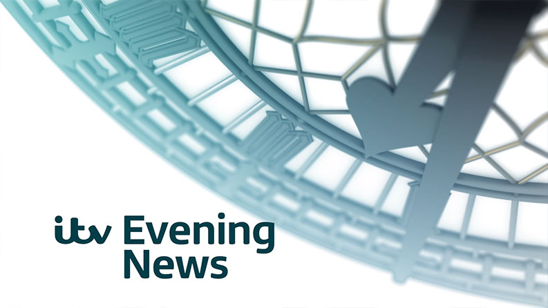
I created an ITV News mock some time ago using the Big Ben clock face, it had good feedback but I never developed it further.

This one is based on that, but also incorporates the swipe effect which seems to be a trend for Sky News and GMB at the minute.

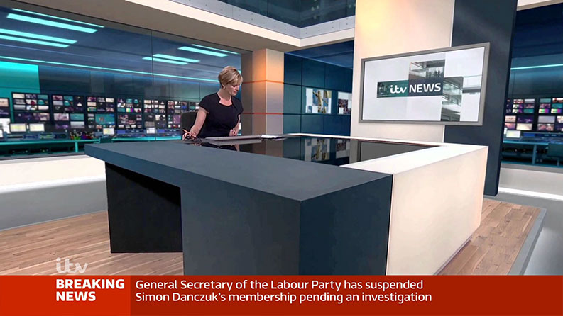
Someone is keen for my mocks to disappear from YouTube so apologies if this vanishes too!
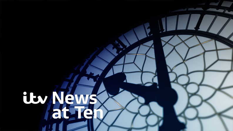
*

*

*

*

*

*

*

*

*

*

HB
HarryB
Another brilliant mock!
All great, the lower thirds are a bit too bland for my liking but still nice and improvement with what there is now. What would you do for website and LIVE graphics? Full screen graphics?

All great but not too keep on the simple animation for the end board of the titles.
DW
DavidWhitfield
Lower thirds are very Sky News, but I like them. Love the ident-style ITV logo and the darker style of the News at Ten one. The breaking news graphic in particular is excellent.
Last edited by DavidWhitfield on 31 December 2015 8:56pm
TA
Tantusar
This makes me very happy. If I had to make criticisms, the lower third text seems a little close to the bottom of the screen, and the ITV bug is too close to the top of the lower third when the lower third has a good amount of text. With that in mind, 4/5.
MD
mdtauk
Great work as usual Lee. Simple idea and simple transitions
NI
Nicky
Now THIS is how to do it. Nothing really here to fault at all. The clockface sequences are excellent (loving the nod to 1995) and the graphics clean, simple and tidy.

Outstanding work, Lee.
BK
bkman1990
This looks stunning. The quality of work is superb and more importantly it works extremely well.
JU
Justin
I love the concept. Could do some work on how the title text animates in and on thee lower-thirds.
MF
MatthewFirth
I believe these may have been inspired by the ITN clock face seen between 1996-1999?
DG
Dan Gooding
Love these. Simple and a hark back to a few 'looks' ago but doesn't feel dated at all!
FA
fanoftv
Brilliant work as always Lee.

I love the subtle swipes and I like the lower thirds.

I do feel that the titles work better with the News At Ten music. Something like that could have been implemented to differentiate the programme whilst keeping it close to the ITV News branding.
LE
Lee
Brilliant work as always Lee.

I love the subtle swipes and I like the lower thirds.

I do feel that the titles work better with the News At Ten music. Something like that could have been implemented to differentiate the programme whilst keeping it close to the ITV News branding.


I actually tried with both and felt the main ITV News music worked better, but uploaded the NAT theme for some variety. Having said that I do like the end of the titles on the NAT version.

With other comments regarding the lower thirds, I wanted to go as low as possible. I think the BBC News channel actually goes a little lower with it's ticker?

I wanted to scale back, de-clutter, simplify, etc. I wanted to remove a ticker from the equation and make use of that space. I know they do wheel out the ticker on occasion, but as a news programme rather than rolling news channel I didn't want to clutter up the screen with lots of information, I also feel the existing 2-line graphic does a good enough job on it's own.

I'll expand on this and do more if I can.

Newer posts