The Gallery

ITV News

New onscreen look (July 2011)

This site closed in March 2021 and is now a read-only archive
JK
JK08
I have created a new onscreen look for ITV News, I have created this which I think of as a mix between ITV News & Sky News.

Title card:
*

Clock & Ticker:
*

Breaking News:
*

Breaking News Strap:
*

Name Strap:
*

Split Screen:
*

Hope you like it and constructive criticism welcome. Smile
ID
Identity
very nice, but only two things I think that could be changed

1: Im not a big fan of the font on the "NEWS" in itv news

2: the shots on the split screen could be a bit bigger, looks like a little too much background

but it's a fantastic start!
JK
JK08
A few tweaks,
*
*
ID
Identity
its a lot better but news looks too big now and you aint changed it in the split screen one, its still the old font
AG
AxG
I can't get passed the fact that the grey is horrid and is covering up the rest of the ITV News logo.
CR
Critique
AxG posted:
I can't get passed the fact that the grey is horrid and is covering up the rest of the ITV News logo.


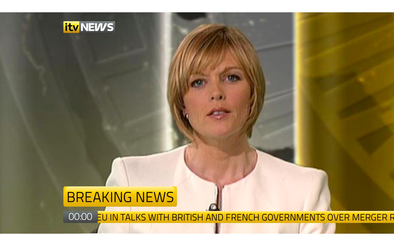
Or that the entirely mock is based around Breaking News, looking very grim, and just rather ugly, along with 3D bevels and the like...

Newer posts