The Gallery

Itv Be

First attempt at mocking for future channel ITV Be (February 2014)

This site closed in March 2021 and is now a read-only archive
DA
davidmarper2010
Seeing all the wonderful mocks on these forums, I have decided to give it a go myself, and have decided to create a mock for the future channel from ITV, ITV Be. I am limited on software so have created this in Microsoft PowerPoint.

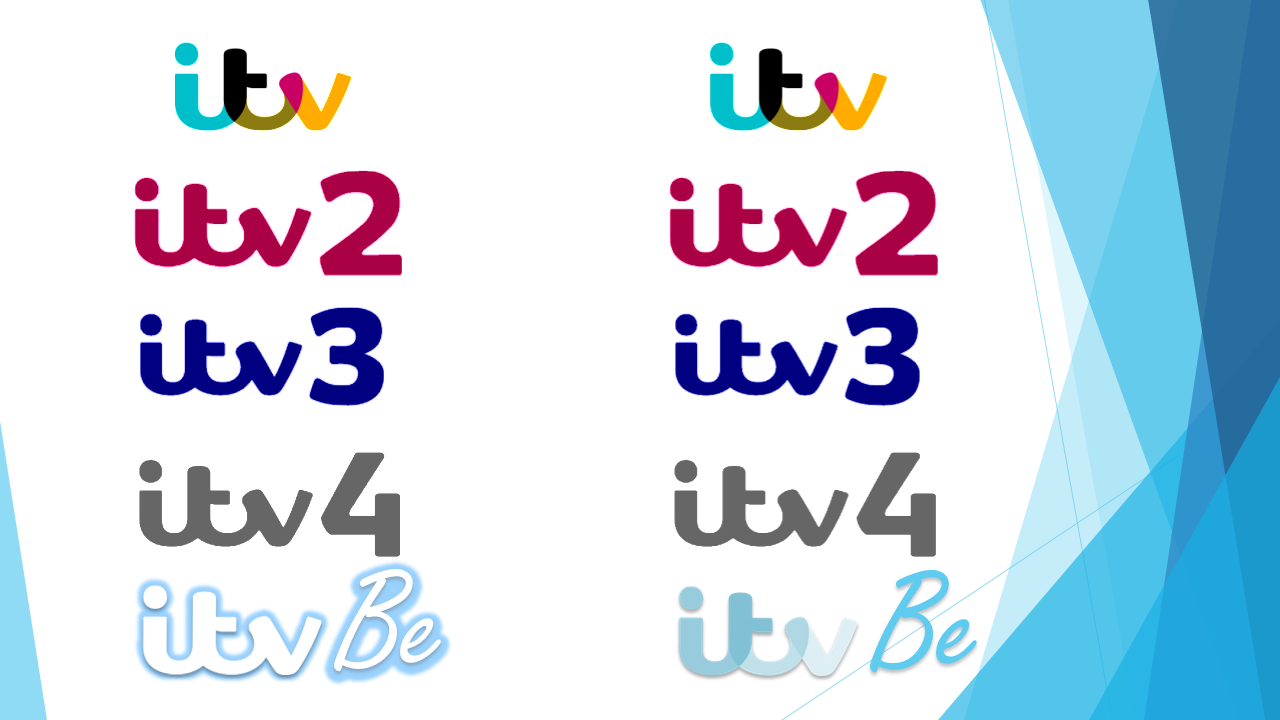
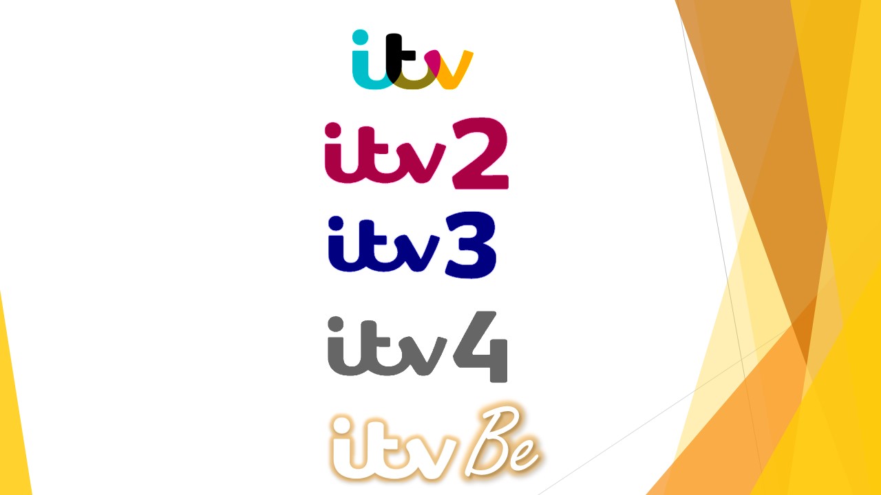
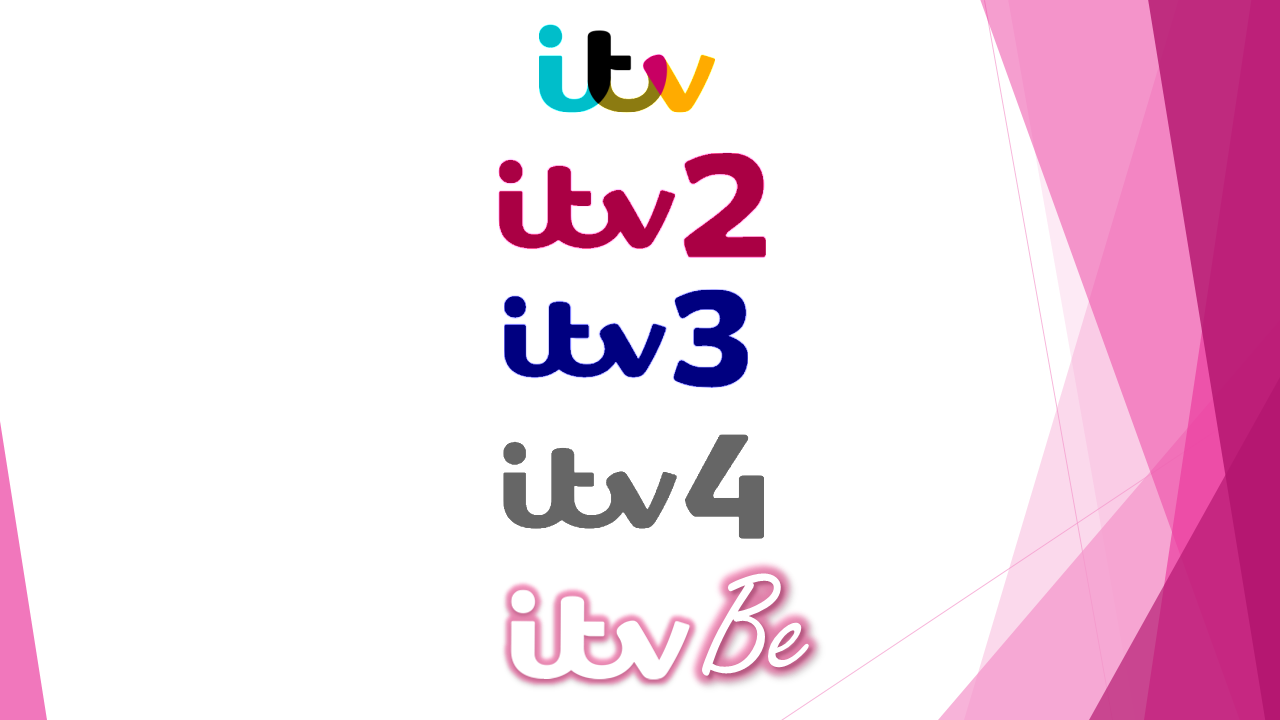
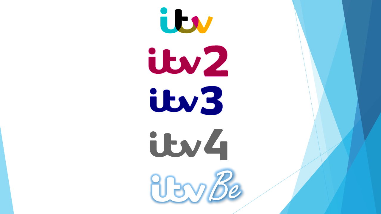
Below is a picture of the logo I have created for ITV Be, in line with the rest of the ITV chanel logos.

*
*
*

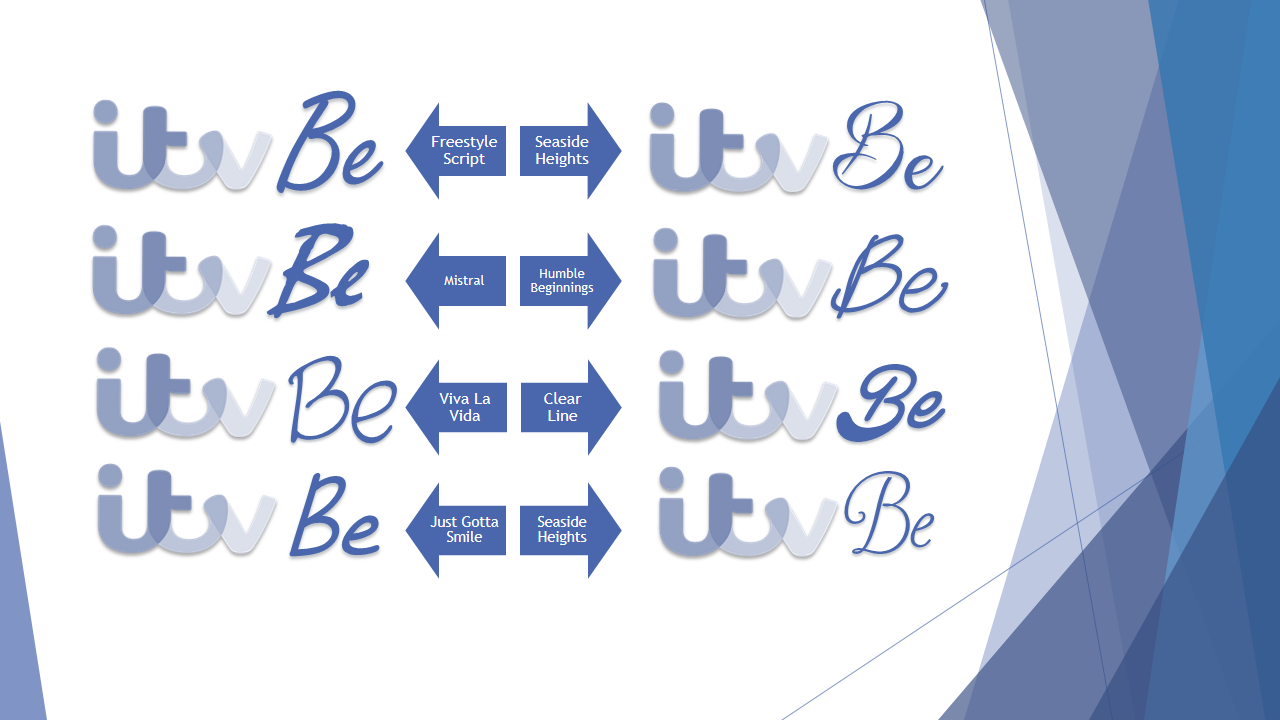
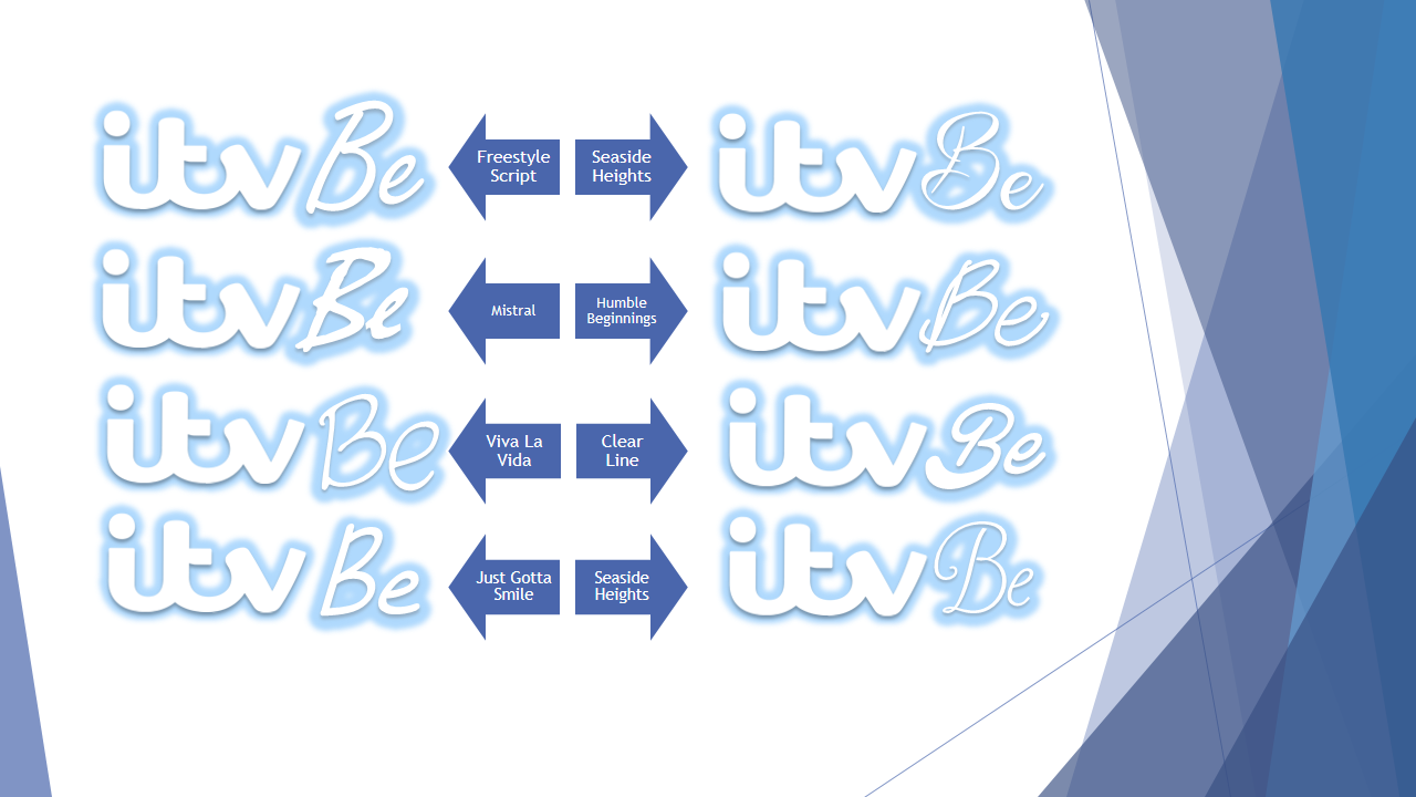
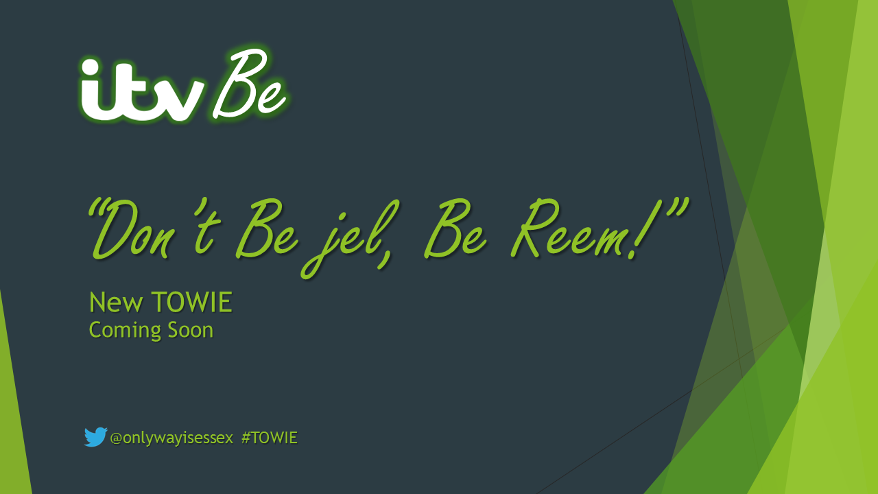
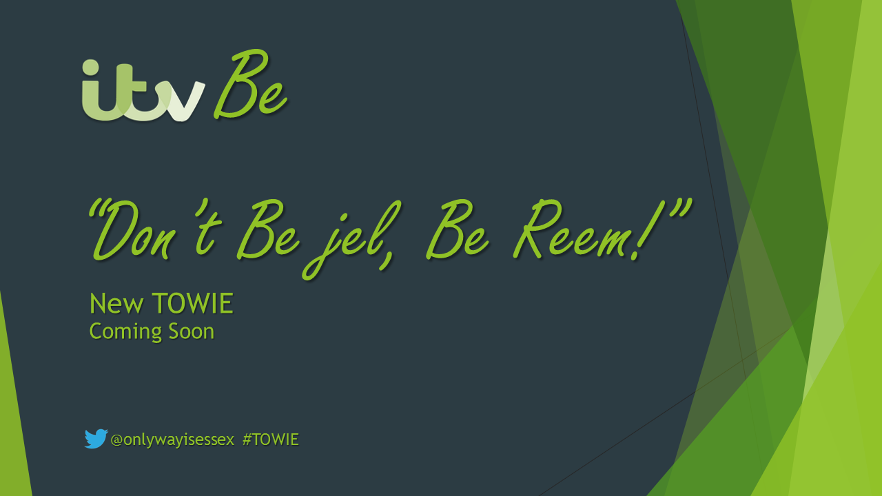
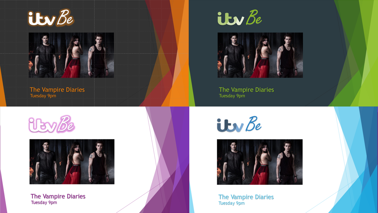
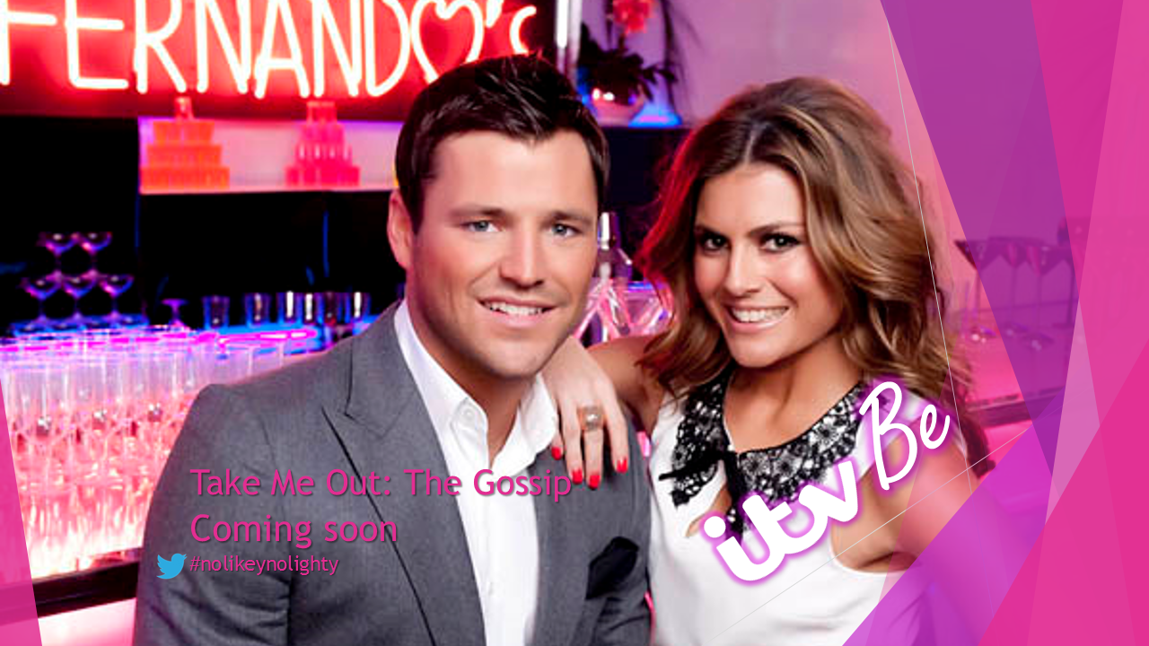
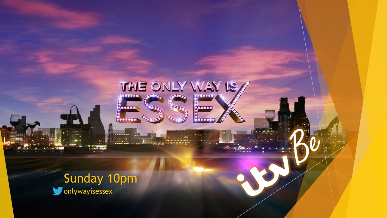
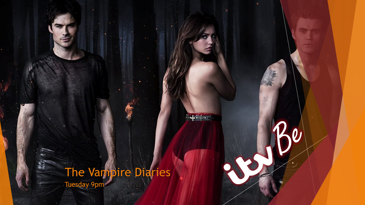
I have decided to go for a neon effect on the logo, that will use a colour match in relation to the programmes being advertised. Below are some trailer endboards, I have chosen these programmes as their target audience is primarily female. The logo I have created is included and I have paid attention to the guide to mocking, using 16:9 safe areas for titles and logo placement. Examples of which are shown below.


*
*
*

Any feedback would be greatly appreciated as this is my first attempt at mocking.
Last edited by davidmarper2010 on 28 February 2014 6:32pm - 4 times in total
MF
MatthewFirth
This is fine. 4/5
This is fantasic PowerPoint work, and in addition, a good mock. That is realistically how I'd see the ITV Be package being used.
AG
AxG
I personally think a the logo should match that of the others and not have the coloured glow, also using text on top of the images will course problems with readability, as seen in the Take Me Out image.
JO
Jon
This is fine. 4/5
This is fantasic PowerPoint work, and in addition, a good mock. That is realistically how I'd see the ITV Be package being used.

Not sure how a mock can be fine, a 4/5 and good.

But I'd say I'm not a massive fan for the font you've used for the word Be, it looks a bit tacky and not young enough for what I think they're going for.

Some nice ideas in the package though, which I think you can work on. I'm afraid I can only give this mock a 3/5.
DA
davidmarper2010
AxG posted:
I personally think a the logo should match that of the others and not have the coloured glow, also using text on top of the images will course problems with readability, as seen in the Take Me Out image.


I did try the logo with a "shades" effect before deciding to use the glow effect. The two ideas can be seen side by side below. I would be grateful if other forum users could tell me if they prefer the logo with or without the glow and an example of the colour pallet the channel will use.

*
*

Thanks David
TA
Tantusar
I say use the shades.
DA
davidmarper2010
Jon posted:


I'd say I'm not a massive fan for the font you've used for the word Be

Some nice ideas in the package though, which I think you can work on. I'm afraid I can only give this mock a 3/5.


Hi Jon, thanks for the feedback. I have tried playing around with some different fonts and come up with some more ideas, I personally like the idea of it being a handwritten style.

Shades:
*

Glow:
*

Thanks, David
Last edited by davidmarper2010 on 28 February 2014 10:00pm
TW
tweedledum
I like this. Not sure about the logo on a slant on the promo endboards. Overall, very good mock - well done! Smile
DA
davidmarper2010
I like this. Not sure about the logo on a slant on the promo endboards. Overall, very good mock - well done! Smile


Been trying out some different endboards with different logo placements and logo styles. I have also been taking into account what AxG said about placing text over images.

TOWIE Promo:
Glow:
*
Shades:
*

Vampire Diaries Promo:

Glow:
*

Shades:
*

Comparison of Colours and Logos:
*
Last edited by davidmarper2010 on 1 March 2014 12:12am - 2 times in total
WH
Whataday Founding member
Overall, good, but NO NO NO to that hideous Photoshop-style glow around the logo.
MF
MatthewFirth
I think you better change to the shades.
GE
georgeishungry
I like this mock, I liked the version where you had a full-size image with the overlays (the endboards in your original post). Nice job! Smile

Newer posts