The Gallery

Five News (something alongside 2002-2005 style)

Just a sudden idea. (November 2011)

This site closed in March 2021 and is now a read-only archive
GR
German Rudnev
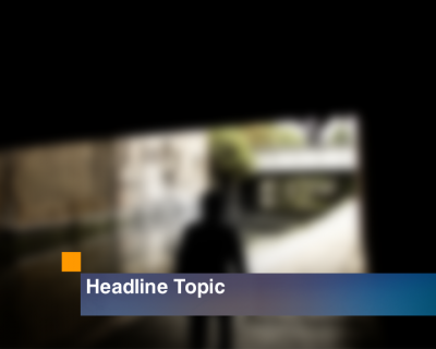
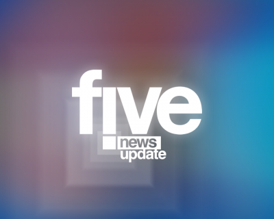
Suddenly, when I was watching various pieces of Five News presentation from around 2002-2003, this idea came to me. I think it could be used around 2003-2004, under ITN ownership - and a studio from real 2003-2005 look could fit here well.

*

**

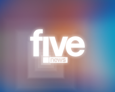
Animation would be probably similar to 2003 opener, with 'five' sliding down and a square slowly zooming out, revealing 'news' rectangle.
***

So, is it somehow decent or it's just awful?
Last edited by German Rudnev on 23 November 2011 9:55am - 2 times in total
BA
baa
Somehow decent or just perfect... no, neither. Somewhere inbetween though. I'm not much of a fan of i's as exclamation points and it edges a little downmarket for five during this era, don't draw attention to such a clichéd design idea. I like the concept but hate the intense glow applied to the logo on the titles because you might get away with having five being legible but both News and Update below would be blurred into blobs of nothing.

The orange and blue tones do make some sense but remember that even when ITN went a little further under the veil of ITV they were still very much independent of ITV for other broadcasts so they wouldn't have used it unless five were using the same colours. Otherwise, it's fine but mainly uninteresting.
GR
German Rudnev
Well, I see I was a bit wrong with various points. I amended both the post and the opener images.

**

I chose blue and orange colours because they were used during this era in similar mixes.
BA
baa
Yeah, the text for News and News Update is small, I'd say to size it up but you'd lose the exclamation point thing you've got going there. I wouldn't say no if it went but you've not got much else than "News" in a box so you'll need something to add visual interest.

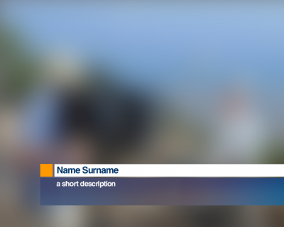
Making it a rectangle won't help if you're thinking it might, also the spacing around the square in the logo is off as is the box around News, align the gaps. I never did tell you about the other onscreen furniture because it's functional but the text sits too small for the name bars. Got any idea how it'd animate?

Newer posts