The Gallery

Five News

A rebrand for 5 News (April 2014)

This site closed in March 2021 and is now a read-only archive
AS
ASO
I wanted to change the font from Ubuntu to Gotham. I also want to make 5 News a less cheap, plastic, gimmicky
feel. I've taken elements of current branding of 5 News, taken elements from Channel 5 itself, removed the pink and purple, as well as getting rid of the numeral in the name (as I preferred that part of the old 'FIVE' branding)

I hope you like it so far. Constructive criticism welcome as always Smile

Logos - with different variations of colours:
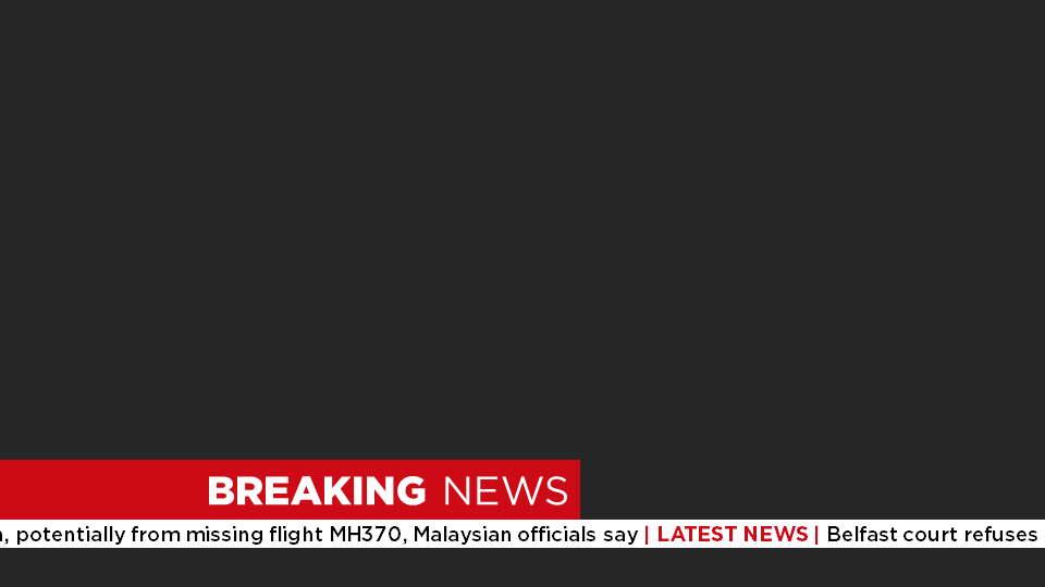
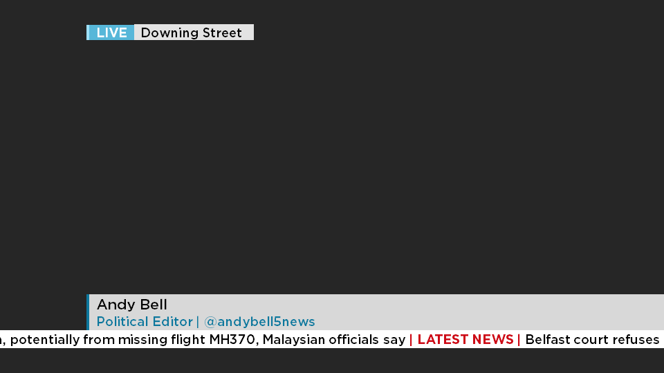
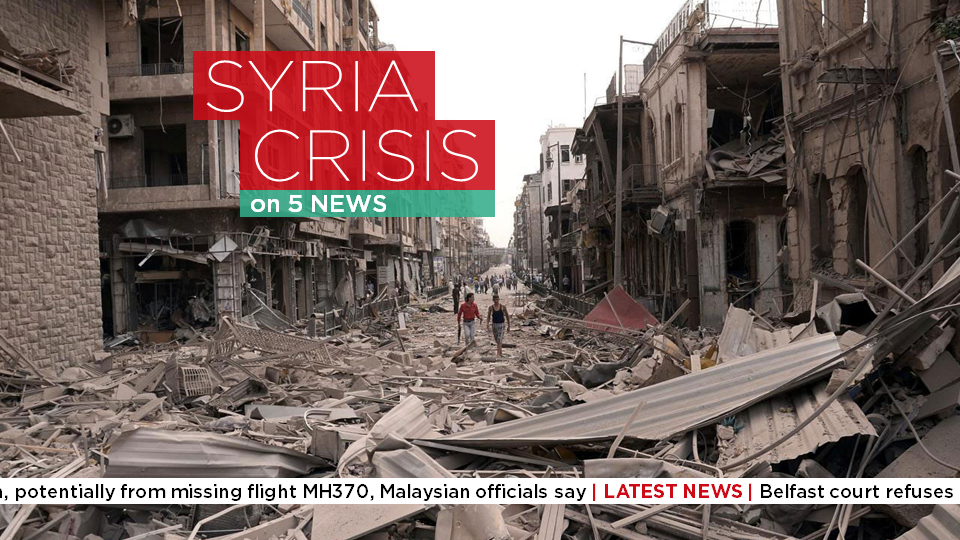
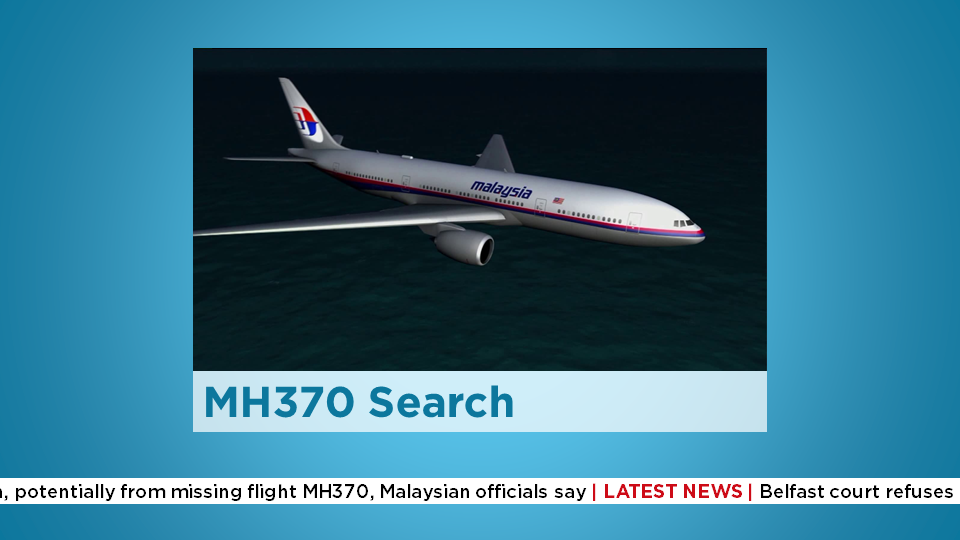

All other graphics

DOG - for headlines only (a bit like ITV News)
*

Breaking News
*
*

Name strap and live strap
*

Online
*

Warning
*

Other graphics
*
*
*
*

Ticker on its own
*

Coming up (animation breakdown)
*
*
*

Weather Intro
*

Credits
*

Endcap
*

Taster of NewsTalk Live
*
Last edited by ASO on 11 April 2014 2:05pm
LE
Leah
Very good. Well thought out Smile
HJ
HJL
Really like the font, and most of the presentation ideas, but perhaps you could improve the execution.
Firstly the live bar at the top doesn't meet the Downing Street in hight. Which is fine if you want it like that but make it a greater difference so it looks more purposeful rather than messy.
The Coming up slide with the angles and tiny plane picture needs re thinking. Maybe do something where you split it top and bottom rather than left and right, with longer pictures that don't look like an after though, but rather purposeful.
The Weather also needs a re-think, For starters, you've got five written on the screen twice, which is unnecessary- and even if you wanted it like that please align the text to the middle of the box. If powerpoint won't let that happen with the font think about making the text and independent shape then it will align better.
I LOVE the gradients used, and think they're subtle but impressive. and the Newstalk live looks really nice. I also like the breaking news slide, but don't know when that would get used in a news programme, especially on channel 5! And I'd like to know which logo you prefer, or about the different uses each would have.

Well done, just improve on these points and this mock could be Impressive! Very Happy

EDIT: also on the Syria one its 5 News, if its Five News use that throughout.
Last edited by HJL on 11 April 2014 5:59pm - 2 times in total
AG
AxG
Not so sure on the 'Five News' name, not now that the channel is 'Channel 5'.

Breaking News: The lines should have equal overhang on 'Breaking', the B and N don't line up, also the spacing between Breaking and News needs reducing.

I have no idea why your tittles (dots) are not aligned with the letters themselves

Coming Up: Get rid of the shadow.

Don't like the weather intro graphic
AG
AxG
AxG posted:
I have no idea why your tittles (dots) are not aligned with the letters themselves

Huh?

https://en.wikipedia.org/wiki/Tittle
HJ
HJL
AxG posted:
AxG posted:
I have no idea why your tittles (dots) are not aligned with the letters themselves

Huh?

https://en.wikipedia.org/wiki/Tittle

Wow thats really impressive, good eye for detail!! -they say you learn something new everyday!! Very Happy & sorry if I came across as a little rude!
AS
ASO

The Weather also needs a re-think, For starters, you've got five written on the screen twice, which is unnecessary

http://www.tv-live.org.uk/wp/media/fivenews/2012/weathersting1.jpg Well channel 5 seem to disagree!

I agree with your other points though so thanks very much. Very Happy
AS
ASO
AxG posted:
I have no idea why your tittles (dots) are not aligned with the letters themselves

It only appears like that as an image. It's Gotham, it's a great font so I'm pretty confused!

Also I have started a mock of the whole of channel 5 where it is called channel five, so this was started to in-keep with that brand. Seeing as the network is being sold, I think it could do with the change. I really appreciate your feedback.
AJ
AJ
ASO posted:

*


Hmmmm.... Inspired by an American restaurant which has recently come to the UK by any chance?
*
AJ
AJ
Aside from the above, just spotted a branding inconsistency. You're calling the programme "FIVE NEWS," yet your Syria Crisis image has "5 News"

Attention to detail counts.
AS
ASO
AJ posted:
ASO posted:

*


Hmmmm.... Inspired by an American restaurant which has recently come to the UK by any chance?
*


God damn it, did you hack into my computer? That is my studio mock! Jeez this is embarrassing. Embarassed

Seriously though. I've never actually been to five guys.

Bold, white writing on a red background. Different font. Similar I agree, but not inspired by the burgers.
Last edited by ASO on 11 April 2014 6:03pm
owainshenton and HJL gave kudos
AS
ASO
AJ posted:
Aside from the above, just spotted a branding inconsistency. You're calling the programme "FIVE NEWS," yet your Syria Crisis image has "5 News"

Attention to detail counts.


Oops, I did that part a while back, thought Id changed it but didn't. Very sorry about that, which is genuinely embarrassing.
Last edited by ASO on 11 April 2014 6:00pm

Newer posts