CH
One of the BBC's public purposes is to "show the most creative, highest quality and distinctive output and services" and '[set] the standard both in the UK and globally'. The BBC quite rightly calls its news services 'high quality' and 'accurate'. The BBC's vision statement is to 'be the most creative organisation in the world'. There is no argument that some of the reporting from BBC News is industry best and indeed the organisation has driven innovation for decades - so why are the graphics used to present this industry-best news and stories so, in my opinion, poor?
This mock has been in the works for a long time; I've decided to try and take BBC News in a visually different direction. It is louder and prouder, whilst still retaining its very British core and staying out of the way to ensure that the journalism remains front and centre.
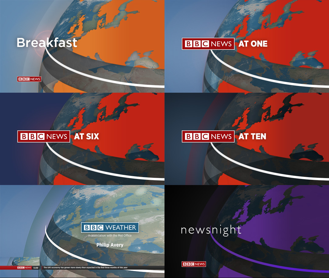
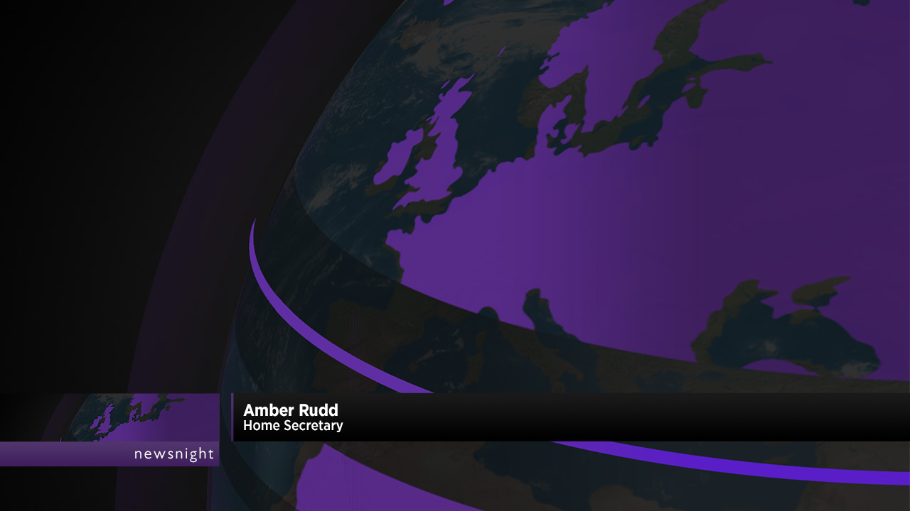
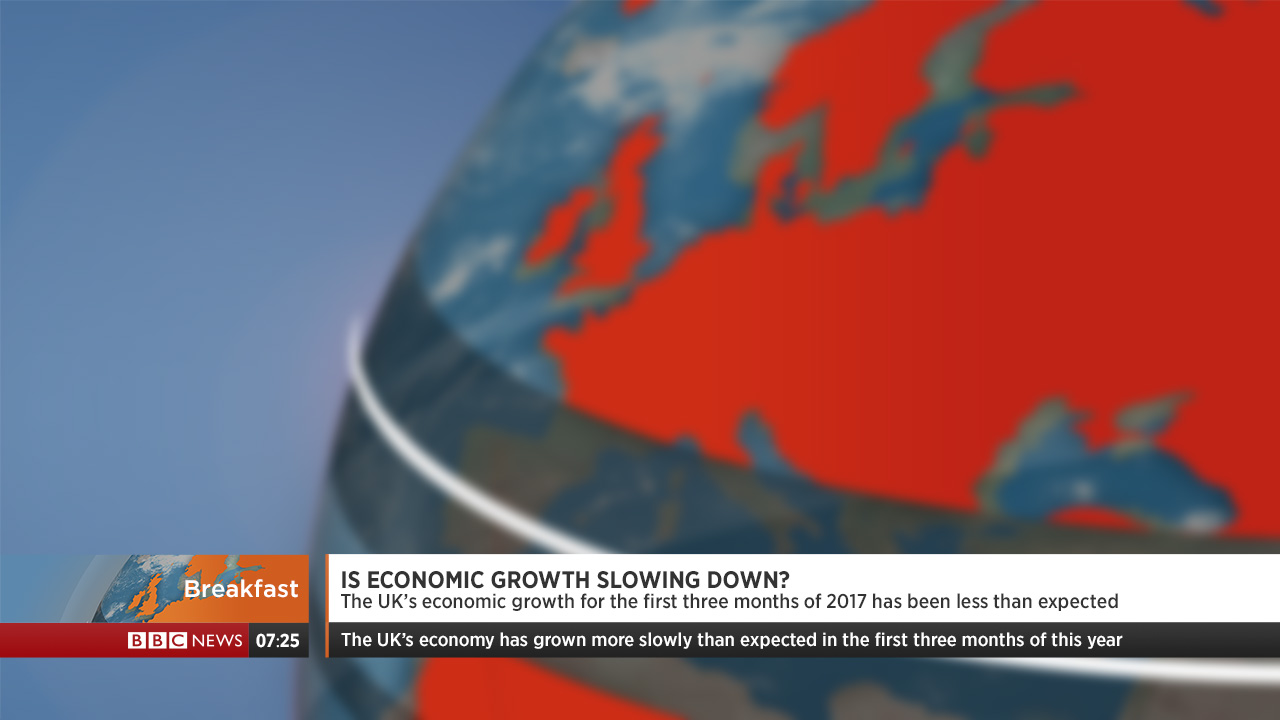
First are some new globes. I can see opinion being divided on these - I'm not completely tied to them, and could see this mock working just fine alongside the existing globe. My new globe changes dynamically with the content and the time of day - viewers on the News Channel will see the lighting and background subtly change as the day goes on, going from a morning scene for Breakfast to a darker, more serious theme for the Ten. As for titles, I would invisage something similar to RTVS Spravy in Slovakia.
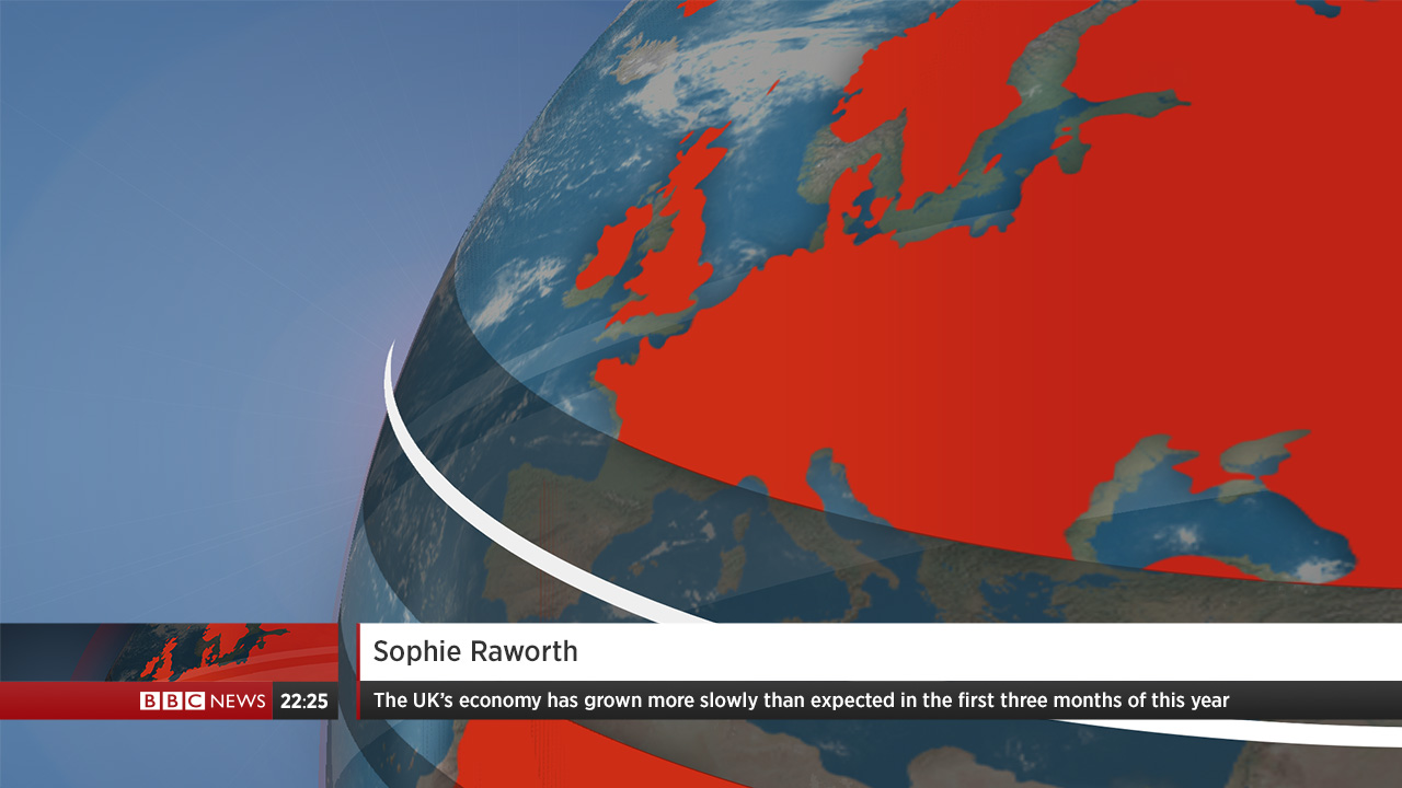
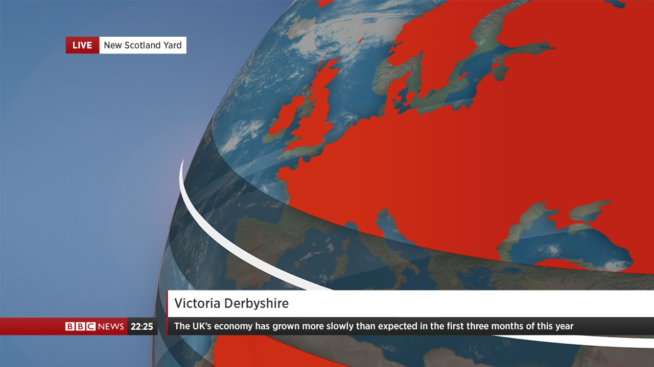
The graphics, although not a radical departure from what we already have, use a bit more gloss and feature the globe prominently. The globe will slide up with the straps, and disappear when the straps do. You'll see that it is possible to have a strap without the globe, but for the sake of visual balance, I chose to keep the globe there whenever a strap is present.


Programmes with distinct identities like Newsnight and Victoria Derbyshire can retain these identities, whilst still conforming to the new graphics package.
Finally, on the network bulletins, the clock and flipper are dropped but otherwise the graphics remain the same.
I've spent a lot of time on both pen and paper and on a screen working on various different directions, but I feel this is the best product I've been able to deliver for this mock which has been in my head for many months now. One minor qualm is that I worry the graphics could be slightly on the small side - but nonetheless, I hope you've enjoyed this rather long post(!) and I'm looking forward to hearing your feedback.
This mock has been in the works for a long time; I've decided to try and take BBC News in a visually different direction. It is louder and prouder, whilst still retaining its very British core and staying out of the way to ensure that the journalism remains front and centre.
First are some new globes. I can see opinion being divided on these - I'm not completely tied to them, and could see this mock working just fine alongside the existing globe. My new globe changes dynamically with the content and the time of day - viewers on the News Channel will see the lighting and background subtly change as the day goes on, going from a morning scene for Breakfast to a darker, more serious theme for the Ten. As for titles, I would invisage something similar to RTVS Spravy in Slovakia.
The graphics, although not a radical departure from what we already have, use a bit more gloss and feature the globe prominently. The globe will slide up with the straps, and disappear when the straps do. You'll see that it is possible to have a strap without the globe, but for the sake of visual balance, I chose to keep the globe there whenever a strap is present.
Programmes with distinct identities like Newsnight and Victoria Derbyshire can retain these identities, whilst still conforming to the new graphics package.
Finally, on the network bulletins, the clock and flipper are dropped but otherwise the graphics remain the same.
I've spent a lot of time on both pen and paper and on a screen working on various different directions, but I feel this is the best product I've been able to deliver for this mock which has been in my head for many months now. One minor qualm is that I worry the graphics could be slightly on the small side - but nonetheless, I hope you've enjoyed this rather long post(!) and I'm looking forward to hearing your feedback.
Last edited by channelsurfer on 23 July 2017 10:21pm - 4 times in total