Firstly, thank you to those who have been constructive (although I must say, veteran or not, I would expect everyone to be treated with respect on this forum).
I've developed the box idea a little further. The more I looked at the boxes, the more I felt it needed something a bit more radical, so I've developed the logos for BBC 1 and BBC 2 further. And with these I have made some video mocks.
I have a feeling the font is going to be a bit Marmite but I like it (even the W).

BBC 1 Ident - using visuals from a beautiful BBC Entertainment ident.
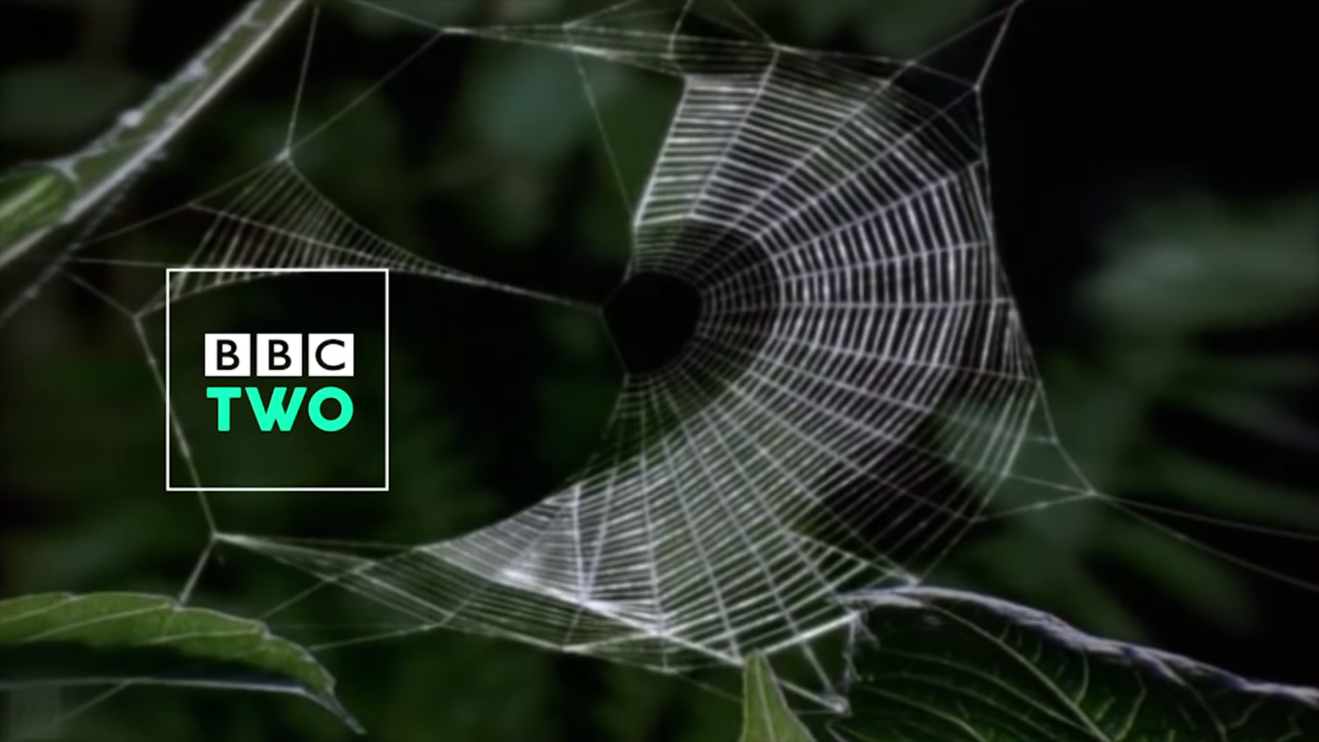
BBC 2 Ident/Sting 1
BBC 2 Ident/Sting 2
BBC 2 Ident/Sting 3
I've deliberately called those Ident/Stings because I'm expecting someone to say "those are too short to be idents" but they are visuals that allow for the new position of the box, to give you the gist of it. So there.
Before I made the colour changes to the BBC 1/2 logo, I'd already done a video for BBC News, using a controversial blue rather than the now traditional red. So even though it doesn't match the exact style of the channel logos, I thought I'd share this too.
Last edited by Whataday on 12 October 2015 1:45am - 2 times in total
