The Gallery

BBC Box Ideas

What would more adstract logos look like? (March 2016)

This site closed in March 2021 and is now a read-only archive
MF
MatthewFirth
OK, I apologize for being too harsh but I was saying that because I know GIMP can provide better mocks than his original.

P.S. You are improving.
Last edited by MatthewFirth on 31 March 2016 10:00am
MI
Michael
Go back to the future.

*
MatthewFirth, AxG and DTV gave kudos
CO
Colorband
They were bad at the beginning.

Now, they're actually getting better.

Granted, they're far from 5 stars yet, so keep trying. This is The Gallery; we're all about expressing new ideas for television presentation in any way, shape, or form.
CR
Critique
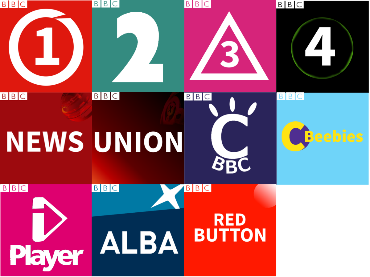
We've gone from this...
*

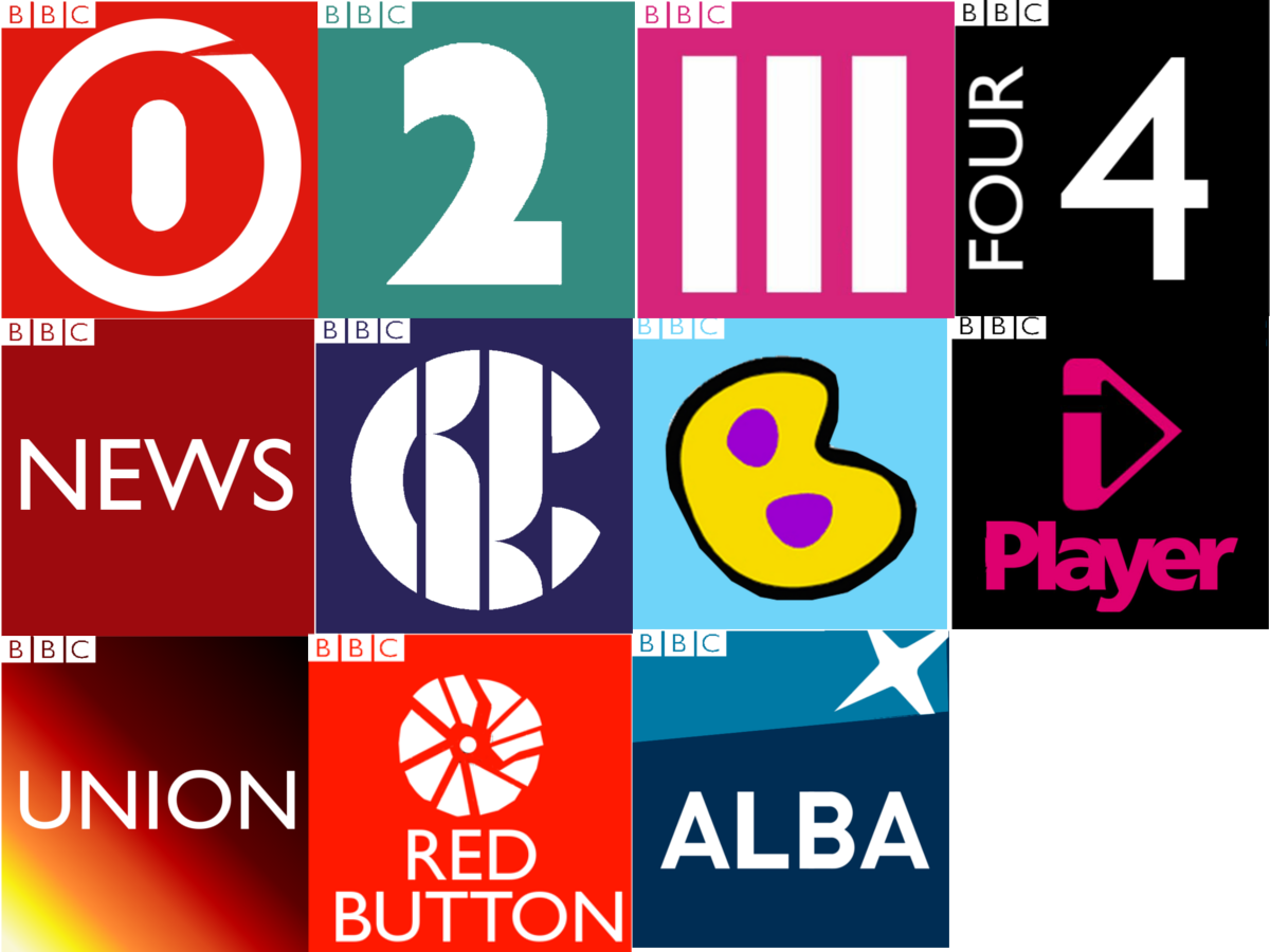
to this...

*

...and people are congratulating the OP for making improvements?? For BBC One we have a circle with a cut in it and a 1 in the middle, for Two the Lambie-Nairn numeral in a box, for Three a triangle with a number inside, for Four a circle with a number in, for Children's two strange creations that fail to improve on the originals, for iPlayer and Alba the actual logos, just moved around a bit, and for the remaining three the names of the channels in a box. There's a complete lack of consistency, with the positioning of the logo jumping up and down within the box, the BBC logo is too small, the font choices are seemingly random and as previously mentioned, 'BBC Union' makes no sense as a channel name.

I know we should be encouraging mockers and helping them improve, but there's no point in giving needless praise when there is no real improvement, on either the original mock or what we have in real life.
UB
UBox
Would it not make more sense to have four as a square since 1 is a circle and 3 is a triangle.
JO
Josh

The BBC 2! logo has been fixed to say BBC 3

I wouldn't call it BBC 2! just because it looks like that. If you haven't seen the logo before, then fair enough.

Newer posts