AS
Thanks, I will think of a way of making the whole design consistent with the wood.
Thanks for the feedback people. Keep it coming.
Much better (kerning on 'ke' though) prefer the logo on wood than the blue.
Thanks, I will think of a way of making the whole design consistent with the wood.
Thanks for the feedback people. Keep it coming.
AS
Thanks. In hindsight they are really not the best I can do. I love the idea of a banner though.
I posted them as an idea to see whether there was any element that people liked. I would like to know if you like the different colour logos for each scene which I might utilise for the banners.
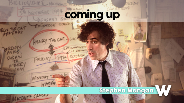
Don't like these, think they're too simple. Have a feeling the lines improved the break stings, maybe bring them back, even with wood. It could always be a banner across or down the middle?? I like the Coming up though. That's nice!
Thanks. In hindsight they are really not the best I can do. I love the idea of a banner though.
I posted them as an idea to see whether there was any element that people liked. I would like to know if you like the different colour logos for each scene which I might utilise for the banners.
Last edited by ASO on 12 May 2014 9:07pm
HJ
Thanks. In hindsight they are really not the best I can do. I love the idea of a banner though.
I posted them as an idea to see whether there was any element that people liked. I would like to know if you like the different colour logos for each scene which I might utilise for the banners.
I'd like to see it, but remain to be convinced!
Don't like these, think they're too simple. Have a feeling the lines improved the break stings, maybe bring them back, even with wood. It could always be a banner across or down the middle?? I like the Coming up though. That's nice!
Thanks. In hindsight they are really not the best I can do. I love the idea of a banner though.
I posted them as an idea to see whether there was any element that people liked. I would like to know if you like the different colour logos for each scene which I might utilise for the banners.
I'd like to see it, but remain to be convinced!
TW
I really like these, simple, and overall pleasing on the eye! May I ask what font that is you are using, it too is lovely!
AS
What? That's the just font.
Precisely.
Font is called 'cocogoose', as Leah said. I also got it from DaFont. Thanks for your kind comments!
Why is your w backwards?
What? That's the just font.
Precisely.
I really like these, simple, and overall pleasing on the eye! May I ask what font that is you are using, it too is lovely!
Font is called 'cocogoose', as Leah said. I also got it from DaFont.
AS
I have decided against the banner idea as I think it sets the wrong feel for the show. It makes it too grand and dare I say, pompous. It was a lovely idea - thanks Henry, but I'm not sure anymore. I will not be uploading anything today probably  but I should have something for Thursday - tomorrow is busy for me.
Thanks all for the feedback
Thanks all for the feedback
