MM
I'm not a fan of the use of the teal logo box on these idents - and certainly not in the position that Network has chosen to place it. It would've been more platable if it were moved more to the right and reduced in size a little. Why on earth Network insists on putting that redundant 'Subtitles' indicator on all of its idents, I have no idea (would make a nice change if they even used the correct channel font). And another layout fail is the fact the 'Subtitles' indicator isn't aligned with the right-hand-side of the logo box - that just looks messy.
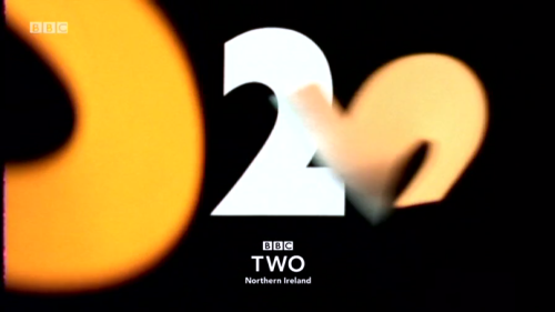
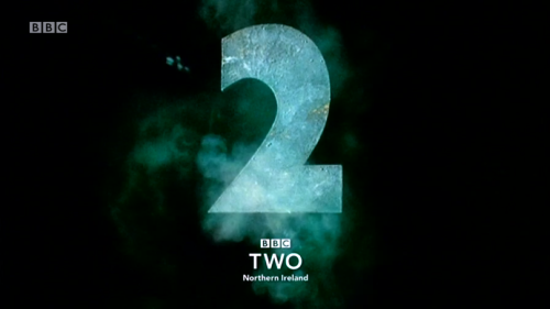
Well done to BBC Northern Ireland for their implementation of existing logo with old symbols. And thank you for taking the time to get such a wide range of old idents packaged together and back on air!
BBC TWO dun goofed.
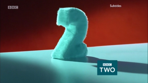
I'm not a fan of the use of the teal logo box on these idents - and certainly not in the position that Network has chosen to place it. It would've been more platable if it were moved more to the right and reduced in size a little. Why on earth Network insists on putting that redundant 'Subtitles' indicator on all of its idents, I have no idea (would make a nice change if they even used the correct channel font). And another layout fail is the fact the 'Subtitles' indicator isn't aligned with the right-hand-side of the logo box - that just looks messy.
Well done to BBC Northern Ireland for their implementation of existing logo with old symbols. And thank you for taking the time to get such a wide range of old idents packaged together and back on air!