SH
So? They probably weren't going to update that.
Unless later on in time, they create new titles with Reith included.
Gill Sans is still prominent in the opening titles.
So? They probably weren't going to update that.
Unless later on in time, they create new titles with Reith included.
RN
Looks very slick and modern, I like it. Only disappointment is the opening titles which haven't been updated with the new font. Bit like when Breakfast relaunched last year with new opening titles but kept the old bsckground. Why do the BBC have to do everything in stages?
GT
Well, I must say, it’s an amazing bit of graphics. There were indications. For example, the 3rd of July.
DM
So? They probably weren't going to update that.
Unless later on in time, they create new titles with Reith included.
Did I say it was a problem or was I just stating something that I noticed?
Gill Sans is still prominent in the opening titles.
So? They probably weren't going to update that.
Unless later on in time, they create new titles with Reith included.
Did I say it was a problem or was I just stating something that I noticed?
Last edited by DeMarkay on 15 July 2019 9:14am
TR
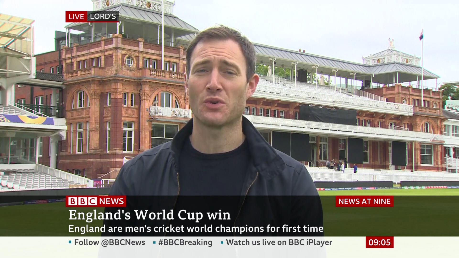
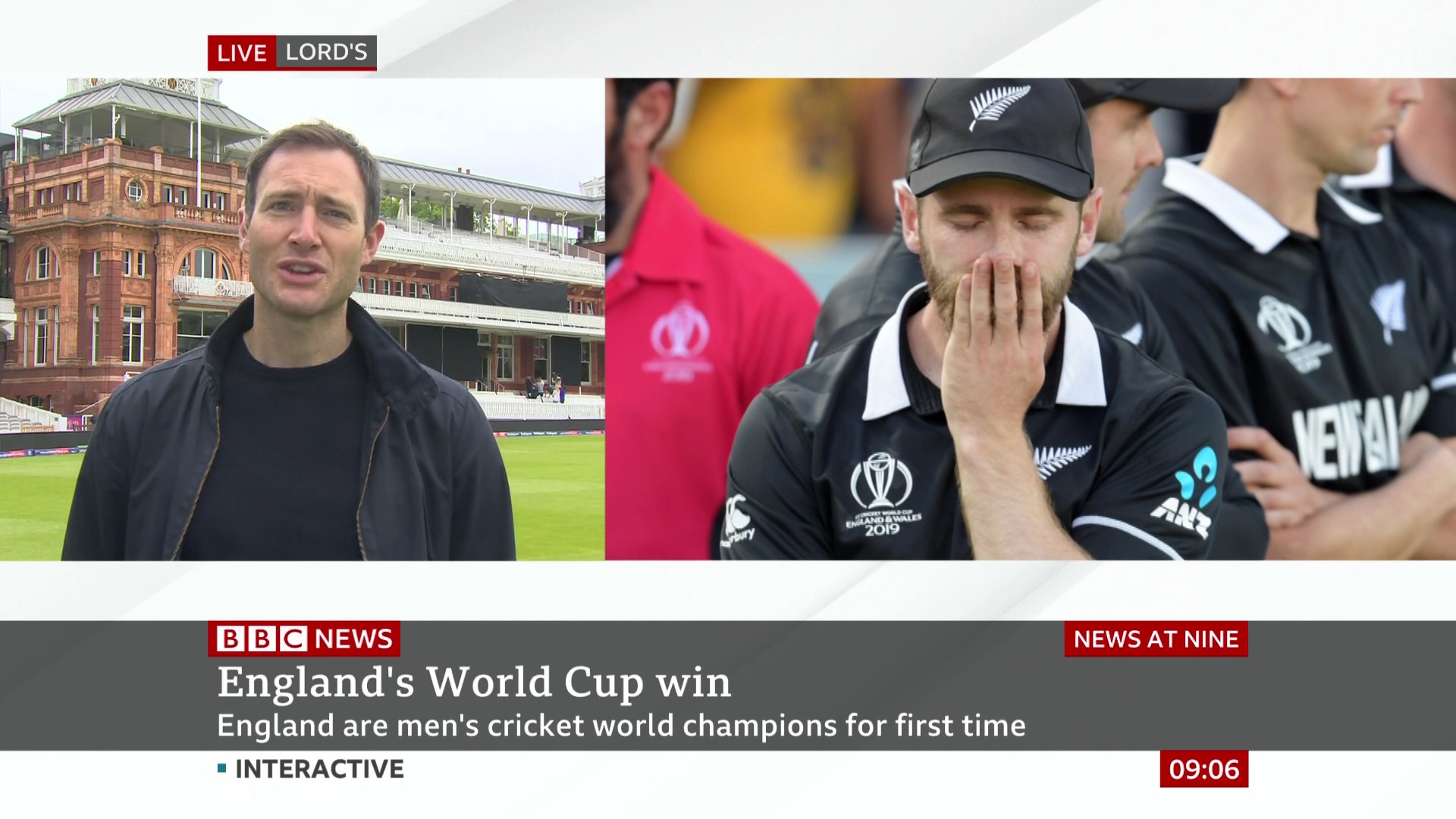
Those headline graphics are an absolute mess. They had plenty of time with their online videos to realise that "smear a muddy black gradient over 60% of the picture in order to make your ugly graphic legible" is a terrible, terrible style choice. Really gross to see this on TV now as well.
BC
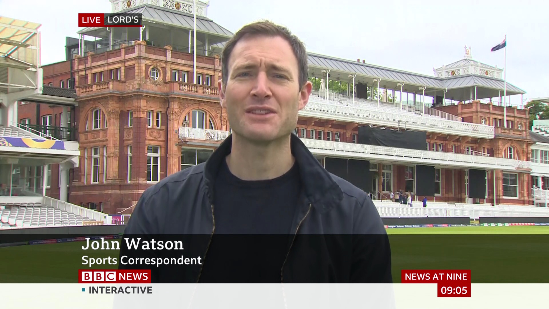
Though 'LIVE' and the location not quite lining up will irritate as soon as you notice it.
Other than that minor thing, all very lovely so far. Neat way of making the name straps different to the info straps.
Blake Connolly
Founding member
The ‘LIVE’ bug is gorgeous!
Though 'LIVE' and the location not quite lining up will irritate as soon as you notice it.
Other than that minor thing, all very lovely so far. Neat way of making the name straps different to the info straps.
WO
They seem to be promoting askthis@bbc.co.uk rather than the bbcnewschannel@ email address on the flipper.