MO
MSNBC rebranded all their daytime programming to MSNBC Reports to emphasize the presenteres are journalists and not "hosts" and the programming is news programming and not opinion so the MSNBC LIVE titled was retired.
Tvnewser has more
https://www.adweek.com/tvnewser/msnbc-live-is-now-msnbc-reports/475007/


Tvnewser has more
https://www.adweek.com/tvnewser/msnbc-live-is-now-msnbc-reports/475007/


HC
For a news channel, very strange for it not to have a ticker/fipper.
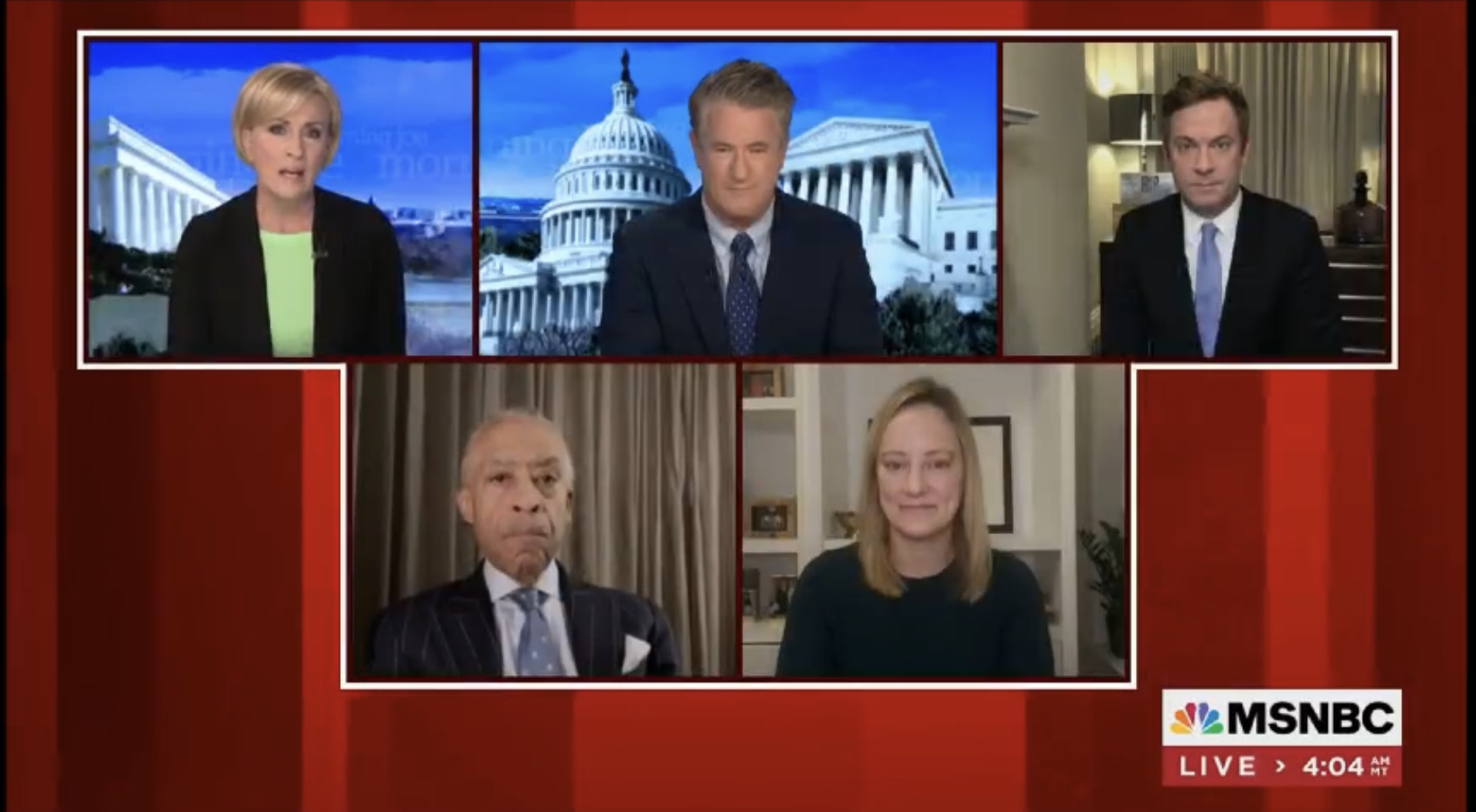
I take it the clock graphic under the MSNBC logo alternates with programme title?
I take it the clock graphic under the MSNBC logo alternates with programme title?
RK
Yes it does. MSNBC dropped the ticker a few years ago as they viewed it as a distraction to the content (and probably numerous focus groups said so - Comcast and NBCU love their data). When needed they did add it and all they do is shift everything up.
For a news channel, very strange for it not to have a ticker/fipper.
I take it the clock graphic under the MSNBC logo alternates with programme title?
I take it the clock graphic under the MSNBC logo alternates with programme title?
For a news channel, very strange for it not to have a ticker/fipper.
I take it the clock graphic under the MSNBC logo alternates with programme title?
I take it the clock graphic under the MSNBC logo alternates with programme title?
Yes it does. MSNBC dropped the ticker a few years ago as they viewed it as a distraction to the content (and probably numerous focus groups said so - Comcast and NBCU love their data). When needed they did add it and all they do is shift everything up.
SC
That's interesting. I don't know the last time I've actively read a scrolling ticker on normal coverage. Usually only during the first few minutes when there's something big and urgent going on and I'm waiting for a recap or summary.
scottishtv
Founding member
MSNBC dropped the ticker a few years ago as they viewed it as a distraction to the content (and probably numerous focus groups said so - Comcast and NBCU love their data). When needed they did add it and all they do is shift everything up.
That's interesting. I don't know the last time I've actively read a scrolling ticker on normal coverage. Usually only during the first few minutes when there's something big and urgent going on and I'm waiting for a recap or summary.
BI
Totally agree! It is so CNN - not distinctive at all - what were they thinking?
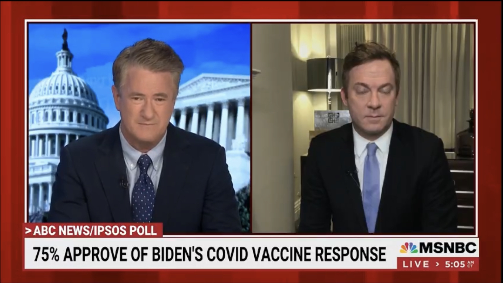
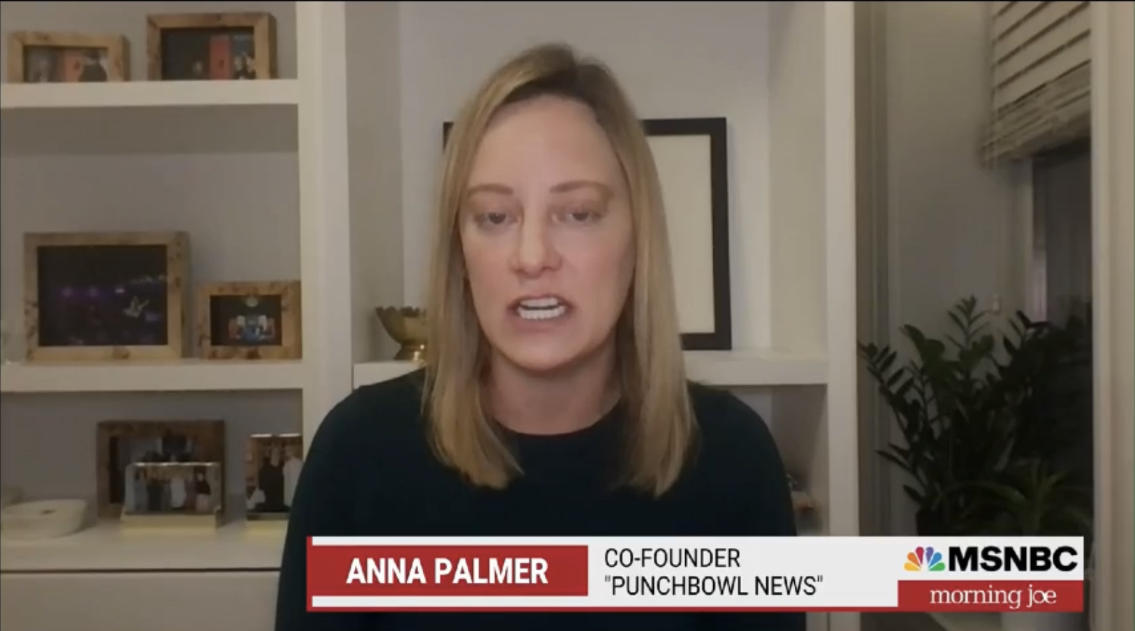
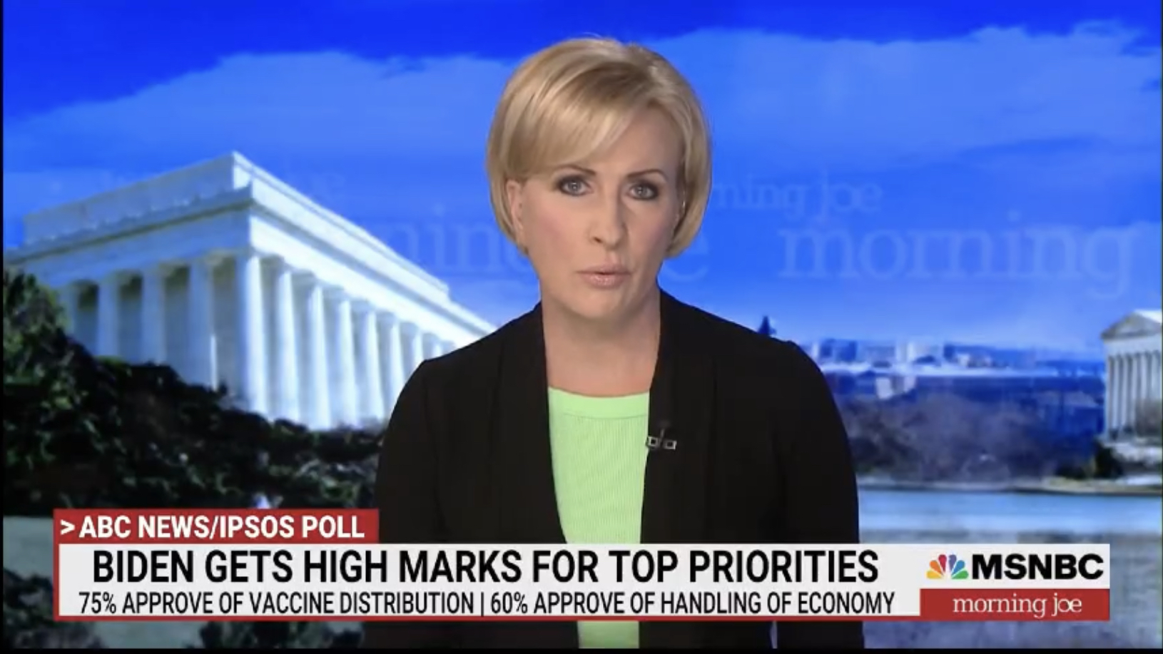
The lower thirds look like they are lifted from CNN - even the font is uncannily similar... Especially notable in the first picture. If you lose the '>' in the slug and the red line along the bottom they'd be the same...
Totally agree! It is so CNN - not distinctive at all - what were they thinking?
IN
Totally agree! It is so CNN - not distinctive at all - what were they thinking?
It comes across as though they looked at the CNN graphics and got jealous, so just copied them.
What’s the point of doing that?
The lower thirds look like they are lifted from CNN - even the font is uncannily similar... Especially notable in the first picture. If you lose the '>' in the slug and the red line along the bottom they'd be the same...
Totally agree! It is so CNN - not distinctive at all - what were they thinking?
It comes across as though they looked at the CNN graphics and got jealous, so just copied them.
What’s the point of doing that?
LO
I'd imagine there's something psychological about branding like the competition to seem familiar enough for people to tune in.
What’s the point of doing that?
I'd imagine there's something psychological about branding like the competition to seem familiar enough for people to tune in.


