The Newsroom

North American Affilliates/Network Set Design

American,Canadian Network & Affilate Set Designs (February 2014)

This site closed in March 2021 and is now a read-only archive
UB
UBox
The new 9am hour of Today, branded 'Megyn Kelly Today', launched this morning:

*note the lady who nearly falls over when standing to applaud Kelly's entry Very Happy

I quite like the set however feel it could have benefited from less steep seating to keep the open feel.

Newscast studio article: http://www.newscaststudio.com/2017/09/25/megyn-kelly-today-debut/
MO
Mouseboy33
Here is the actual set that debuted. The trees arent permanent. They are for the autumn debut. They change up the set dressing depending the season or programme theme.
http://www.newscaststudio.com/wp-content/gallery/cbs-sunday-morning/ncs_cbs-sunday-morning-studio_0002.JPG
Newscaststudio.


CH
Charles
US audiences may be used to it, but on first view I found the face of the sun logo quite scary.

With regards to CBS News and CBS, is there not a set font for the typography? I've seen many different versions.


Not since the Dan Rather era more than ten years ago has CBS News had a consistent set of typefaces. One program will get a refresh, and then another program with get another refresh a few months or years later that is completely different. CBS News, the news department and not any particular program, still has this beautiful logo set in Didot:

http://innovate.unl.edu/images/news/cbs_news_logo_0.gif

That logotype set in Didot goes back to at least the 1960s. The CBS Evening News and CBS Morning News also had matching logos set in Didot until 2006. It will still show up in a lot of places, particularly underneath correspondents' titles, but every other program uses different typefaces. CBS This Morning and the CBS Morning News are set in Avenir, and the CBS Evening News in some sort of blocky sans serif. Interestingly, the relatively new streaming network CBSN has its logo set in Didot.

CBS, the network itself, used to also set the "CBS" letters in Didot until sometime in the last 10-15 years. It has appeared in a number of typefaces, though Proxima Nova seems to be the most common in the last five years or so. The signage outside their buildings in New York and LA remain in Didot.

*

28 days later

MO
Mouseboy33
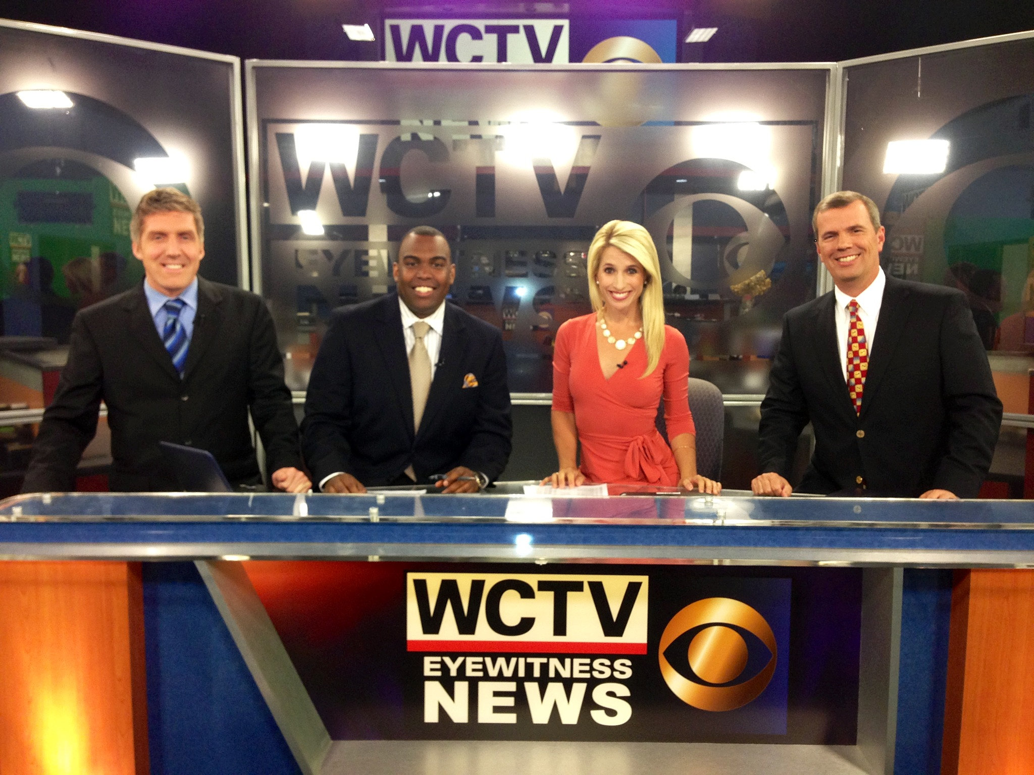
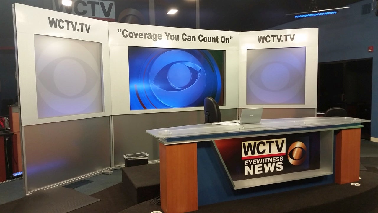
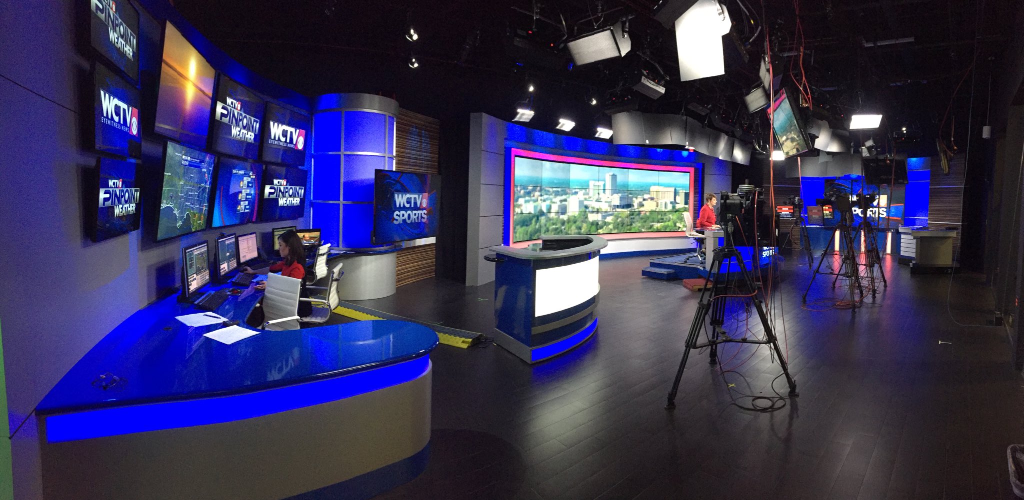
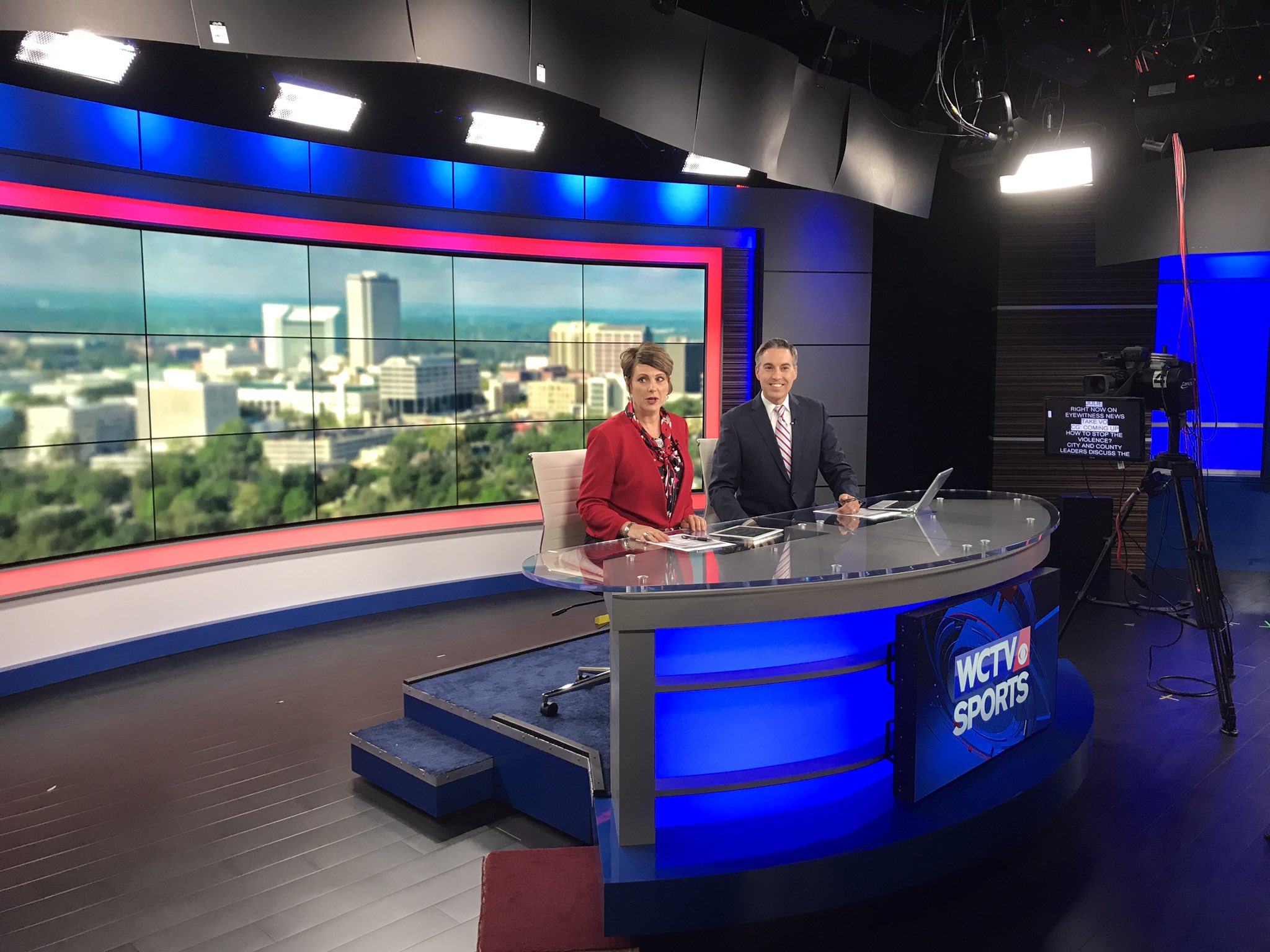
WCTV - CBS Tallahassee FL (State Capitol of FL) - THis is probably one of the biggest upgrades I've seen in ages. Previously the station had a newsroom set. It was pretty bad.
*
Then they added an odd plexiglass etched panels
*
THen at some point a mental defective thought this mess was a good idea. I cant find the words how bad this is. I think the picture speaks for itself.
*
Well today the station relaunched with a new professional set. A bit dark. And a new logo. Very impressive considering what they were using before. And the size of the marker
*
*
MO
Mouseboy33
WROC- 8 CBS Rochester NY
Uhhhh. Nexstar why? Why do they keep doing this? Nexstar station group literally launches these jumbled sets in every market. There are some intersting elements. Like the LCD header over the weather center instead of a bog standard duratrans and a low res curtain behind the the anchor desk. But everything thing else.....ugh. The desks are always clunky designs. And the panels are usually random and unrelated to anything else on the set. (for example the 2 wave-like panels, and the leaning weather center grid) Ive seen worse from Nexstar. But they just arent that great IMO
http://www.newscaststudio.com/wp-content/uploads/2017/10/ncs_wroc-tv-graphics_0034.jpg
http://www.newscaststudio.com/wp-content/uploads/2017/10/ncs_wroc-tv-graphics_0033-1024x576.jpg
From WROC
MO
Mouseboy33
KOAT 7 - Albuquerque NM - Well first Im not a fan of stacked stone. And yellow its probably not the best colour on a news set. But Im not sure why I like elements of this set used at this Hearst station. Most of them use the signature "Hearst Diagrid" pattern (You can see this pattern used at all Hearst stations on the graphics on the screens). Well KOAT breaks that up and uses a sutble mountain pattern to reflect their mountainous location of the city. As well as the colours of the desert, hence the yellow and the stacked stone. I hate the angle podium portions under the monitor arrays. Looks kinda game showy, even though it reflects SW architecture. And whats up with the random white boxes under the screens. Looks strange. I like the desk with the Circle 7 logo embedded. Not sure why I find that frosted overhang attached to the wall just below the yellow band. I like it. Overall this is a nice take on the standard Hearst station group diagrid set.
http://www.newscaststudio.com/wp-content/uploads/2017/10/koat-new-set.jpg
http://www.newscaststudio.com/wp-content/uploads/2017/10/koat-new-set-toss.jpg
Newscaststudio
MO
Mouseboy33
CBRT - CBC Calgary.
Apparently the CBC sold the previous facility to move into a smaller building. The move meant a new set was designed and there was a tech upgrade. I love the modern aesthetic. And the diamond design is quite unique. I really like the layered, local imagery and the street grid background. Well done to the CBC. Unfortunately with the CBC's constant budget issues, its unlikely these sets would be rolled out nationally, but who knows. They are selling off loads of oversized properties for a number of years now and moving to smaller premises all over the country.
See the set in action here http://www.cbc.ca/player/play/1083261507992
http://www.cbc.ca/news/canada/calgary/events/cbc-calgary-moving-new-location-1.4359438

*
*
TVNT

10 days later

MO
Mouseboy33
CBC - The NATIONAL Launches tonight with 4 presenters and a new set. The show has departed from the brighter set used for previous Peter Mansbridge version. Now the set is darker. Most of the CBC news sets are white a bright including the CBCnewsNETWORK set. The National is currently beaten in the ratings by CTV National News and Global National so, it will be interesting to see if this new look and line up and push the ratings.

More from the CBC Website. http://www.cbc.ca/news/entertainment/national-cbc-news-stories-digital-1.4383591

*
*
*
*
Here are 4 new presenters that a will present the show from Vancouver Ottawa and Toronto
*

For reference here is the
Previous The National with Peter Mansbridge set
*
CBC NewsNetwork set
*
The old incomparable opening to the National from the early 2000s, best theme ever IMO
Last edited by Mouseboy33 on 6 November 2017 2:42pm - 5 times in total
RK
Rkolsen
What type of pedestals are they using?
JU
Justin
CBC - The NATIONAL Launches tonight with 4 presenters and a new set. The show has departed from the brighter set used for previous Peter Mansbridge version. Now the set is darker. Most of the CBC news sets are white a bright including the CBCnewsNETWORK set. The National is currently beaten in the ratings by CTV National News and Global National so, it will be interesting to see if this new look and line up and push the ratings.


The new intro is really not working for me. Really needs a voiceover of some kind.


Last show before the relaunch; much more authoritative feel (starts at 1:45)
Quatorzine Neko and Kevizz MS gave kudos
KM
Kevizz MS
The graphics are quite clunky and amateurish. The minimalist aesthetic they're aiming for isn't very forgiving and it's all a bit powerpoint.

Different audience but Vice does it much better:


Really like the format however, original and quite compelling. Feels a traditional newsmagazine but with the relevance of daily news.
JS
JosiahStuart
Yes, the graphics are a bit PowerPoint-like; but the new format of The National is very compelling. I'm definitely going to find it interesting when 1 or 2 of the 4 (Adrienne, Rosemary, Andrew, and Ian) are out in the field.
Justin and Mouseboy33 gave kudos

Newer posts