DV
Contrasts .....
Tomorrow here the Met Office are forecasting on the BBC Site winds maxing briefly at 20mph NW, in comparison Meteogroup have a full on gale blowing at times in excess of 40mph for nine hours. Will let you know what the outcome is.
Tomorrow here the Met Office are forecasting on the BBC Site winds maxing briefly at 20mph NW, in comparison Meteogroup have a full on gale blowing at times in excess of 40mph for nine hours. Will let you know what the outcome is.
PE
peterrocket
Founding member
The two can often be exactly the same or wildly different, but so far Meteo have been closer to the truth over the last two days than Met Office.
:-(
A former member
Isn’t Meteo using multiple sources whereas the Met Office just uses its own?
:-(
A former member
Still getting Met Office here...
RO
I think we might be onto v2.3 of Reith now, with a lot of the recent work being on the condensed variants.
I have seen mention of this being V2 of the font. Perhaps it wasn't fully hinted and tuned for mobile displays until recently?
I think we might be onto v2.3 of Reith now, with a lot of the recent work being on the condensed variants.
SJ
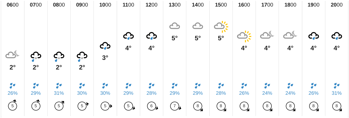
This may just be me being desperately thick here, but what determines which symbol is shown in the new system? In this example, a 26% chance of rain at 1600 gets a cloudy-with-sun symbol, and a 26% chance at 1900 gets a rain symbol. Am I alone in finding that a little confounding? Is it to do with the duration of rain forecast within the hour?


SC
scottishtv
Founding member
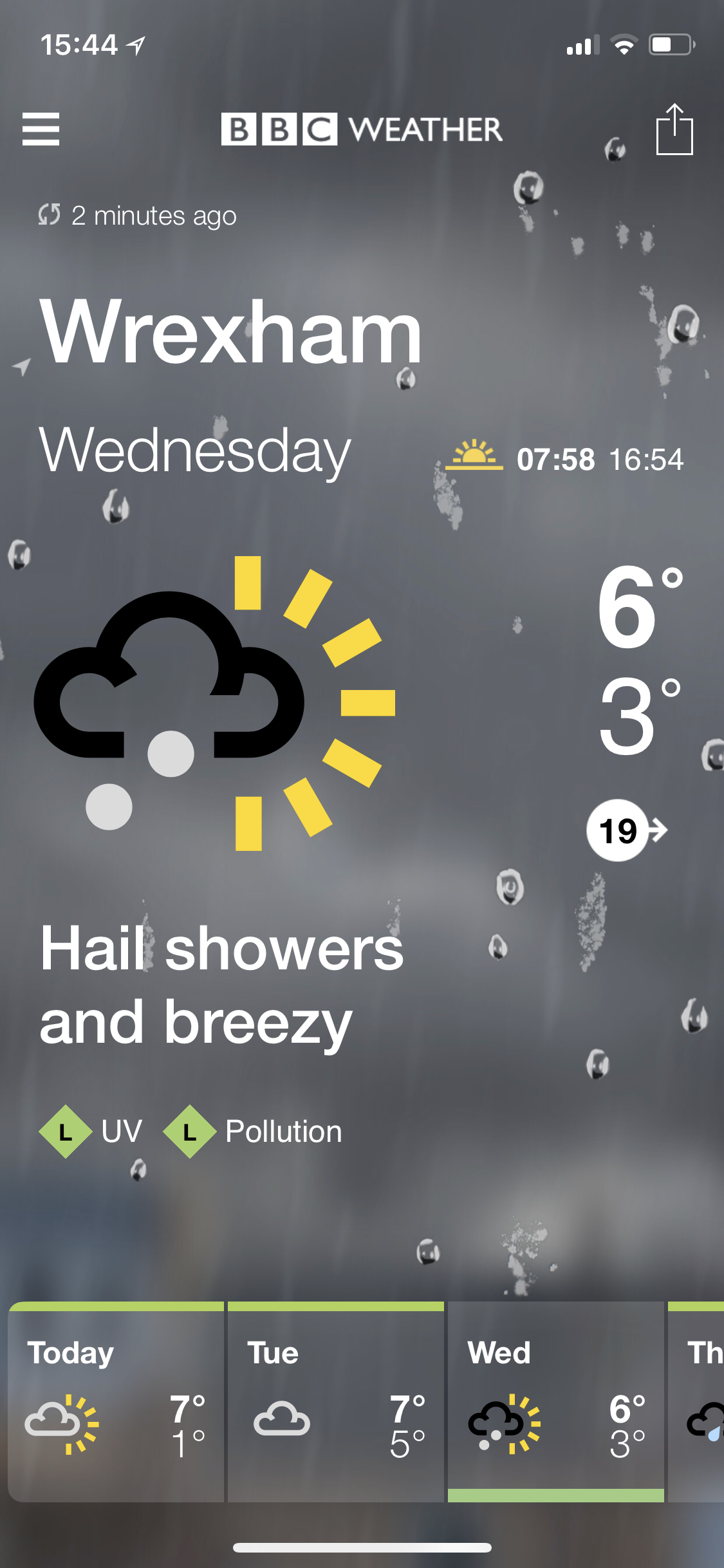
I'm afraid I don't have answers, but only another question. I can't work out what the coloured lines are for each day on the summary. They seem to vary quite a bit, and don't look like pollen or U.V. 

EDIT: Oh, actually think it's quite simple. Looks like I there is going to be a temperature colour gradient in use. Dark blue (cold), blue then through greens, yellows (all I've seen so far) but guess it'll run through oranges and probably red?
DOUBLE EDIT: Didn't realise the colour on the temperature symbols were always varied on the website. Wonder if that will come to the telly forecasts too.
