RH
richard h
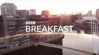
Video from the 6am opening sequence this morning for the refreshed BBC Breakfast. No huge surprises in the look, but good to see it in line with the rest of the output.
Video


Video
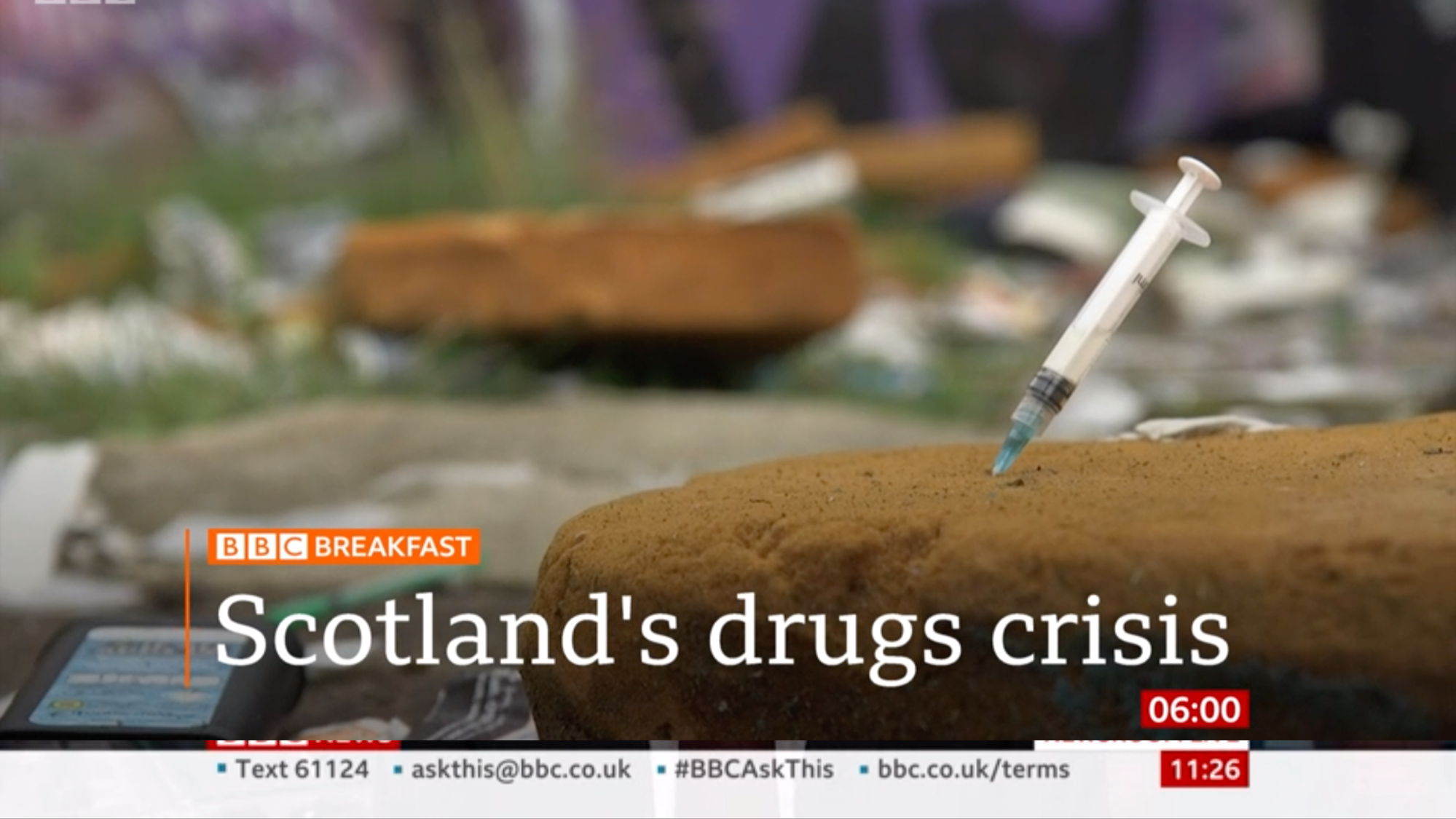
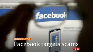
Every headline shown so far this morning has used the single line of text too which I think looks a lot nicer
DG
I think it looks smarter than that still we saw. Plus, the wipe is from the bottom, in line with the sunrise, now which makes much more sense!
SP
I think with so much detail in the Salford images, a heavier weight of Reith for the logo would have worked better. It just doesn’t really punch through as it is. Looks okay when used on the relatively plain orange background though.
I think with so much detail in the Salford images, a heavier weight of Reith for the logo would have worked better. It just doesn’t really punch through as it is. Looks okay when used on the relatively plain orange background though.
CU
I agree that the Reith version of the Breakfast title is a little too light and could be heavier / thicker.
Beyond laziness, I still don't understand why they haven't used this as an opportunity to do away with the remants of the disco ball title sequence on their backdrop. Or even completely revamp that backdrop / set.
Hopefully the arrival of the new editor in September will shake things up a little in this respect, but I'm not holding my breath.
RN
I quite like the small music refresh but do agree the font could be heavier. And yes, as Jay Lee points out, another opportunity missed in sorting the backdrop out (not that I really expected much).
PA
I agree that a thicker weight of Reith could be used, but I suppose it does mean that its a uniform logo now as opposed to the thicker logo that was used on all the previous graphics compared to the thin weight of Gill used to match 'NEWS' on the old lower thirds.
It would be nicer if they did apply the orange to the live graphic and the clock.
I also noticed that the clock, when compared to the NC, is quite a bit larger, it's not really much of an issue, I just would have expected them to be the same, but I do think the NC version looks better, I don't think the Breakfast one fits the box that well.
LL
London Lite
Founding member
The lower thirds work well on Breakfast. Prefer having the clock in a box instead of the 1/4 strap used before.
Thumbs up for me.
Thumbs up for me.
