JI
Every now and then over the last 10 years, I’ve have taken the opportunity to post and share work and creations I undertook in my spare time. The last several years have been relatively quite due to my own life commitments taking time away from undertaking further developments and improvements. Some projects were very ambitious and sadly little was ever made, whilst others I took time to tweak the design and add a little uniqueness to the work.
Over the years, the threads became stale and many of the images lost to Image Hosting platforms, and with myself being concerned about data, I also removed links to videos which further showcased the work. The closing of the TV Forum site as made me question my past decisions, and why I struggled to showcase my work and accept the criticisms.
This time, I want to take ownership of my work, and showcase some work that was also not released.

ABC News 2010 Graphics
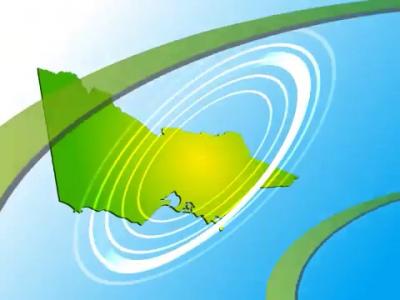
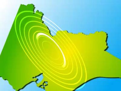
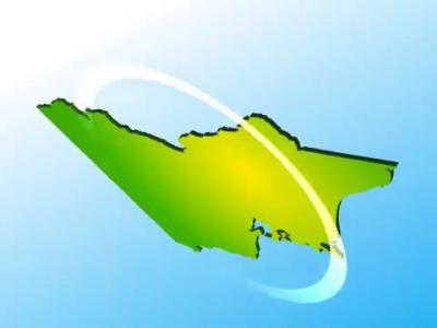
This project was intended to be an ambitious project undertaken in 2013. The ABC launched their News Channel, and a wholesale change was made to the graphics package. At the time I was boarding in Melbourne and some housemates were wanting to stretch their creative works, and wanted to create News Bulletin updates similar to what was broadcast on TV. Mentioning the work I was undertaking, I made efforts to recreate the ABC News Graphics package.
I had no forehand knowledge about the design cues and concepts, and could only work with what I saw. Sliding Boxes and segmented pictures looked to be the design language, and often, the photos would be replaced depending on the programme. One thing I found lacking was how blurred the graphics looked, even under 720p High Definition, and there were too many static images for my own liking.
I set my challenged to combine these issues and reattempt the design.


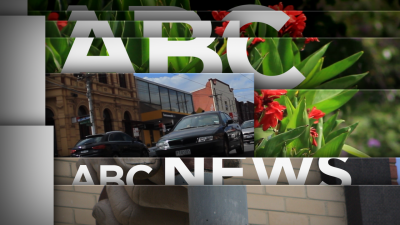
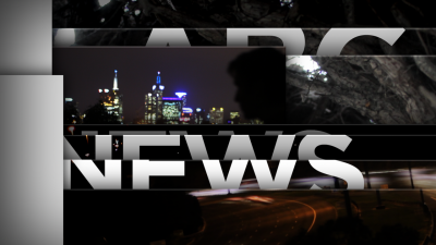
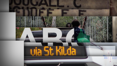
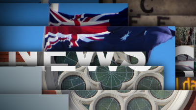
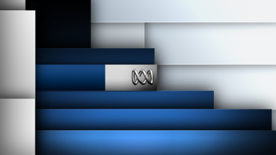
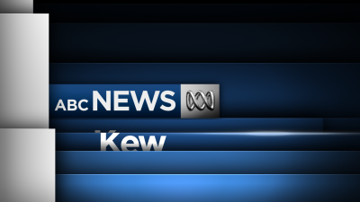
I also took the challenge of recreating the Promo Boards and make a Backdrop Template for presenters, where an image can be placed behind the overlays and re-rendered. Taking advantages of After Effect’s Dynamic Layering features.



Lastly, there was the footer banner. It was always a static image, and I wanted to give it some life.
I never returned to this project and 2014 was the last year it was touched.

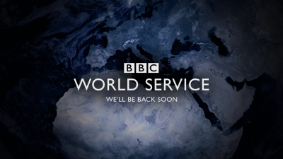
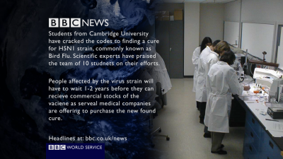
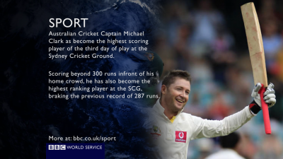
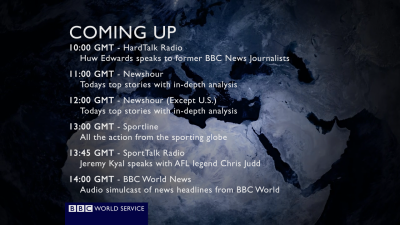
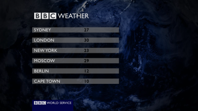
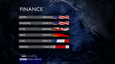
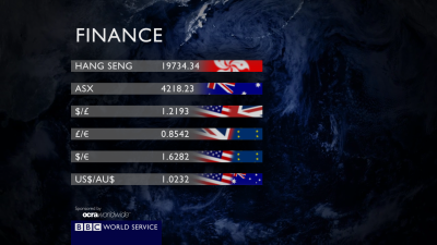
BBC World Service Breakfiller
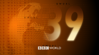
Stumbling around David Lowe’s old Member’s Area (Some TVF users may remember that), I came across a shared piece of work called the “Breakdown Music”. It was intended to be played out over the radio if there were ever internal disruptions to broadcasting, and music needed to be played to avoid dead air. Something akin to the Breakdown animations played on BBC World and News 24.
Listening to the music, I observed that the song was broken into music motifs and styles as it played, and reminded myself of the breakfiller Pre-"Dynamic Junctions". Jumping straight into After Effects, I cobbled together a background loop which spanned the length of the song, then started creating Composition templates where I could write up content for each.
The background, I was hoping for the use of the Cat’s Cradle, but could not attempt it at the time, but it sufficed with a dark blue tint, representative of the World Service logo at the time.
At the time, during 2012 I had originally shared by work with the TV Forum community, and got some nice ideas, and managed to incorporate them into the work. The long render times ended up exhausting me and I dropped the work. I have since managed to re-render the work.
BBC Four News
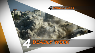
I really don’t remember much about this project. It was undertaken in late 2011, and I was finishing my final year. Gosh I am old. This work is probably my earliest that I ever retained related to TV content, suitable for TV Forum consumption.
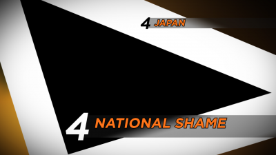
It was a take on BBC Four News from 2002. Intending to use the 4 as the symbol of choice for astons and the opening titles. Probably more suitable for Channel 4 rather than BBC Four.
I had the design patterned down, I just struggled to find suitable images, and the footage was too low quality for my liking. Plus it is super taxing on my computer when rendering, even today, as my version of After Effects doesn’t register later versions of OpenGL, nor does it take advantage of GPU processing.



Ten News 1994 in HD
This is more of a recent activity. Stumbling across some old News recordings of Ten News, I had the iconic drum build up I am familiar with, but I never recall the design language, though I found it very interesting, and was reminded was past work. The use of box (all be it on angles), and drop shadows, I knew I could recreate this, and have it up-scaled to High Definition.
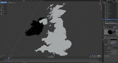
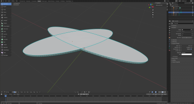
This was a fun reattempt. Finding the correct font was not, as something is up with that “E” character, even in the old VHS footage. Where I knew I would struggle with is anything that is 3D, and rendered externally. I can leverage Blender, but having footage super imposed in Blender is a nightmare. So I sufficed for simple shapes in 3D space. Looks not-great, but it’s fine for concept.


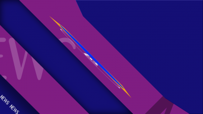



A friend of mine requested a Old-Timey News Summary sting.
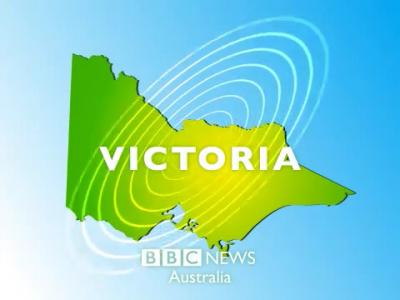
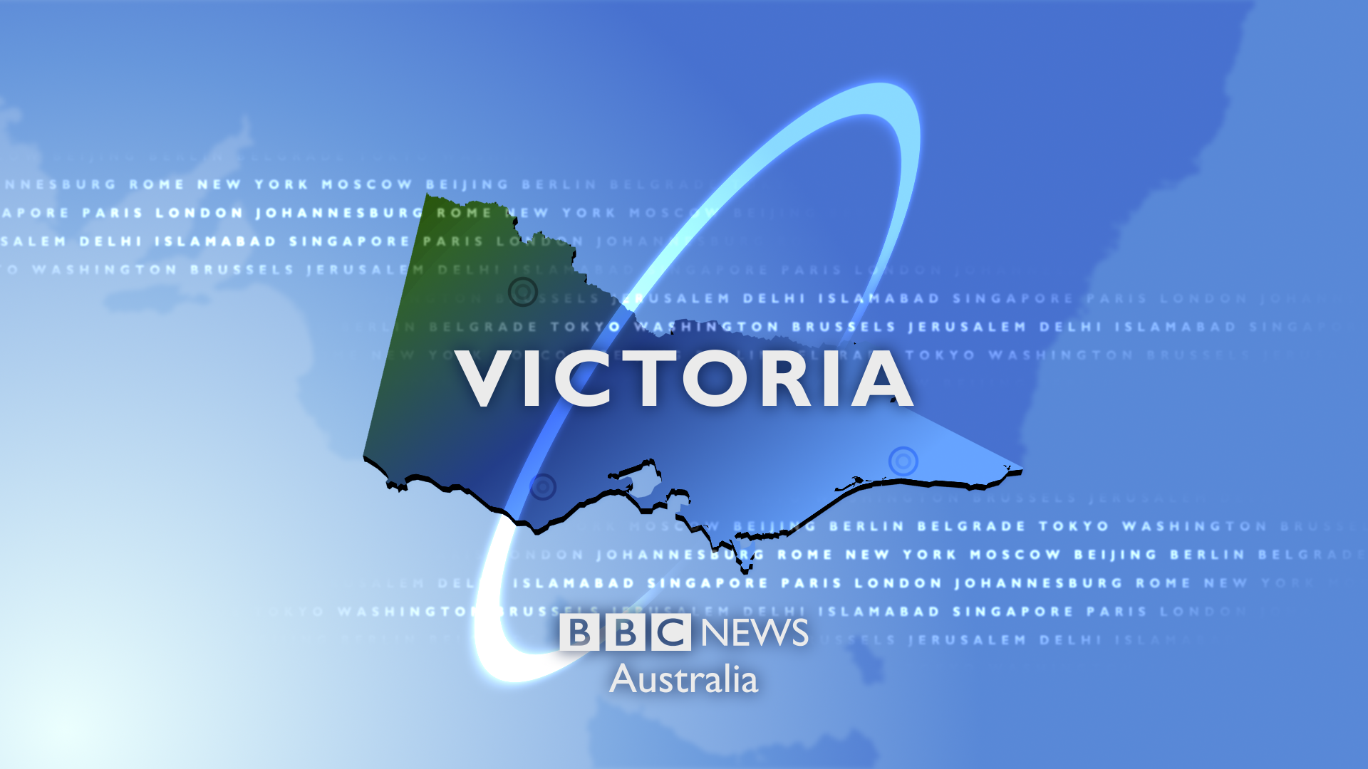
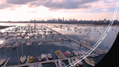
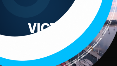
I really do like the 2019 BBC News Regions. Maybe I can make it fit the ABC News styling. They seem to be using some upward-sliding panels too.

Over the years, the threads became stale and many of the images lost to Image Hosting platforms, and with myself being concerned about data, I also removed links to videos which further showcased the work. The closing of the TV Forum site as made me question my past decisions, and why I struggled to showcase my work and accept the criticisms.
This time, I want to take ownership of my work, and showcase some work that was also not released.

ABC News 2010 Graphics
This project was intended to be an ambitious project undertaken in 2013. The ABC launched their News Channel, and a wholesale change was made to the graphics package. At the time I was boarding in Melbourne and some housemates were wanting to stretch their creative works, and wanted to create News Bulletin updates similar to what was broadcast on TV. Mentioning the work I was undertaking, I made efforts to recreate the ABC News Graphics package.
I had no forehand knowledge about the design cues and concepts, and could only work with what I saw. Sliding Boxes and segmented pictures looked to be the design language, and often, the photos would be replaced depending on the programme. One thing I found lacking was how blurred the graphics looked, even under 720p High Definition, and there were too many static images for my own liking.
I set my challenged to combine these issues and reattempt the design.


I also took the challenge of recreating the Promo Boards and make a Backdrop Template for presenters, where an image can be placed behind the overlays and re-rendered. Taking advantages of After Effect’s Dynamic Layering features.


Lastly, there was the footer banner. It was always a static image, and I wanted to give it some life.
I never returned to this project and 2014 was the last year it was touched.

BBC World Service Breakfiller
Stumbling around David Lowe’s old Member’s Area (Some TVF users may remember that), I came across a shared piece of work called the “Breakdown Music”. It was intended to be played out over the radio if there were ever internal disruptions to broadcasting, and music needed to be played to avoid dead air. Something akin to the Breakdown animations played on BBC World and News 24.
Listening to the music, I observed that the song was broken into music motifs and styles as it played, and reminded myself of the breakfiller Pre-"Dynamic Junctions". Jumping straight into After Effects, I cobbled together a background loop which spanned the length of the song, then started creating Composition templates where I could write up content for each.
The background, I was hoping for the use of the Cat’s Cradle, but could not attempt it at the time, but it sufficed with a dark blue tint, representative of the World Service logo at the time.
At the time, during 2012 I had originally shared by work with the TV Forum community, and got some nice ideas, and managed to incorporate them into the work. The long render times ended up exhausting me and I dropped the work. I have since managed to re-render the work.


BBC Four News
I really don’t remember much about this project. It was undertaken in late 2011, and I was finishing my final year. Gosh I am old. This work is probably my earliest that I ever retained related to TV content, suitable for TV Forum consumption.
It was a take on BBC Four News from 2002. Intending to use the 4 as the symbol of choice for astons and the opening titles. Probably more suitable for Channel 4 rather than BBC Four.
I had the design patterned down, I just struggled to find suitable images, and the footage was too low quality for my liking. Plus it is super taxing on my computer when rendering, even today, as my version of After Effects doesn’t register later versions of OpenGL, nor does it take advantage of GPU processing.


Ten News 1994 in HD
This is more of a recent activity. Stumbling across some old News recordings of Ten News, I had the iconic drum build up I am familiar with, but I never recall the design language, though I found it very interesting, and was reminded was past work. The use of box (all be it on angles), and drop shadows, I knew I could recreate this, and have it up-scaled to High Definition.
This was a fun reattempt. Finding the correct font was not, as something is up with that “E” character, even in the old VHS footage. Where I knew I would struggle with is anything that is 3D, and rendered externally. I can leverage Blender, but having footage super imposed in Blender is a nightmare. So I sufficed for simple shapes in 3D space. Looks not-great, but it’s fine for concept.


A friend of mine requested a Old-Timey News Summary sting.
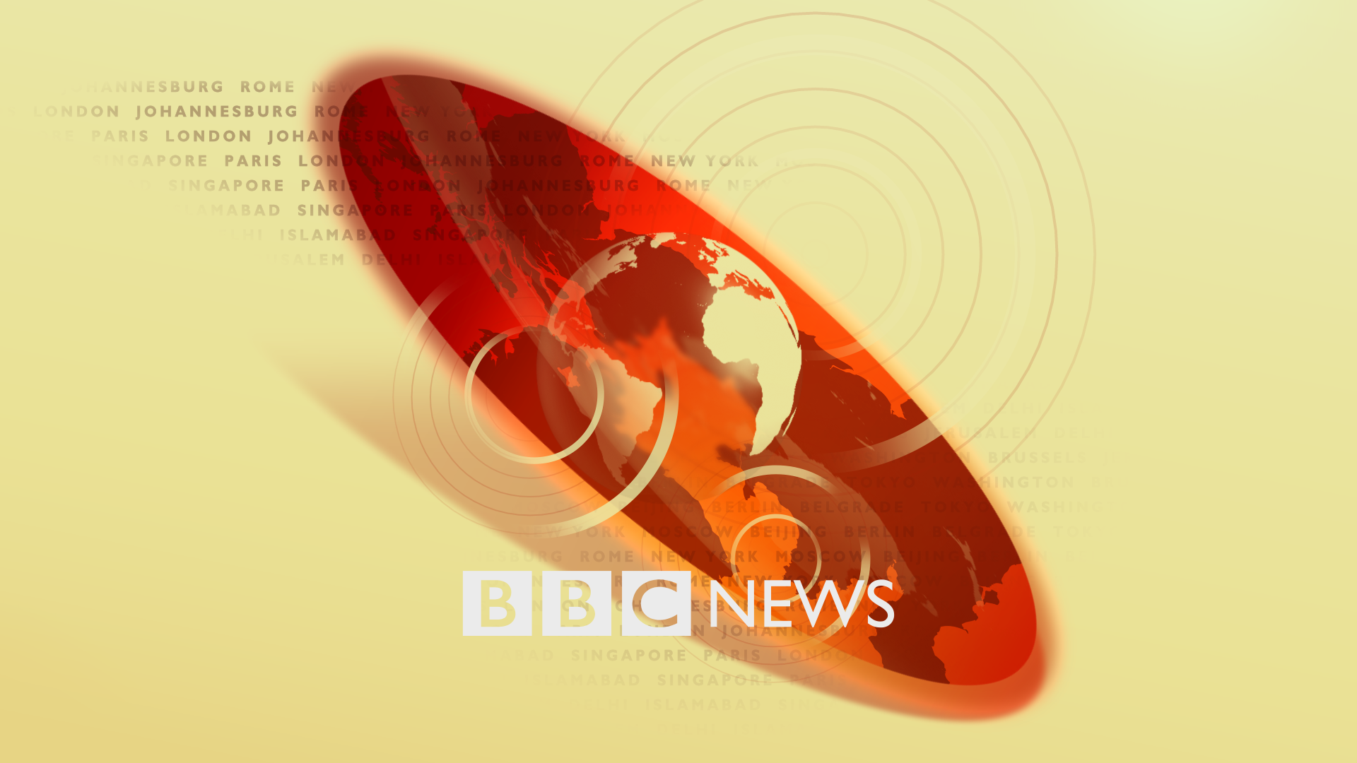
I really do like the 2019 BBC News Regions. Maybe I can make it fit the ABC News styling. They seem to be using some upward-sliding panels too.


Last edited by Jimmyson on 13 March 2021 4:05am - 2 times in total
