AM
Hello. I've been thinking a lot recently about how messy the BBC Radio names have become. None really fit together, some have overly long names, some short ones. Some logos are just some text in a circle.
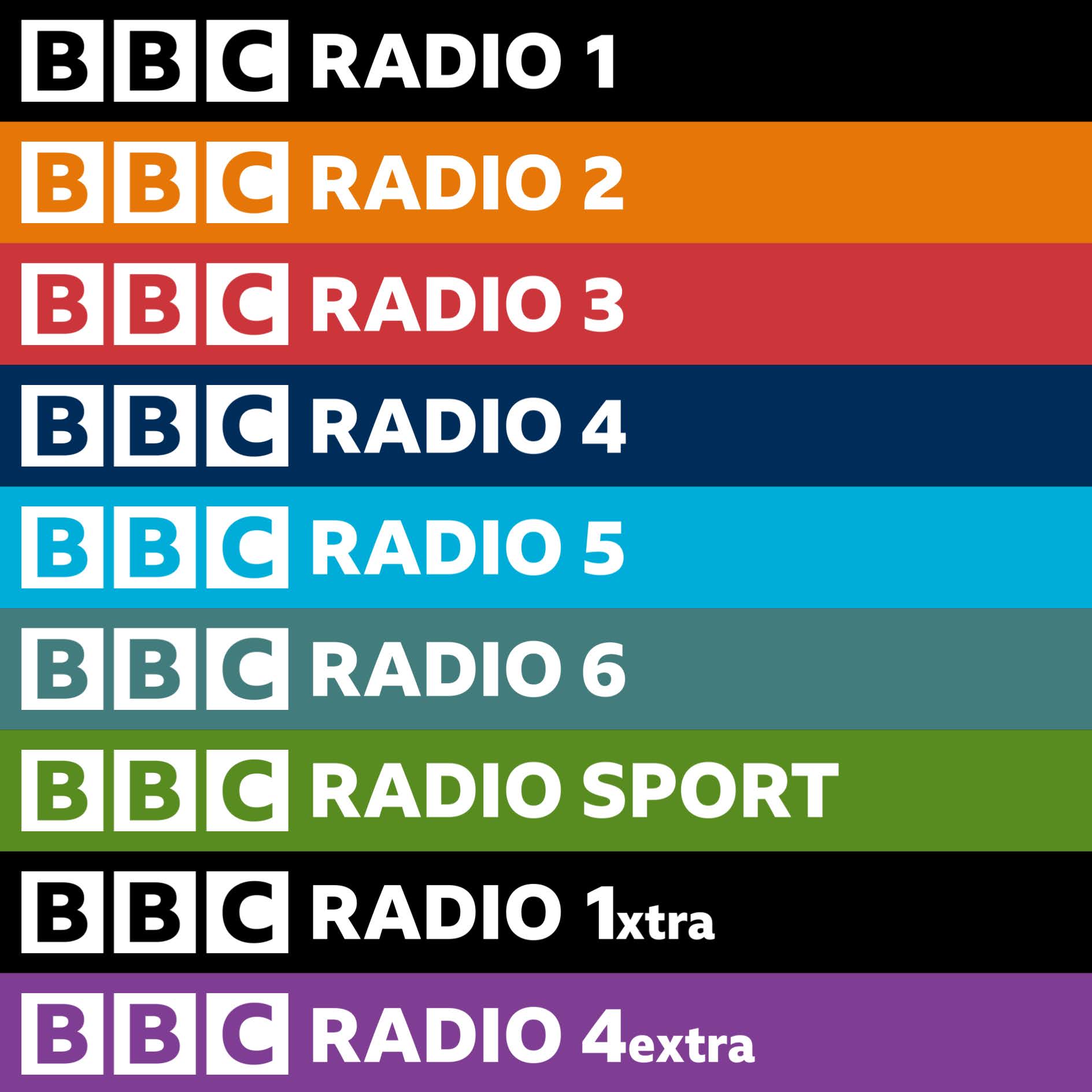
I've designed a new style for BBC Radio logos (and some for the main TV Channels too). I've used a version of the BBC logo with Reith Extra Bold.
Hope you enjoy.
BBC National Radio:
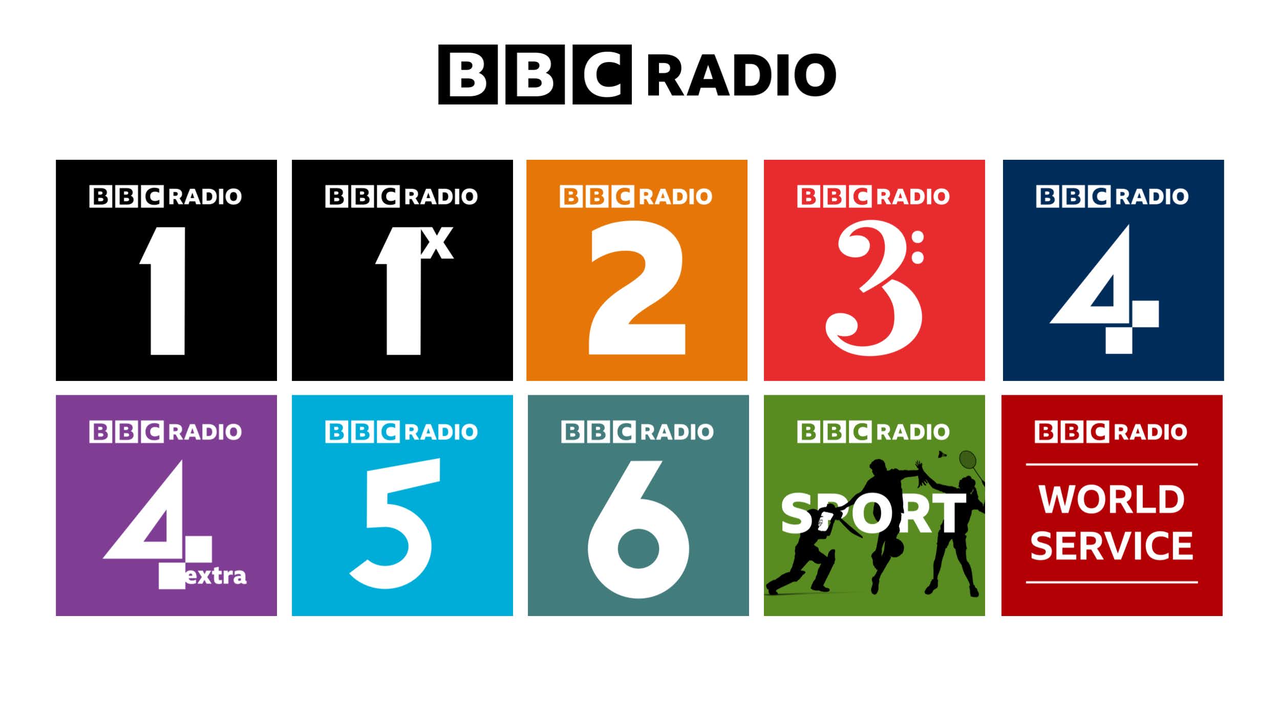
• Radio 5 Live becomes Radio 5
• Radio 5 Live Sports Extra becomes Radio Sport
• Radio 6 Music becomes Radio 6
• Main 'Radio' Text in Reith Extra Bold
• Radio 2 Changed to Reith Extra Bold
• Radio 1, 3 and 6 remain largely unchanged
• Radio 4 and 5 get new icons.
BBC Local Radio
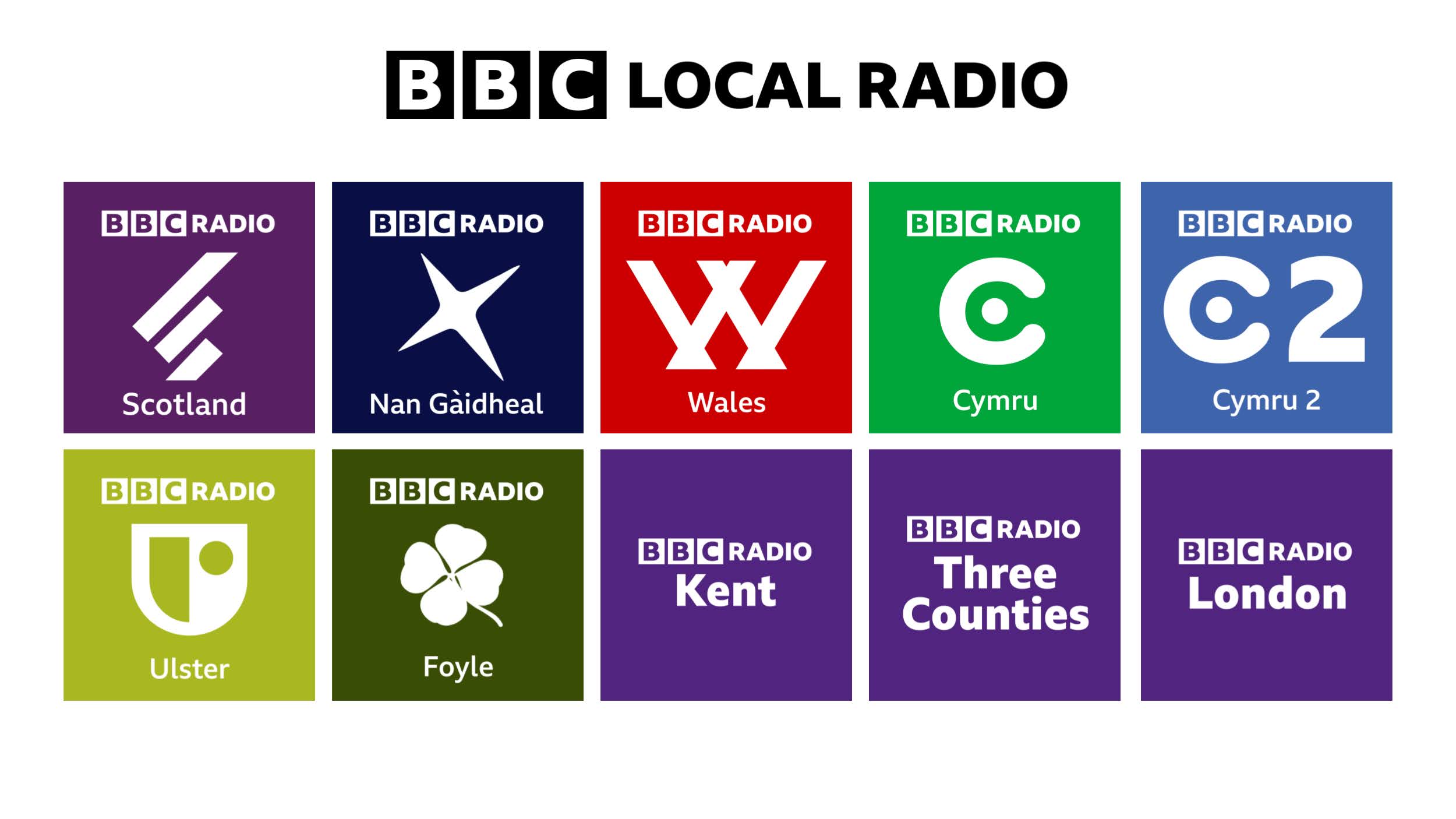
• Scotland and Local Radio remain largely unchanged
• Nan Gaidheal adopts the 'Alba Star'
• Wales and Doyle get new icons
• Cymru, Cymru 2 and Ulster see older icons return (from TV and Radio in the region
BBC Television
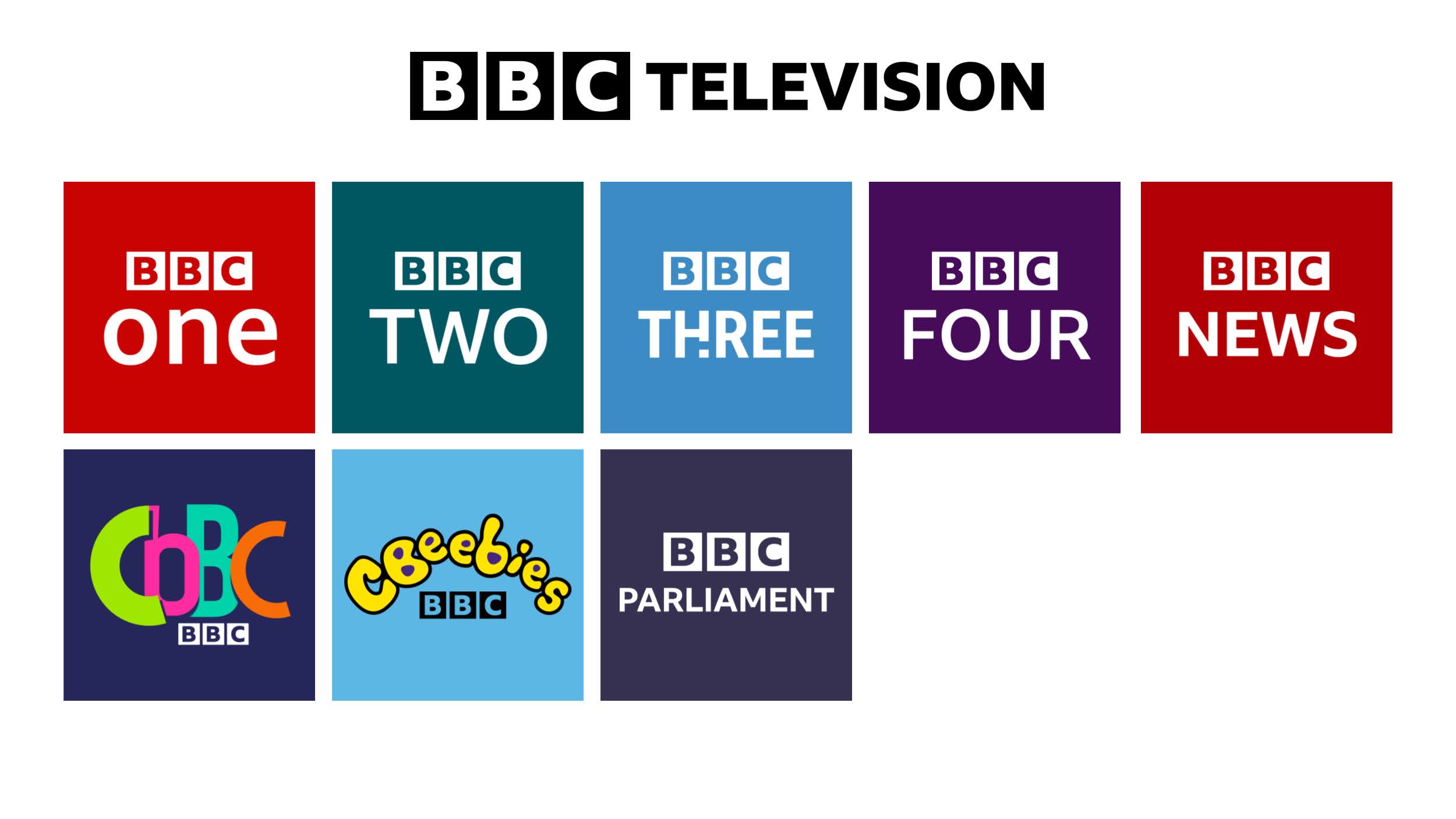
• BBC One, Two and Four get converted to Reith Medium
• BBC Three gets converted to Reith Condensed Bold
• BBC News and Parliament convert to Reith Bold
• CBBC Gets new logo. Inspired by the current 'compressed' look.
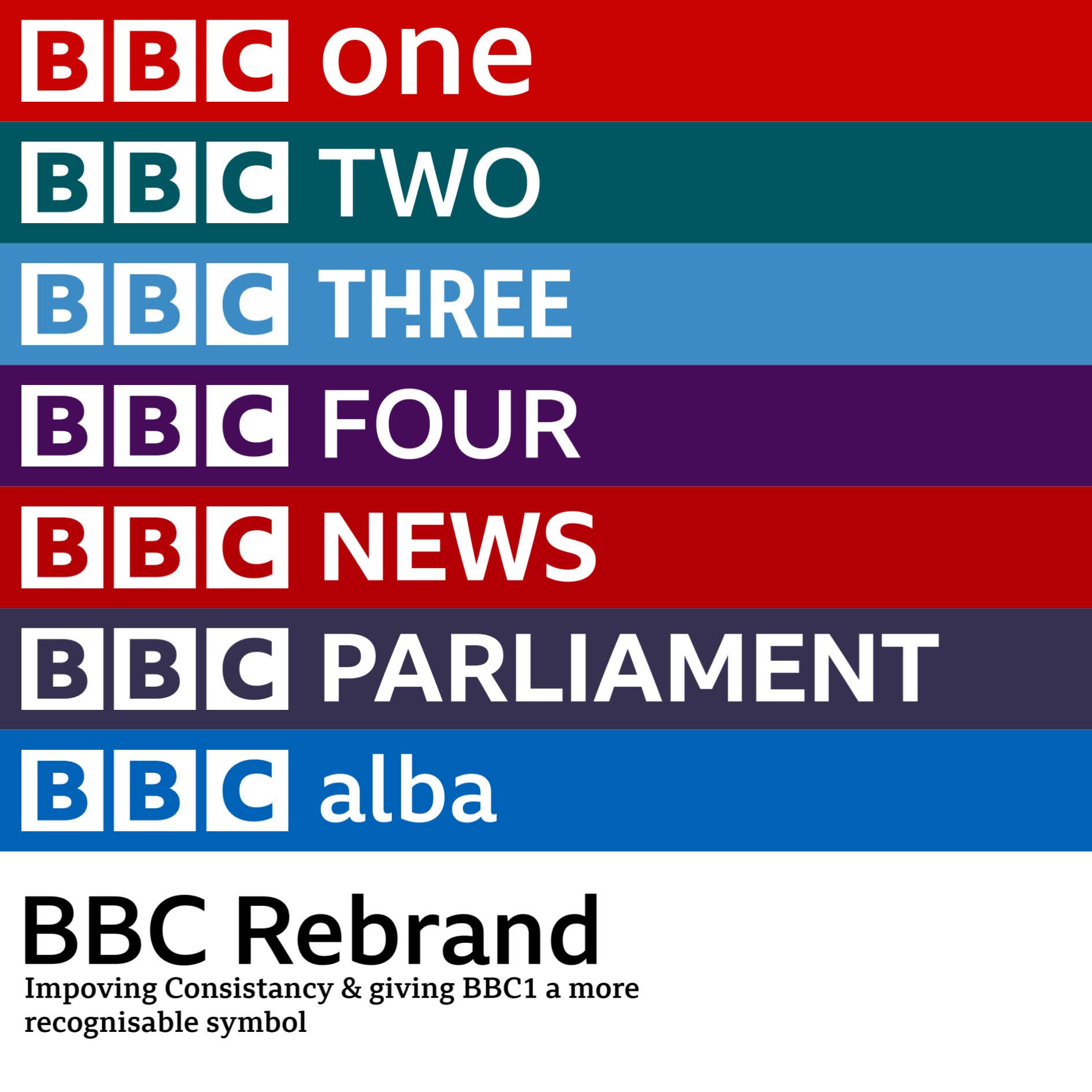
Horizontal Versions
----------------------------------------------------------
I'm currently working on a symbol for BBC one where the icon can become part of monuments up and down the country. Eg. Flag on palace of Westminster, pigeon in Cardiff Assembly, fence topper at White cliffs etc.
I've designed a new style for BBC Radio logos (and some for the main TV Channels too). I've used a version of the BBC logo with Reith Extra Bold.
Hope you enjoy.
BBC National Radio:

• Radio 5 Live becomes Radio 5
• Radio 5 Live Sports Extra becomes Radio Sport
• Radio 6 Music becomes Radio 6
• Main 'Radio' Text in Reith Extra Bold
• Radio 2 Changed to Reith Extra Bold
• Radio 1, 3 and 6 remain largely unchanged
• Radio 4 and 5 get new icons.
BBC Local Radio

• Scotland and Local Radio remain largely unchanged
• Nan Gaidheal adopts the 'Alba Star'
• Wales and Doyle get new icons
• Cymru, Cymru 2 and Ulster see older icons return (from TV and Radio in the region
BBC Television

• BBC One, Two and Four get converted to Reith Medium
• BBC Three gets converted to Reith Condensed Bold
• BBC News and Parliament convert to Reith Bold
• CBBC Gets new logo. Inspired by the current 'compressed' look.
Horizontal Versions


----------------------------------------------------------
I'm currently working on a symbol for BBC one where the icon can become part of monuments up and down the country. Eg. Flag on palace of Westminster, pigeon in Cardiff Assembly, fence topper at White cliffs etc.
Last edited by Alfie Mulcahy on 10 March 2021 10:36pm - 10 times in total