RD
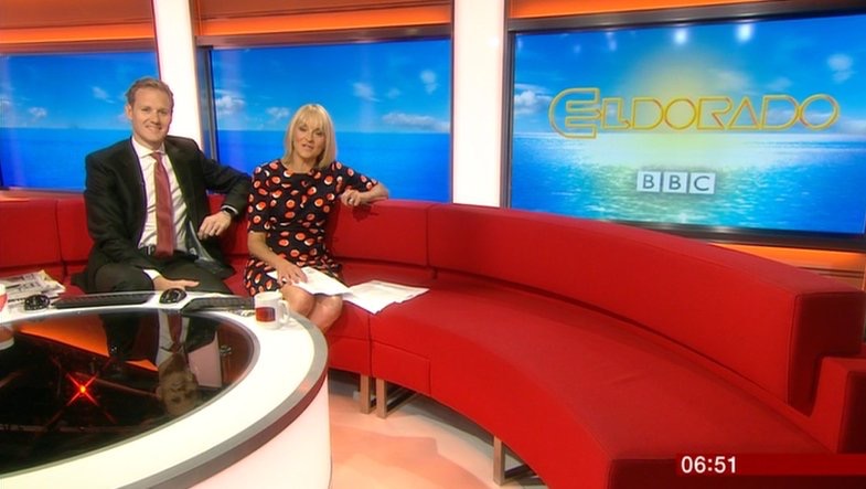
I don't normally do this kind of thing, but I created these mocks for a Facebook group for fans of the short-lived BBC soap opera Eldorado. On the group we constantly mourn the show's passing and wonder what it would be like if it were still around today, or if it were to be recommissioned.
I was quite pleased with how my mocks turned out, so thought I'd share them on here.
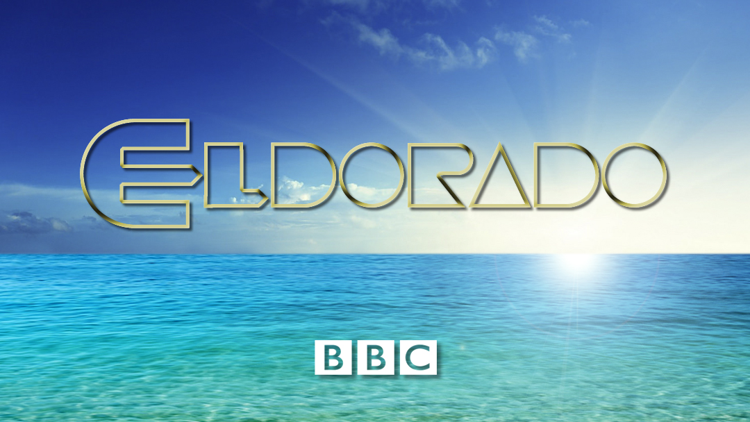
Here are the original 1992 graphics:
I've tried to take into account how the EastEnders titles have evolved, whilst always staying true to the originals, over the course of several decades.
I always thought the original logo looked a bit "clunky" and some of the polygons just looked a bit wrong, somehow. By redrawing the logo with slight tweaks and using it in outline form, it seems to work far better.
I've kept the original Optima font for the credits for the sake of provenance, and because I can't see a good reason to change it.


I was quite pleased with how my mocks turned out, so thought I'd share them on here.
Here are the original 1992 graphics:
I've tried to take into account how the EastEnders titles have evolved, whilst always staying true to the originals, over the course of several decades.
I always thought the original logo looked a bit "clunky" and some of the polygons just looked a bit wrong, somehow. By redrawing the logo with slight tweaks and using it in outline form, it seems to work far better.
I've kept the original Optima font for the credits for the sake of provenance, and because I can't see a good reason to change it.