MF
Yo
Actually I made them on GIMP.
GIMP? You're obviously one of the worst people to use it. I will not make any more comments. GIVE UP MAN!
I have actually been exploring the idea of BBC boxes myself. Comparing yours to mine, I can tell that you did these on Paint, whereas mine is on PowerPoint (as much as it simple and not really ideal for mocks, I still found some good ideas there).
Unless you move onto other software, don't bother carry on with these.
Unless you move onto other software, don't bother carry on with these.
Actually I made them on GIMP.
GIMP? You're obviously one of the worst people to use it. I will not make any more comments. GIVE UP MAN!
DB
Oi. Stop knocking The GIMP, its a good starter to Photoshop. It's how you use it.
Yo
Actually I made them on GIMP.
GIMP? You're obviously one of the worst people to use it. I will not make any more comments. GIVE UP MAN!
I have actually been exploring the idea of BBC boxes myself. Comparing yours to mine, I can tell that you did these on Paint, whereas mine is on PowerPoint (as much as it simple and not really ideal for mocks, I still found some good ideas there).
Unless you move onto other software, don't bother carry on with these.
Unless you move onto other software, don't bother carry on with these.
Actually I made them on GIMP.
GIMP? You're obviously one of the worst people to use it. I will not make any more comments. GIVE UP MAN!
Oi. Stop knocking The GIMP, its a good starter to Photoshop. It's how you use it.
BA
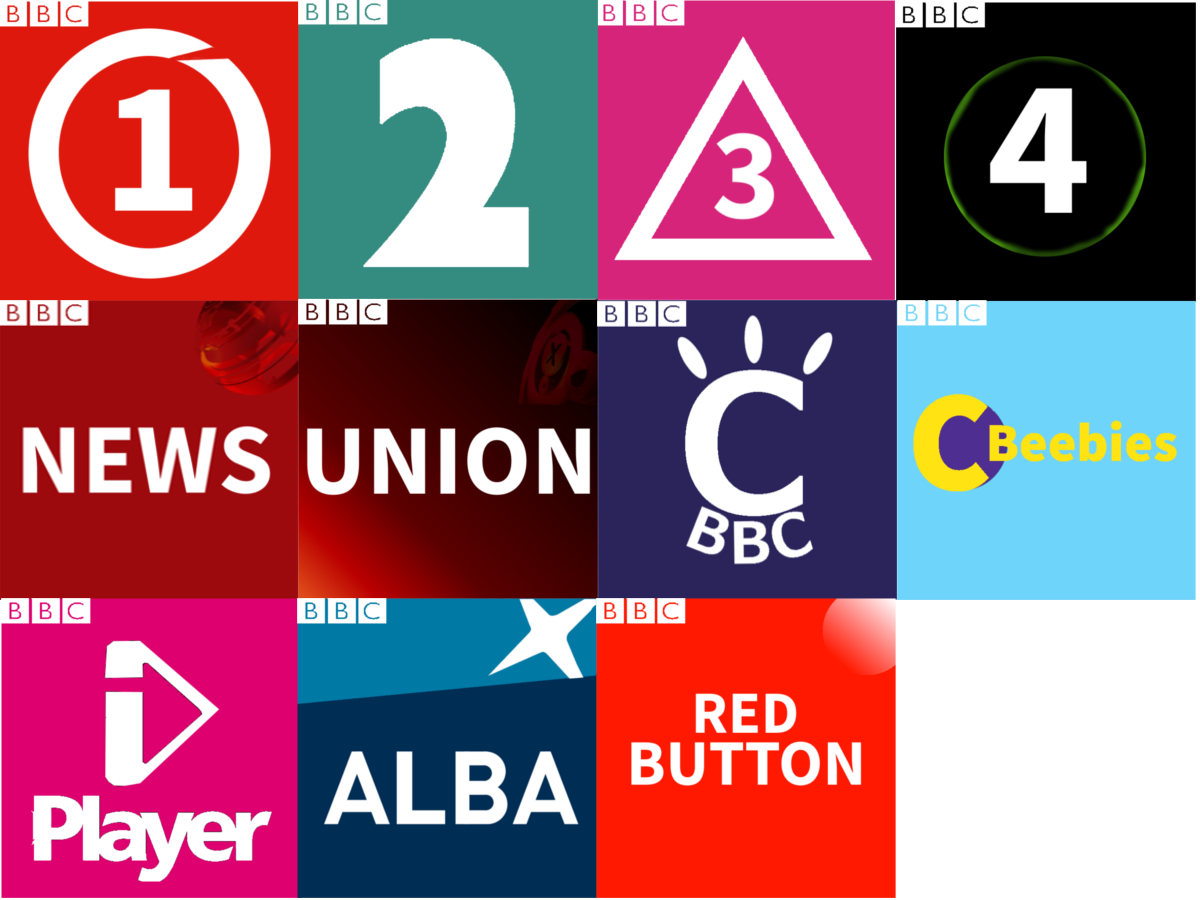
Okay, I am back. I have tried to create a similar look for each of the logo, while keeping their personality. Frankly, for CBBC and CBeebies, those are my last ideas. The coloured ring around BBC 4 will change colour based on what it is placed on.
Okay, I am back. I have tried to create a similar look for each of the logo, while keeping their personality. Frankly, for CBBC and CBeebies, those are my last ideas. The coloured ring around BBC 4 will change colour based on what it is placed on.
Last edited by TheBATs on 30 March 2016 8:13pm
AA
Could you please stop the ridiculous comments? You say this to every new member, and you look just as stupid each time. Quite frankly, I think the majority would be glad if you didn't comment further. All you do in this section of the gallery is have a go at new members. You never give any useful feedback, nor do you submit anything.
Comments like "give up" and "nobody wants you here" aren't useful in any way whatsoever. Whilst this forum is harsh, you seem to take things much further than anybody else.
Yo
Actually I made them on GIMP.
GIMP? You're obviously one of the worst people to use it. I will not make any more comments. GIVE UP MAN!
I have actually been exploring the idea of BBC boxes myself. Comparing yours to mine, I can tell that you did these on Paint, whereas mine is on PowerPoint (as much as it simple and not really ideal for mocks, I still found some good ideas there).
Unless you move onto other software, don't bother carry on with these.
Unless you move onto other software, don't bother carry on with these.
Actually I made them on GIMP.
GIMP? You're obviously one of the worst people to use it. I will not make any more comments. GIVE UP MAN!
Could you please stop the ridiculous comments? You say this to every new member, and you look just as stupid each time. Quite frankly, I think the majority would be glad if you didn't comment further. All you do in this section of the gallery is have a go at new members. You never give any useful feedback, nor do you submit anything.
Comments like "give up" and "nobody wants you here" aren't useful in any way whatsoever. Whilst this forum is harsh, you seem to take things much further than anybody else.
DB

Okay, I am back. I have tried to create a similar look for each of the logo, while keeping their personality. Frankly, for CBBC and CBeebies, those are my last ideas. The coloured ring around BBC 4 will change colour based on what it is placed on.
It's your first mock, it's not the worst I've seen, but not the best. It looks a bit rough and ready at the moment. I'd say research the 4/5 star mocks on here and practice developing your mocking skills. Turn on Anti-aliasing, make text look smooth rather than jagged around the edges.
BA
Okay, I am back. I have tried to create a similar look for each of the logo, while keeping their personality. Frankly, for CBBC and CBeebies, those are my last ideas. The coloured ring around BBC 4 will change colour based on what it is placed on.
It's your first mock, it's not the worst I've seen, but not the best. It looks a bit rough and ready at the moment. I'd say research the 4/5 star mocks on here and practice developing your mocking skills. Turn on Anti-aliasing, make text look smooth rather than jagged around the edges.
Thanks for the advice. Quick Question, is anti-aliasing a filter that you apply to layers, or a mode/option in for example the settings menu. If it is the second option. could you please inform me on where it is in GIMP 2.8 or tell me of a program that would probably be better for mocking? Thanks.
CH
Okay, I am back. I have tried to create a similar look for each of the logo, while keeping their personality. Frankly, for CBBC and CBeebies, those are my last ideas. The coloured ring around BBC 4 will change colour based on what it is placed on.
It's your first mock, it's not the worst I've seen, but not the best. It looks a bit rough and ready at the moment. I'd say research the 4/5 star mocks on here and practice developing your mocking skills. Turn on Anti-aliasing, make text look smooth rather than jagged around the edges.
Thanks for the advice. Quick Question, is anti-aliasing a filter that you apply to layers, or a mode/option in for example the settings menu. If it is the second option. could you please inform me on where it is in GIMP 2.8 or tell me of a program that would probably be better for mocking? Thanks.
From the GIMP help:
Quote:
Click on the fonts button Aα to open the font selector of this tool, which offers you a list of installed X fonts.
Quote:
Antialiasing will render the text with much smoother edges and curves. This is achieved by slight blurring and merging of the edges. This option can radically improve the visual appearance of the rendered typeface. Caution should be exercised when using antialiasing on images that are not in RGB color space
DT
One of the issues with this mock is that is expanding on an already poor concept, the BBC's new trend of shrinking and consigning the BBC logo to the upper left corner is both aesthetically unpleasing and undermines the BBC part of the brand. This fault isn't the fault of the mocker but rather which ever marketing company, possibly Perfect Curve, that managed to BS the BBC into buying the II! logo.
With the mockers interpretation of the style, however, only 1-4 and Alba are of a not-poor quality and Alba is essentially the current logo. With 1-4 though there is a deal of inconsistency - three of them are in the same font and those three also are contained within a shape, BBC Two sticks out like a sore thumb given the significantly larger numeral which is in a different font and being on its own.
One of the main issues with the BBC News logo is it emphasises the word 'News' with the BBC logo being insignificant - though given that it is the 'BBC' part of the brand they are keen to emphasis within the crowded news marketplace this is definitely an issue. When it comes to BBC 'Union' the emphasis on BBC isn't as necessary put the word 'Parliament' or 'Politics' would be, why you have changed it to 'Union' is bizarre. If this refers to the United Kingdom then the BBC would most certainly not be allowed to call it Union given that this is taking a political stance - which the BBC's constitution and editorial policy prevents it from doing.
BR
The second batch are definately an improvement but the BBC logo is too small. As DTV says this isn't your fault but doesn't mean you shouldn't work to fix it - the logo looks much better when it is bought in a bit and either centred or occupies the top left half of the box.
I do quite like your idea for the BBC 1 logo containing the circle. Absolutely right to keep the 2 for BBC2. I wouldn't reinvent the BBC3/CBBC logos as that is what is inspiring this mock. BBC 4 is tricky as it's got to be distinctive but clear. 4 squares might work. For CBeebies maybe a childish version of the CBBC logo would work - position it as a spin-off of that rather than a channel it's in it's own right. After all at launch CBBC and CBeebies shared many common elements.
Also don't get the logic in rebranding BBC Parliament as "Union", especially at a time when that phrase would be quite politically sensitive. They'd have to launch BBC Brexit as well.