MW
As a random aside, was the Perfect Day campaign launched before or after the new corporate logo? I was watching a version on Vimeo from director Gregory Rood, where the current corporate logo is on the 'You make it what it is' endboard, whereas a version on The Mill's site shows it with the previous corporate logo on the same end board (and less some of the background effects, which appear on the artists).
Current corporate logo, courtesy of the director
http://www.themill.com/work/bbc-perfect-day.aspx
Previous corporate logo
That IS Gill Sans (Light). As used on the Perfect Day CD.
http://upload.wikimedia.org/wikipedia/en/0/0f/Perfect_Day_single_cover_-_1997.jpg
Varying weights:
http://upload.wikimedia.org/wikipedia/commons/thumb/6/65/Gill_Sans_weights.png/220px-Gill_Sans_weights.png
http://upload.wikimedia.org/wikipedia/en/0/0f/Perfect_Day_single_cover_-_1997.jpg
Varying weights:
http://upload.wikimedia.org/wikipedia/commons/thumb/6/65/Gill_Sans_weights.png/220px-Gill_Sans_weights.png
As a random aside, was the Perfect Day campaign launched before or after the new corporate logo? I was watching a version on Vimeo from director Gregory Rood, where the current corporate logo is on the 'You make it what it is' endboard, whereas a version on The Mill's site shows it with the previous corporate logo on the same end board (and less some of the background effects, which appear on the artists).
Current corporate logo, courtesy of the director
http://www.themill.com/work/bbc-perfect-day.aspx
Previous corporate logo
MD
Gill Sans has shown it's inadequacies with on-screen use, more so in the HD era. Futura is a cleaner font, but also has it's quirks, and has been used a lot by the BBC in the past.
If the BBC were to refresh their branding, I think they should commission a new geometric style font which is hinted and tweaked for on-screen uses, in a variety of weights which would give the BBC's chosen designers great scope to have varied designs, and flexibility in uses.
With Gill Sans you would have to avoid the ultra bold weights, and the light or thin weights would not be suitable at smaller sizes due to the exagerated differences between weights. The font stems back to sign writing and metal type, and as iconic as it is, and how historically it is linked to the BBC (Eric Gill designed sculptures for Broadcasting House) - Many would argue it is an inferior design compared to its influencer and Eric's Teacher's font Johnston. (Edward Johnston who designed the London Transport font, currently known as New Johnston) - Which arguably has been re-drawn carefully to make it suitable for modern uses.
https://www.typotheque.com/articles/re-evaluation_of_gill_sans/
http://www.creativereview.co.uk/cr-blog/2013/february/eiichi-kono-on-new-johnston
http://niteeshyadav.com/wp-content/uploads/2014/06/Gill-Sans.pdf
JV
James Vertigan
Founding member
I remember this from an Arqiva video on the Crystal Palace digital switchover. I think it was actually a mock that someone had uploaded on this forum, so was obviously found on a Google image search. 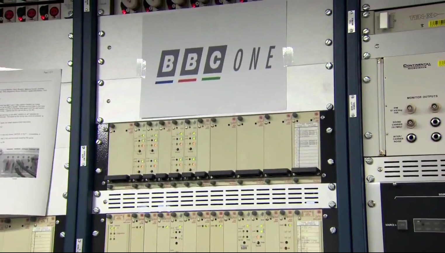
MA
I was at Crystal Palace, a couple of weeks ago, the analogue transmitters and the sheet of A4 paper with the offensive logo, are still there, all frozen in time.
I remember this from an Arqiva video on the Crystal Palace digital switchover. I think it was actually a mock that someone had uploaded on this forum, so was obviously found on a Google image search.
I was at Crystal Palace, a couple of weeks ago, the analogue transmitters and the sheet of A4 paper with the offensive logo, are still there, all frozen in time.
JV
I was at Crystal Palace, a couple of weeks ago, the analogue transmitters and the sheet of A4 paper with the offensive logo, are still there, all frozen in time.
Wow! Weren't tempted to fire them up again were you? I'm surprised they haven't been lobbed in a skip or donated to a museum!
James Vertigan
Founding member
I was at Crystal Palace, a couple of weeks ago, the analogue transmitters and the sheet of A4 paper with the offensive logo, are still there, all frozen in time.
Wow! Weren't tempted to fire them up again were you?
I'm surprised they haven't been lobbed in a skip or donated to a museum!
RO
The BBC logo in current use is, in my opinion, the best one they've ever had. The fact it's been in use since 1997 shows you that the BBC logo is now familiar, and recognisable. The fact they've kept it for 17 and a half years as I write also shows that they're not prepared to keep wasting money updating their logo every 7 years.
Why do I like it? Well, it's not so in your face as the 1989 Sky logo. It also fits in with every occasion possible, without adjustment, which is where the 1996 Channel 4 circles failed. The logo also is clear, and unruffled, suggesting this is a business getting on with the job, and happy with their look and image. Clearly, the BBC have a lot of things to get on with, and commissioning a new logo every few years isn't one of them.
Perhaps the best bit though is that it's timeless. In the 17 and a half years, STV has had four logo changes. Channel four has changed its on screen identity three times. ITV has rebranded three times as well, at least. Sky Sports had had three changes as well. Even channel 5, which launched in the same year as the new BBC logo, but a few months earlier, has had two rebrands. Perhaps, instead of asking whether the BBC should refresh or update their identity, perhaps we should ask why those other broadcasters have changed theirs. As I say, the BBC logo now is timeless. No one has complained about Coca Cola having the same logo since the year dot.
WH
The film first appeared on 20th September 1997, two weeks before the new logo was introduced.
Whataday
Founding member
As a random aside, was the Perfect Day campaign launched before or after the new corporate logo? I was watching a version on Vimeo from director Gregory Rood, where the current corporate logo is on the 'You make it what it is' endboard, whereas a version on The Mill's site shows it with the previous corporate logo on the same end board (and less some of the background effects, which appear on the artists).
The film first appeared on 20th September 1997, two weeks before the new logo was introduced.
IN
At the risk of going off topic, which situation did the 4 in a circle not suit? It gets a lot of stick because it replaced the long running launch identity (albeit with much newer audio), but that logo and the idents were good, just as the squares that replaced them were.
It also fits in with every occasion possible, without adjustment, which is where the 1996 Channel 4 circles failed.
At the risk of going off topic, which situation did the 4 in a circle not suit? It gets a lot of stick because it replaced the long running launch identity (albeit with much newer audio), but that logo and the idents were good, just as the squares that replaced them were.